What is American Chic? For me, it has always been about effortless style. The kind of style that doesn’t shout “Look at me!” A style that is crisp and classic, balanced, often times understated yet always sophisticated, subtle and artfully layered, unfettered by excessive decor and, above all else, timeless. A style that honors the past yet embraces the present and looks toward the future.
In George Stacey and the Creation of American Chic author Maureen Footer lays claim that “The history of interior design is punctuated by a few legends — Billy Baldwin, Sister Parish — and should include trailblazing decorator George Stacey.” Why? Because, in her words, Stacey possessed “an appealing nonchalance and irreverence, combined with erudition, a flair for color, and an innate grasp of balance, scale, and proportion, producing rooms that were surprising as well as sophisticated. Balancing modern aesthetics and modern living with a lifelong passion for French classicism ensured that Stacey designs were both of the moment and enduring.” This, in a nutshell, defines American chic.
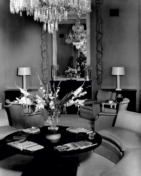
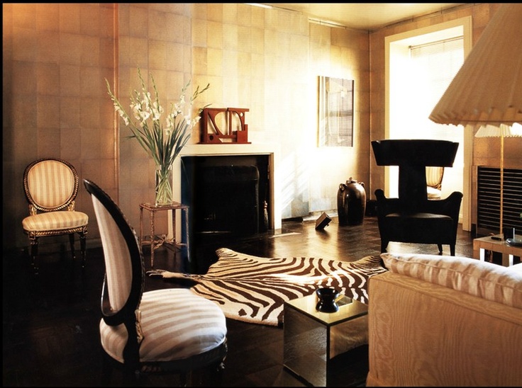
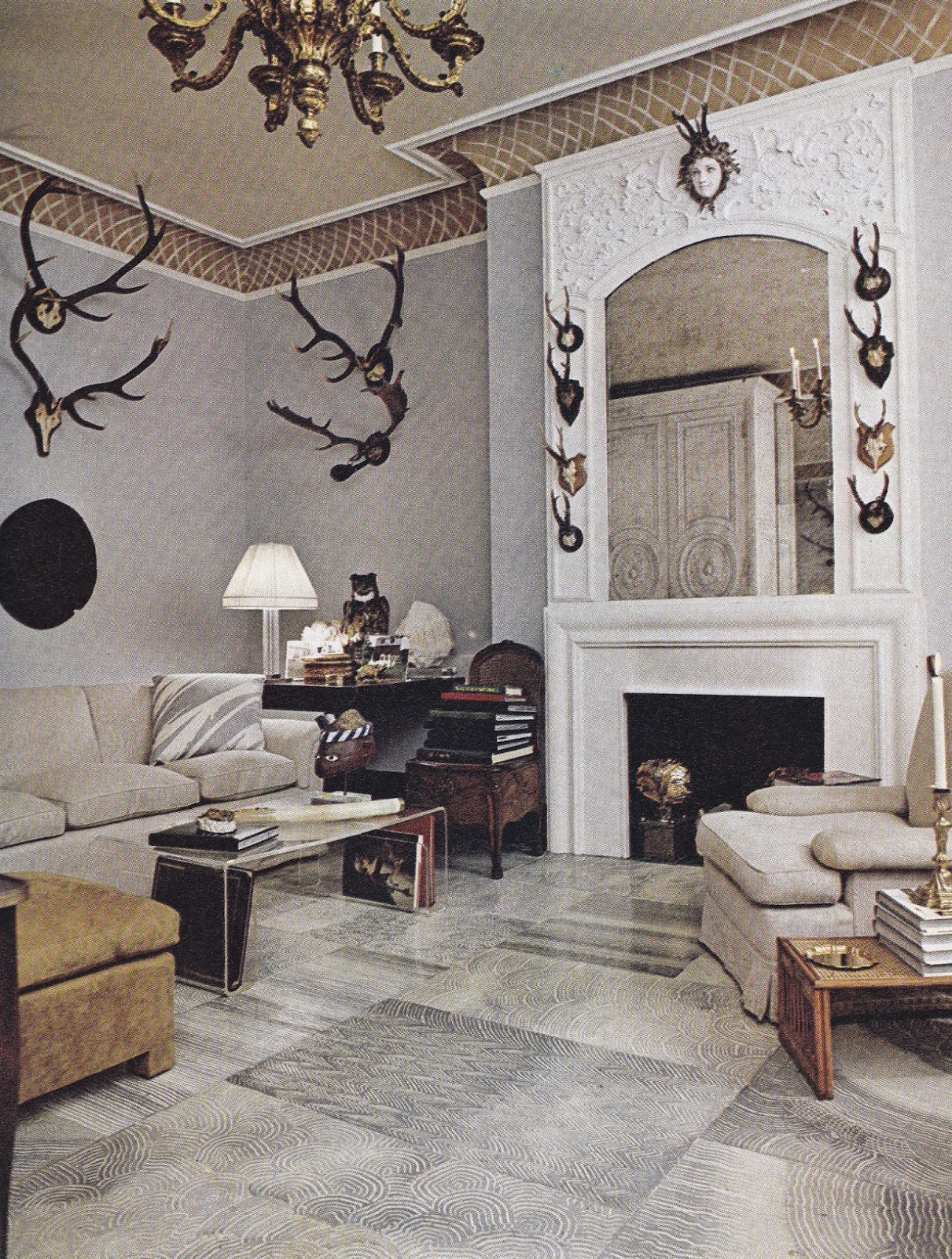
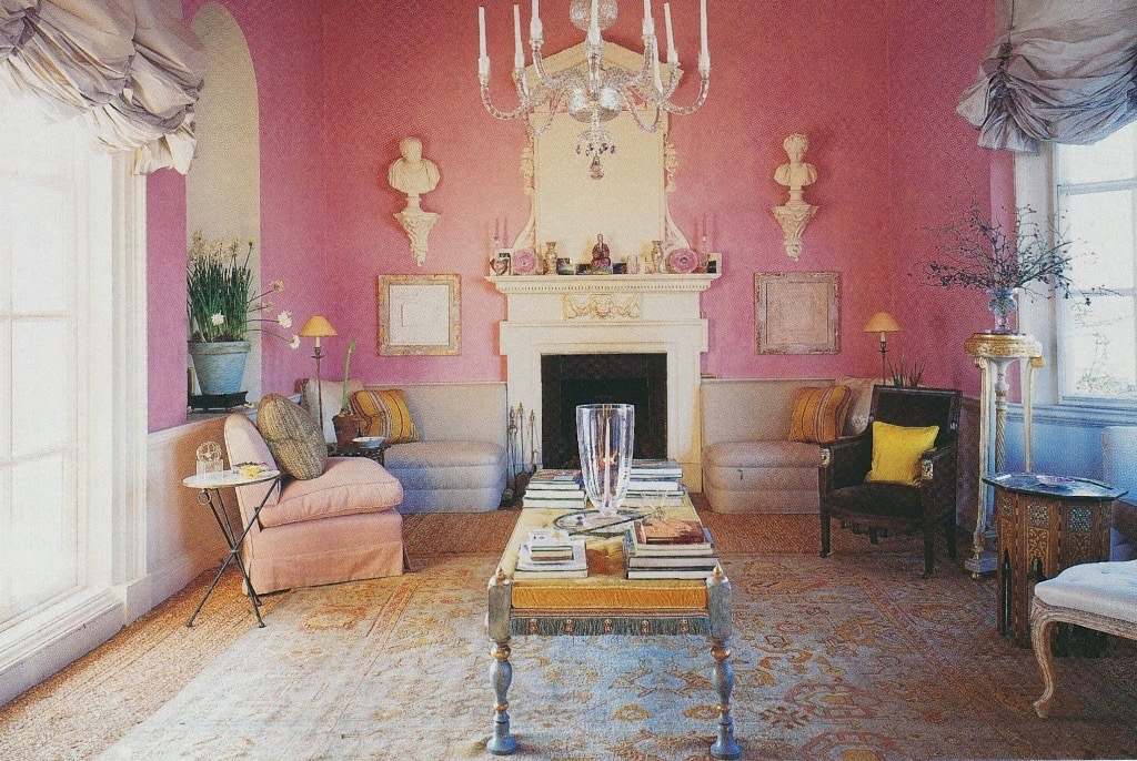
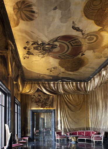
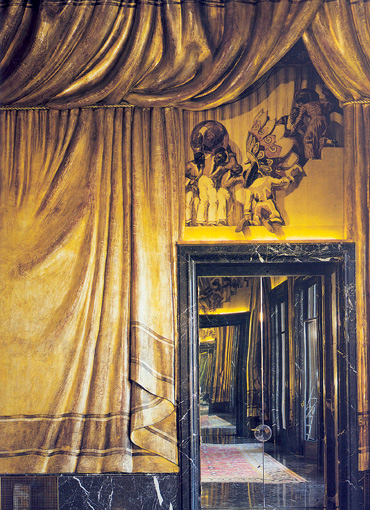
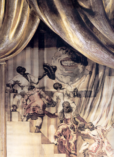
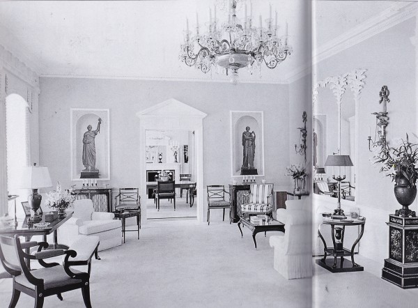
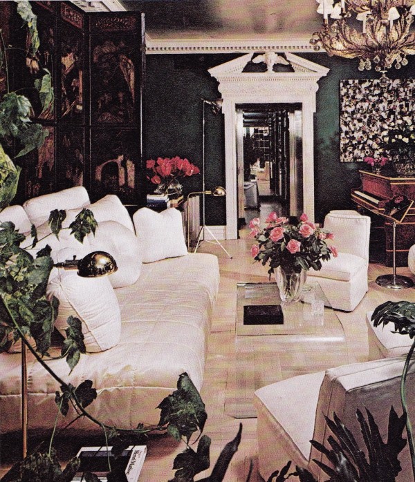
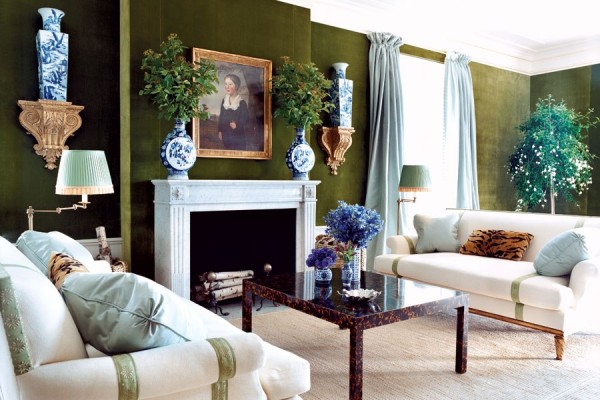
Frances Cheney’s glamorous octagonal living room.
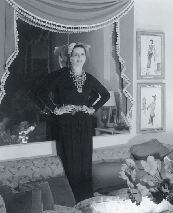
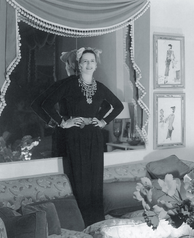
Diana Vreeland posing in her chic George Stacey designed room.
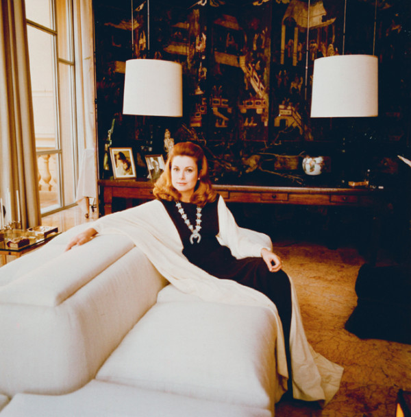
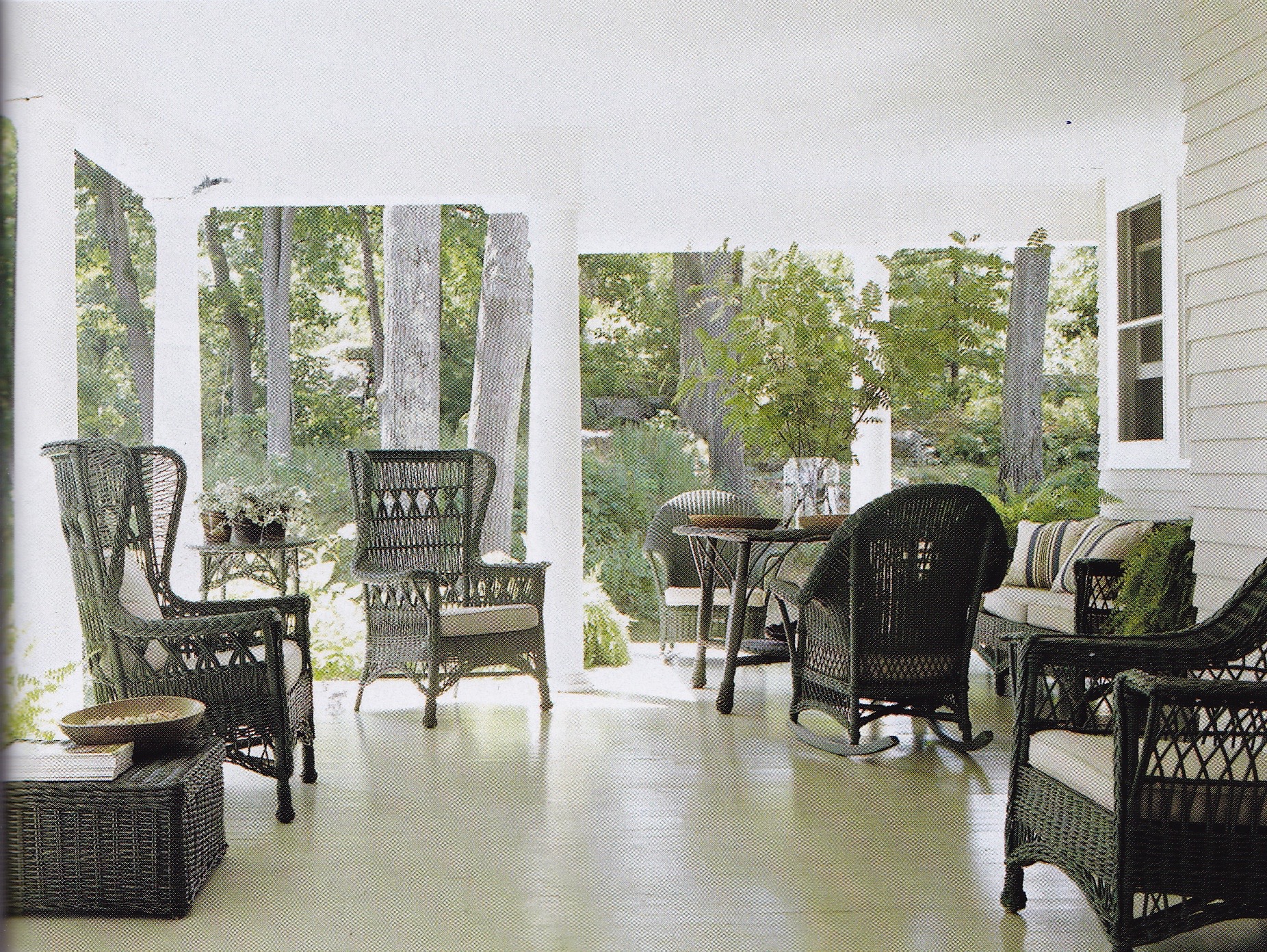
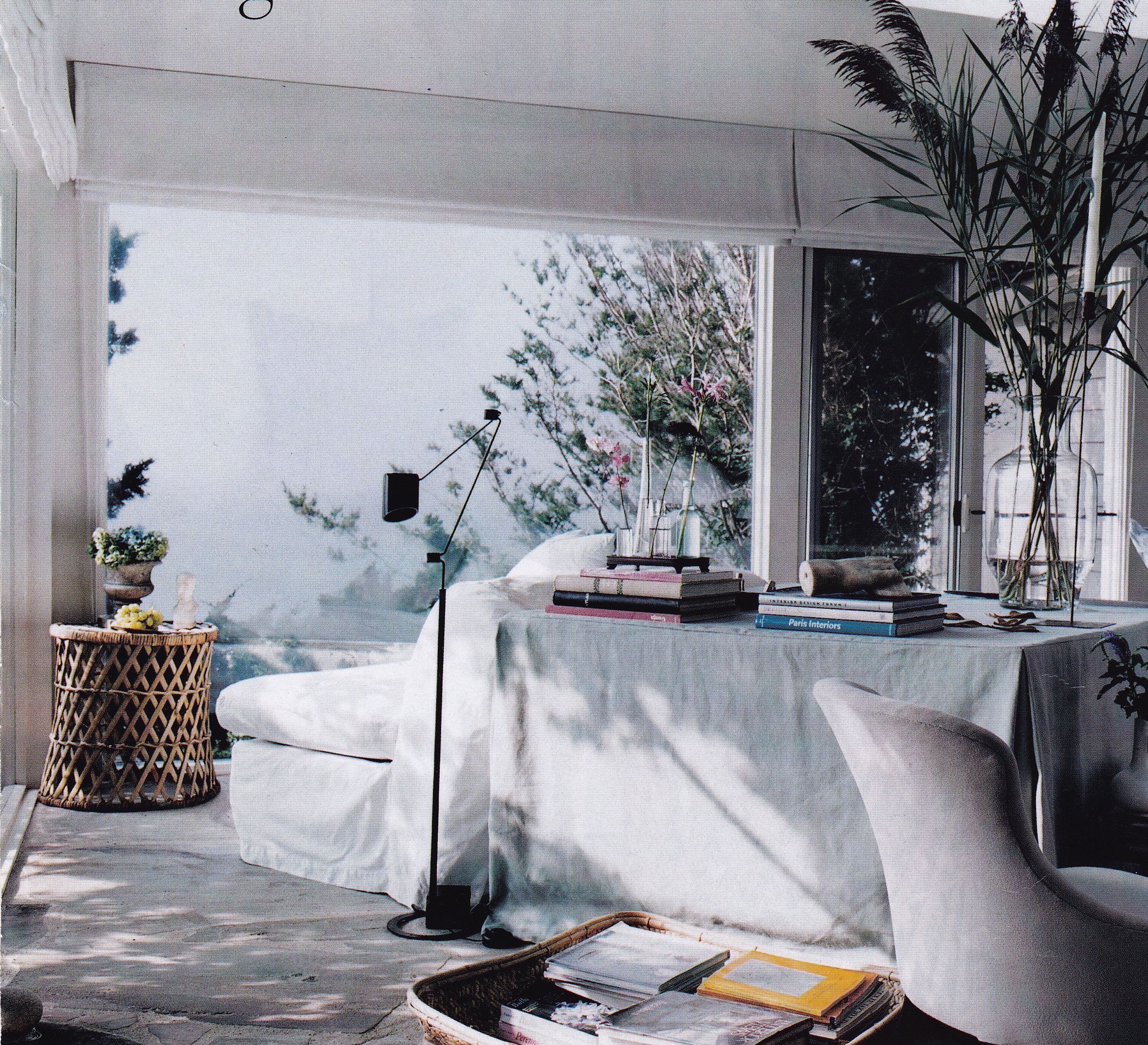
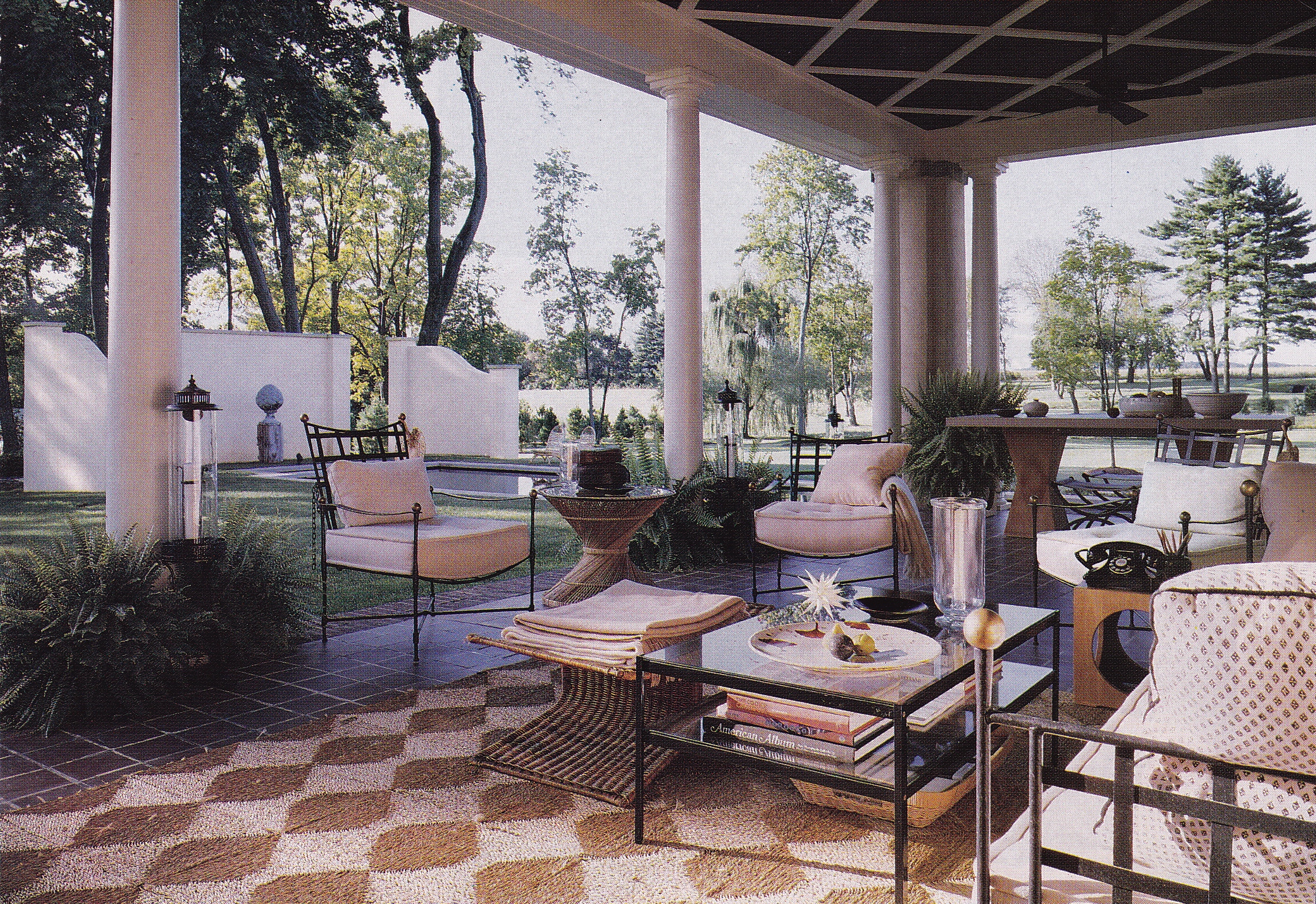
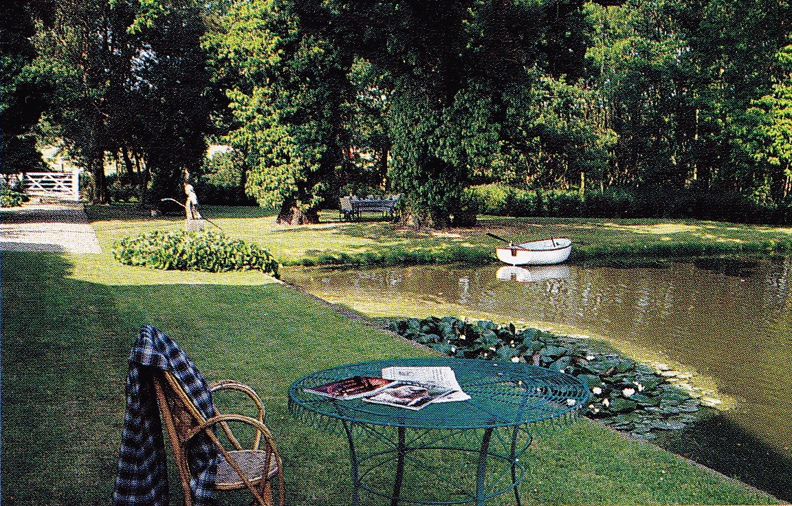
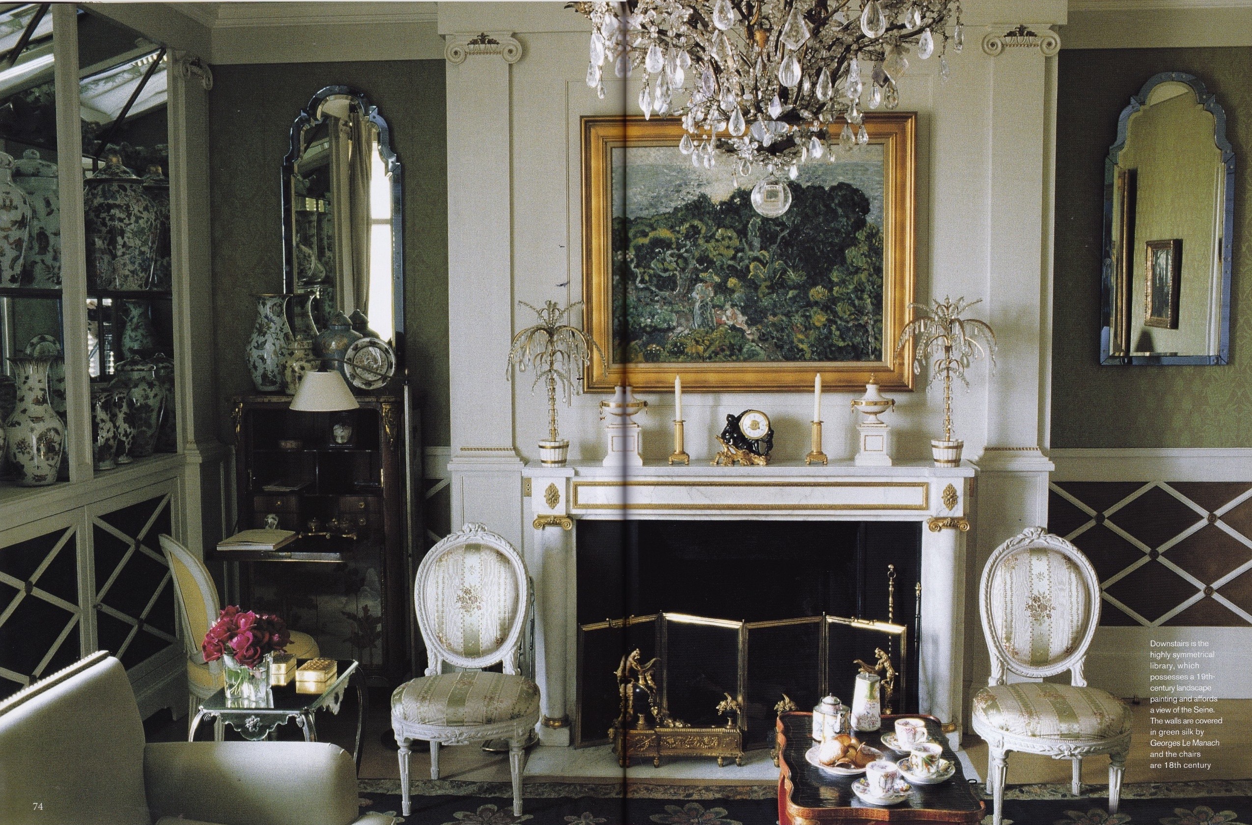
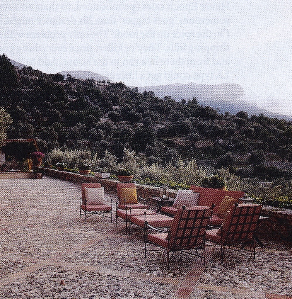
Princess Grace lounges in her conservatory-cum-family room at the Palais Princier in Monaco.
Although I cannot relate to Stacey as readily as I can to Baldwin and Parish, simply because, as she suggests, Stacey never enjoyed the limelight, we are laid witness to a new energy and flair in American interior design and decoration heretofore never experienced. Some may argue that Elsie de Wolfe was not only the first American decorator but the first to introduce American chic, however her style was, though lighter and fresher than its predecessors, firmly planted in the Classic, reinterpreted, often, with whimsy. If Stacey is to be given his due credit, then, we can attribute his contribution to the development of American chic as early as the 1930’s, with his first commissions for socialite Frances Cheney, style priestess Diana Vreeland, and real life Princess Grace of Monaco, when he presented rooms with a new dynamism and effortless style that is uniquely American by design.
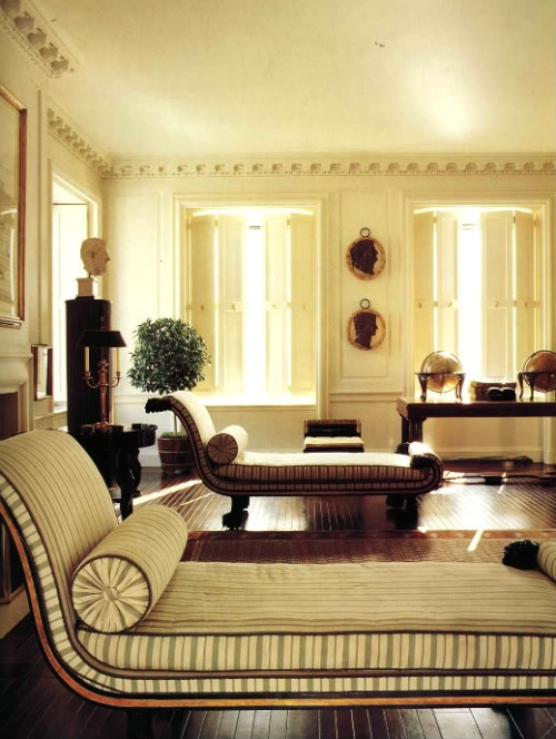
A light and airy living room designed with imagination and flair early in the career of Sister Parish for the C. Champe Taliaferro’s.
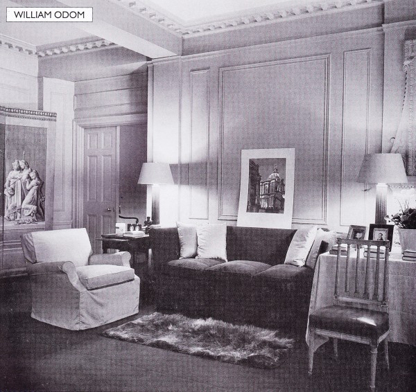
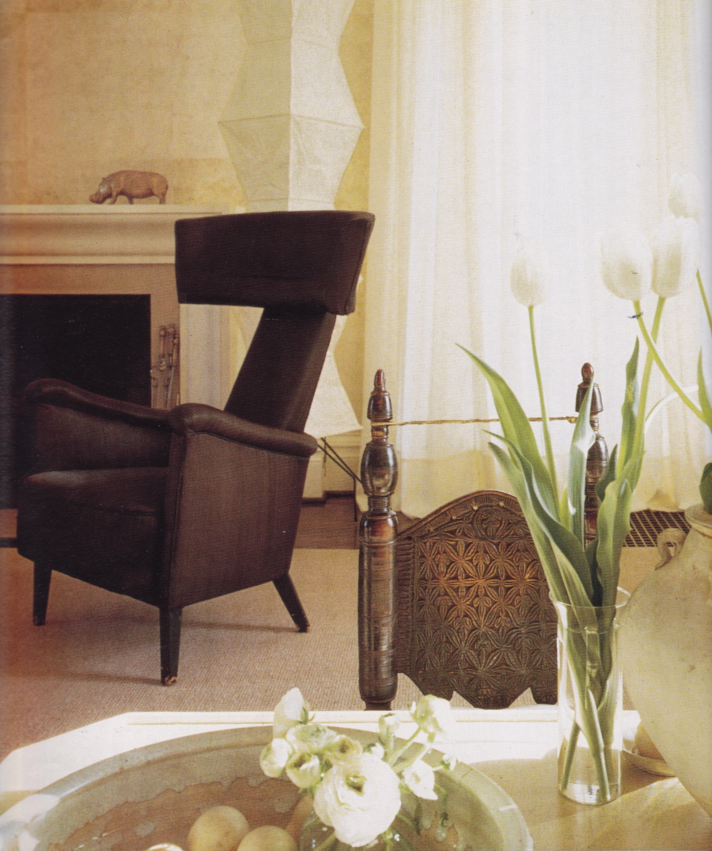
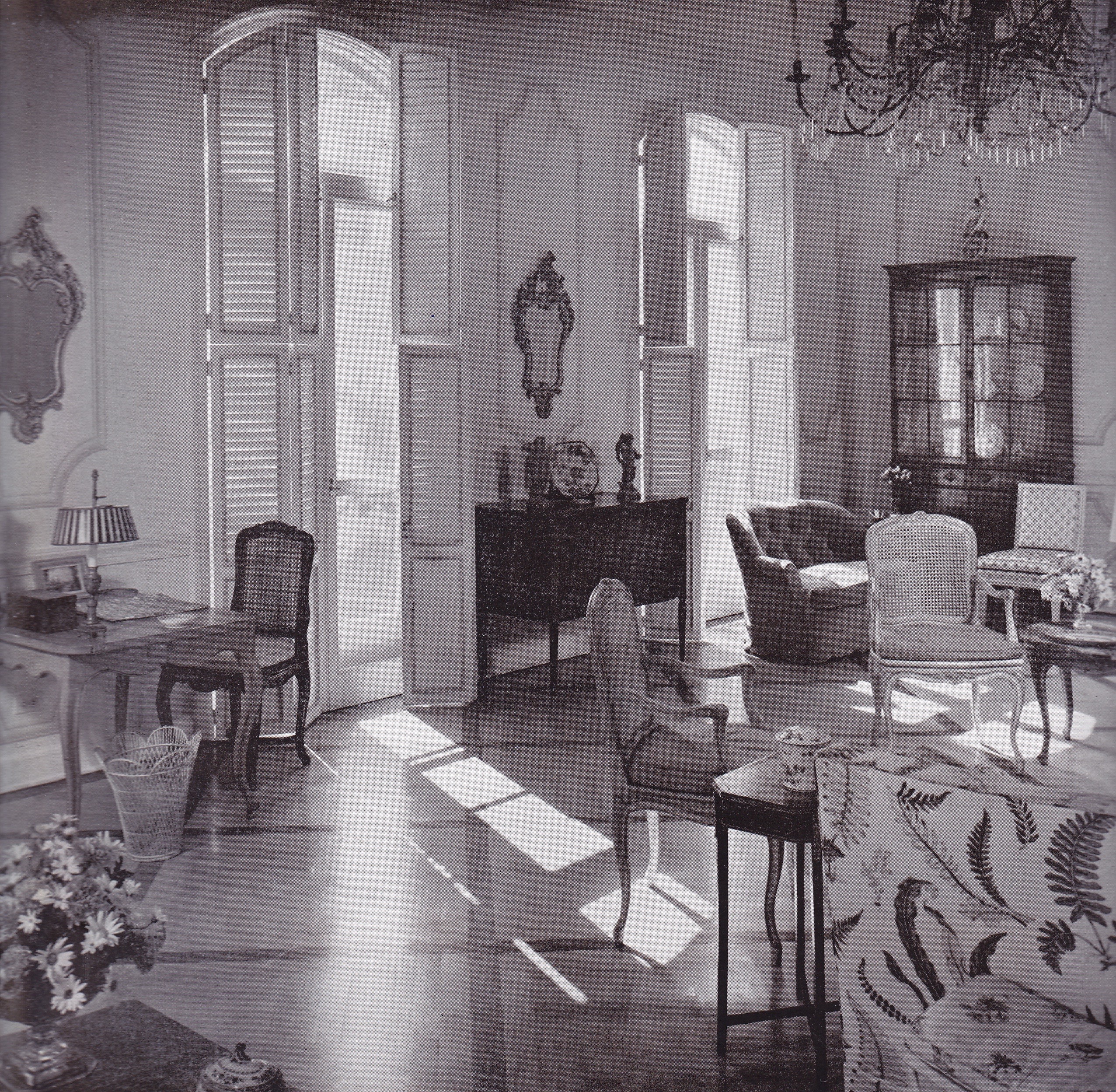
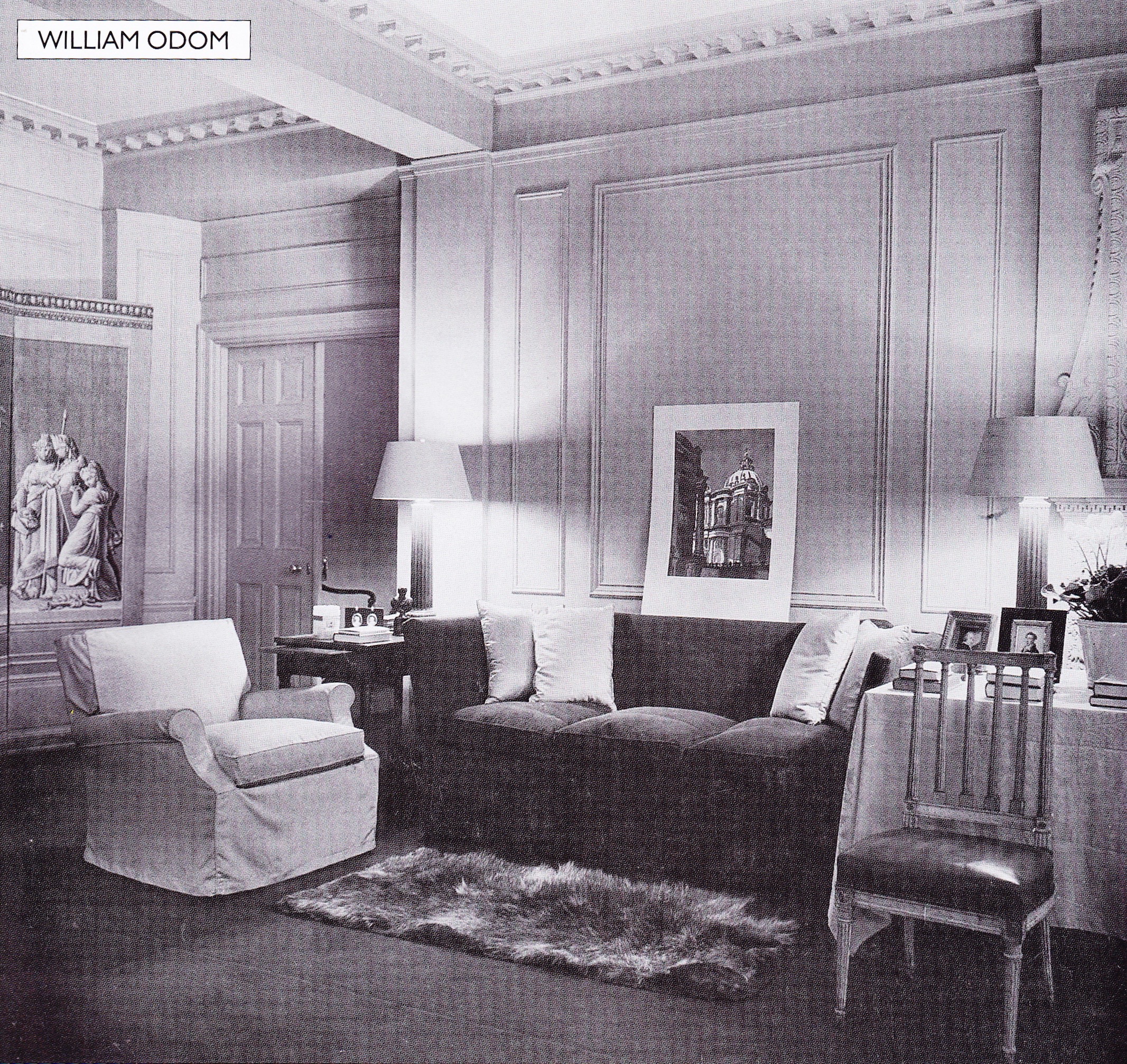
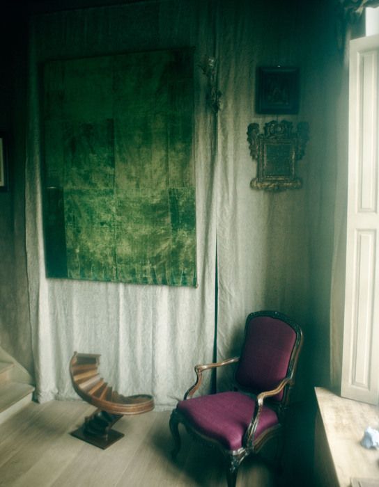
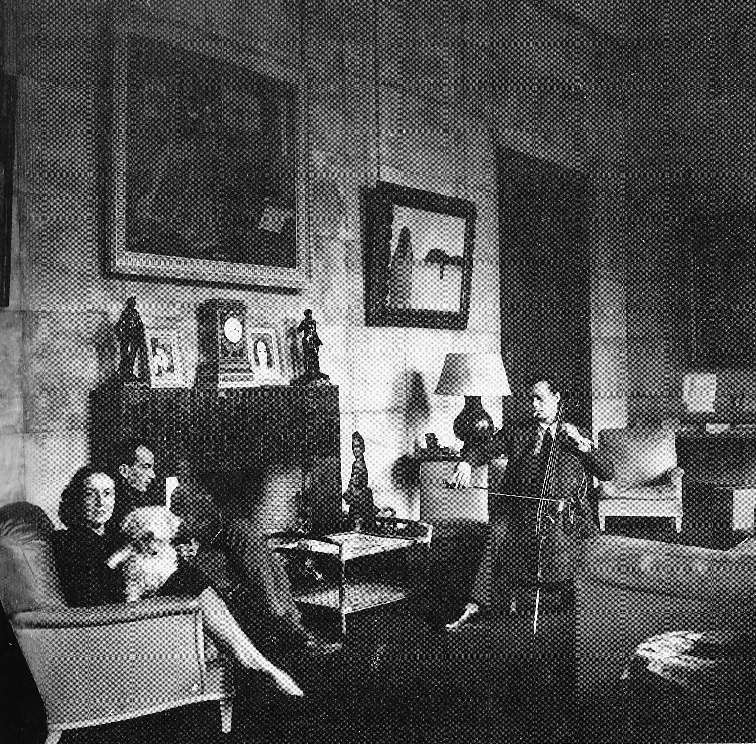
Yet the history books on interior design seem to have almost forgotten another waning star, William Odom. The New York apartment he decorated for himself (above) is as chic as it is classic.
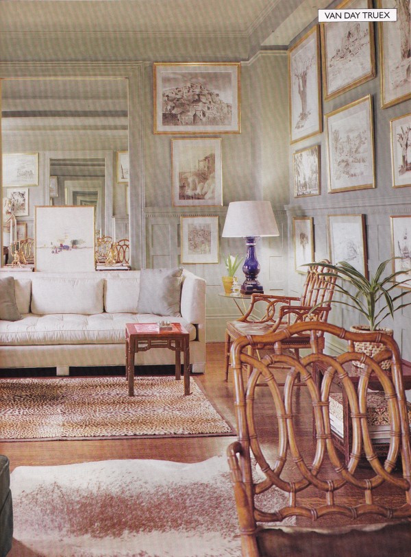
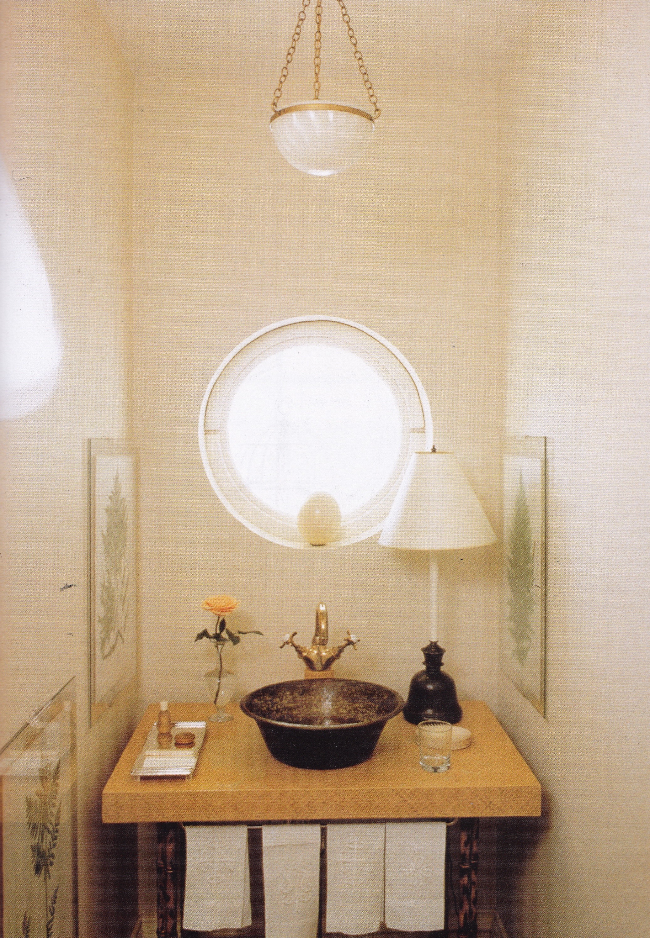
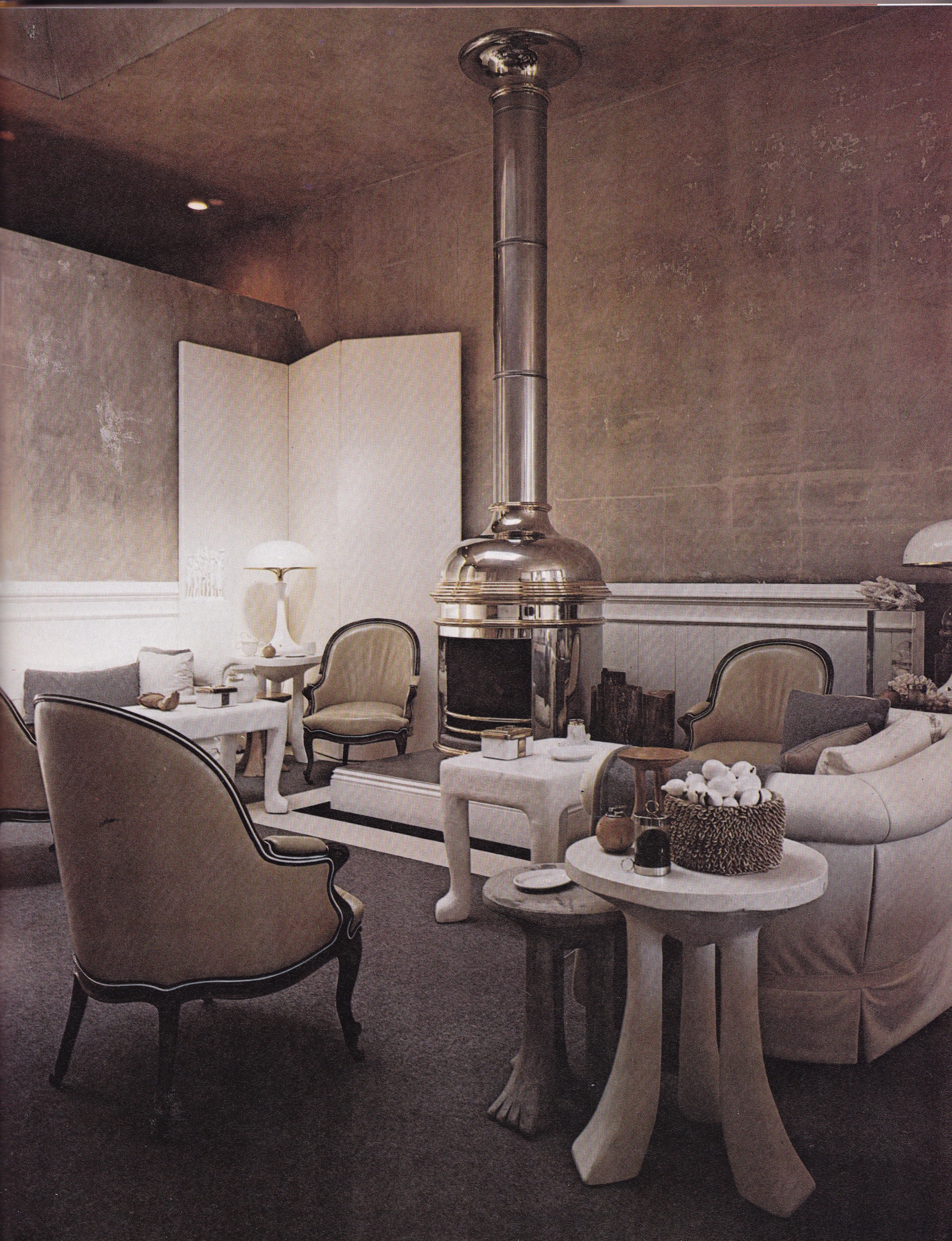
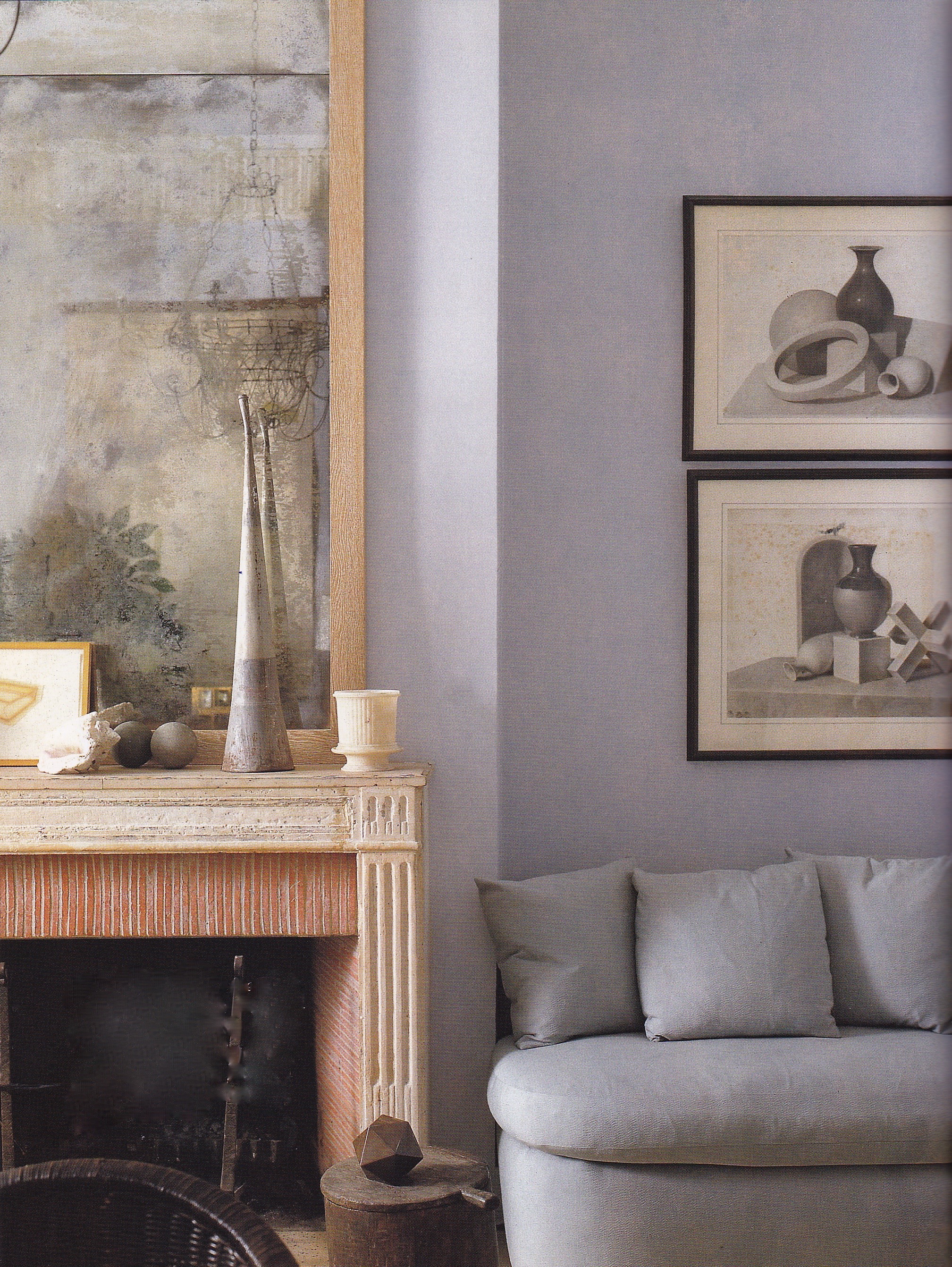
Perhaps no one had more influence on the legacy of contemporary American interior design than did Van Day Truex. Though he has quietly retreated into the annals of America’s greatest interior designers, from his days as President of the Parsons School of Design in the 1940’s to his later role as design director of Tiffany & Co, his restrained approach to crafting quietly elegant spaces continues to inspire designers. His New York apartment in 1969, above, had walls painted a soft gray as a foil for a collection of gold-framed sepia tone prints whose color is repeated naturally in the hides that cover the floor.
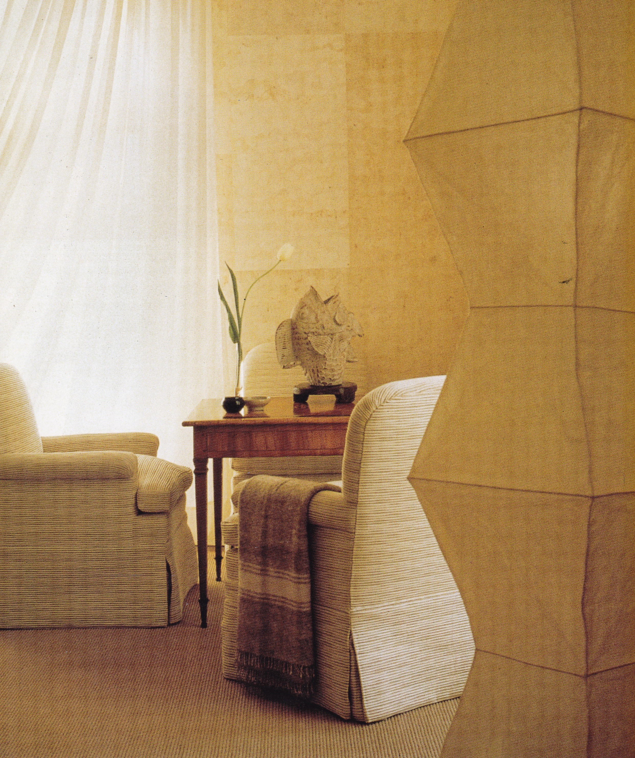
Van Day Truex’s last apartment in New York City was elementally chic and timeless.
Before there was Billy Baldwin there was Ruby Ross Wood, which begs the question: Would there have been a Baldwin without Wood, or a Wood without Baldwin? Baldwin maintained “Mrs. Wood was the best decorator ever. Her motto was ‘Decorating is the art of arranging beautiful things comfortably.’ She taught me the importance of the personal, of the comfortable and the new.” Certainly Baldwin’s confidence in his abilities and level of style and taste also contributed to the success of Ms. Wood’s burgeoning interior design business. He affectionately recalled her tutelage and dedication to making him a design star, introducing him to all the right people. Perhaps one without the other would have produced the same results, but my guess is that Baldwin contributed profoundly to Ms. Ross’s enjoyment of success as the years progressed until her eventual retirement and his singular rise to stardom.
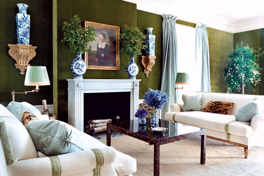
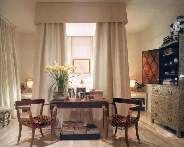
A high-water mark of American design, the Palm Beach living room Ruby Ross Wood and her associate Billy Baldwin decorated for Ellen and Wolcott Blair featured a floor of parchment-colored marble bordered by bleached oak. While the style is distinctly American in its comfortable yet crisp décor it was strongly influenced by Wood’s early appreciation of edgy European trendsetters, particularly Jean Michel Frank – as evidenced by the Louis XV desk covered in leather edged in plain white carpet tape. This brand of ingenuity is a hallmark of American chic.
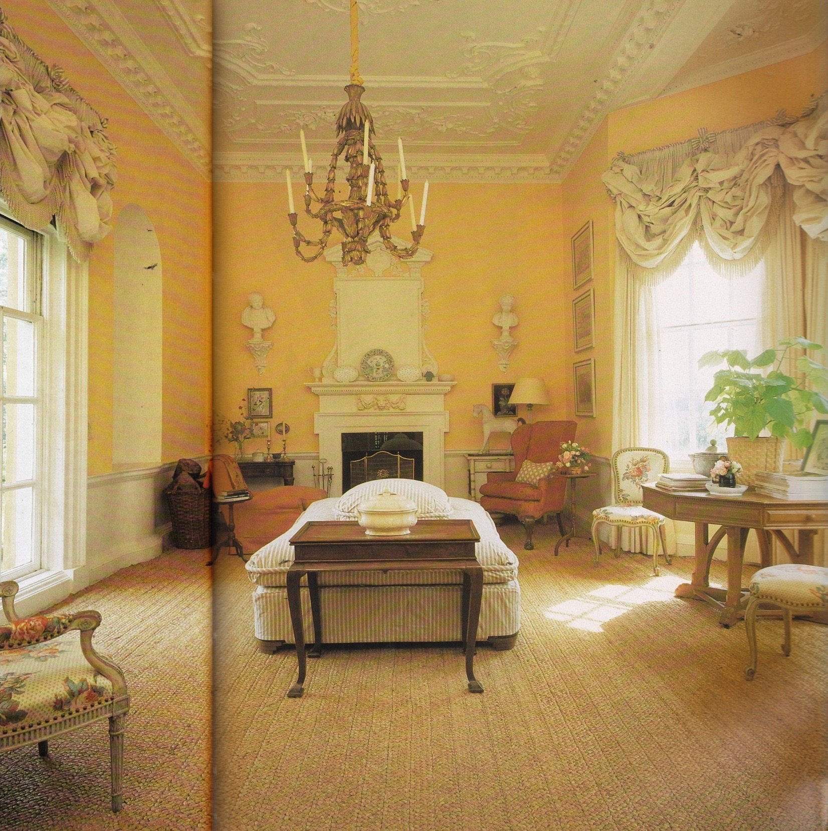
The Palm Beach residence of the H. Mercer Walkers’ decorated by Ruby Ross Wood in the 1940’s exhibited an air of cool classicism against a crisp monochromatic background.

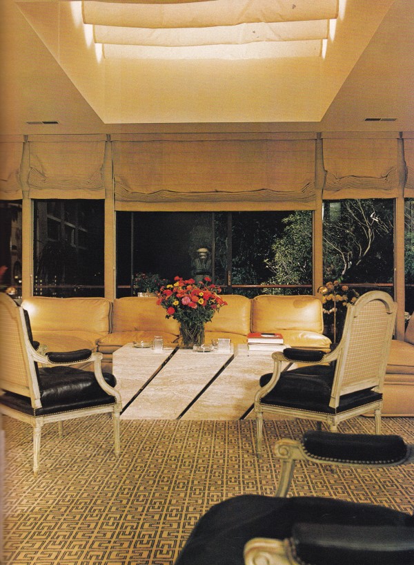
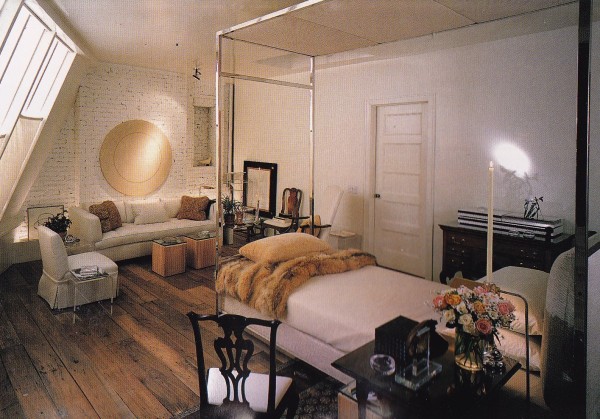
Billy Baldwin’s benchmark midtown apartment in New York City, 1973.

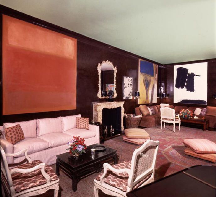
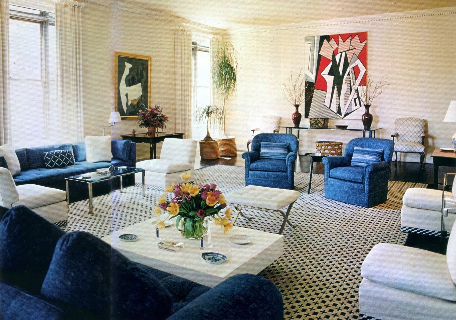
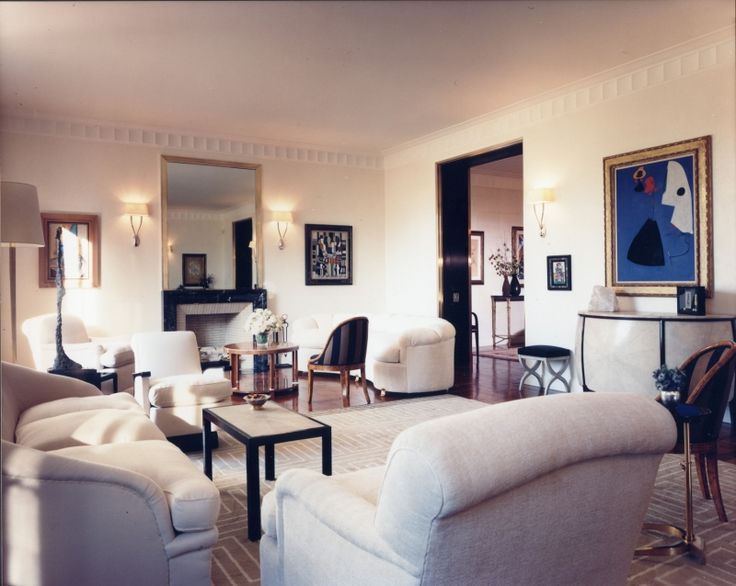
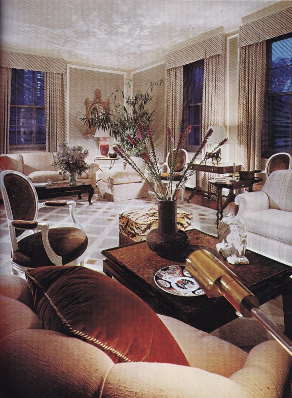
The Baldwin designed New York City living room of Mr. and Mrs. Lee Eastman introduced a modern furniture layout, a mix of contemporary and classic furniture, and a dramatic backdrop for modern art. Photo by Horst.
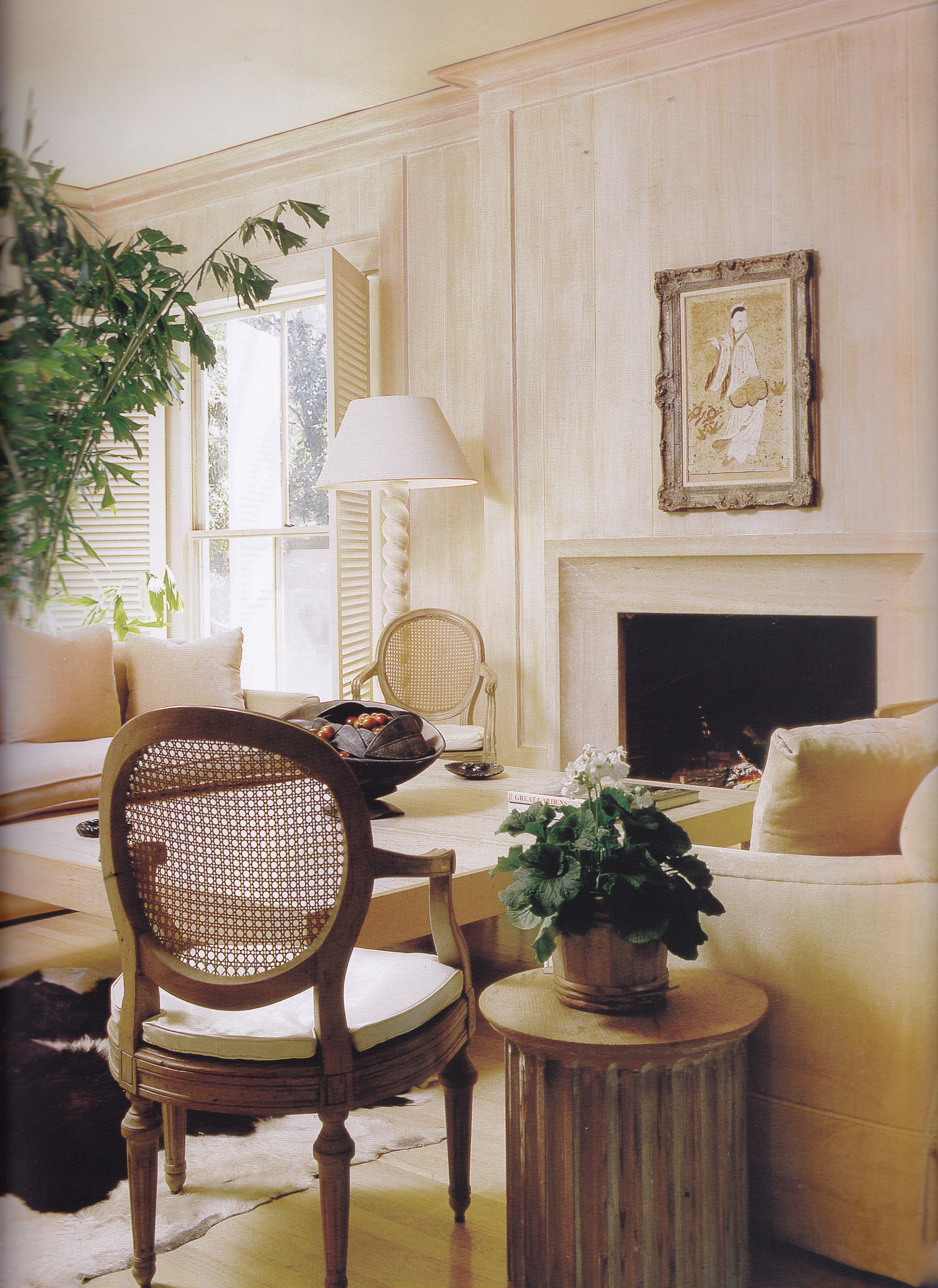
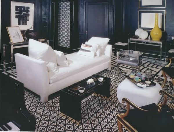
Decades later, this room Baldwin designed for S. I. Newhouse still feels stylish and relevant.
Raised in California, I was witness to the burgeoning California Look that was taking hold in late 1970’s and which exploded into the 1980’s. I was drawn to these lighter, bolder rooms, especially those that mixed classic and contemporary design. My parents gifted me a subscription to Architectural Digest in 1978 (I was merely a child!), and I became hooked. AD became my bible, and I soon discovered House & Garden (at a time when shelter magazines weren’t readily available at grocery store newsstands). It was during this period that I discovered Billy Baldwin, Albert Hadley, Arthur E. Smith, Kevin McNamara, Billy Gaylord, Michael Taylor, Angelo Donghia and a host of others, many of whom, sadly, have fallen off the map of great American interior designers (for those of you interested in the Lost Generation of interior designers be certain to read The Blue Remembered Hills blogpost).

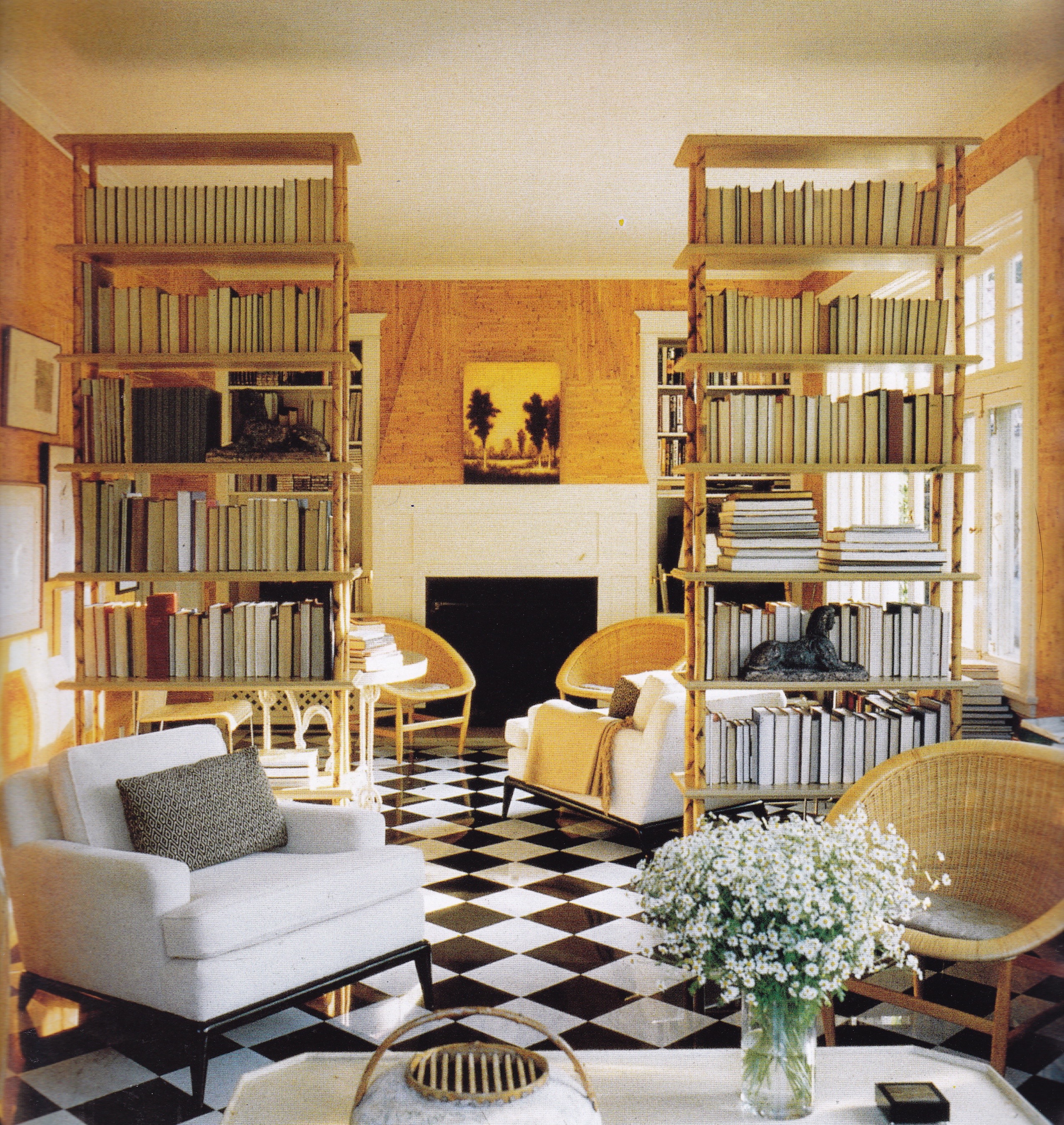
The monochromatic living room Michael Taylor designed for Mabel and Everett Turner in California in 1956 is perhaps the most timeless of them all in its classic simplicity. Photo my Russell MacMasters.

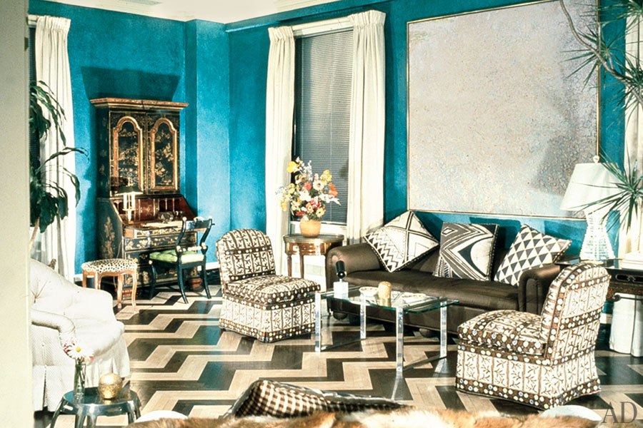
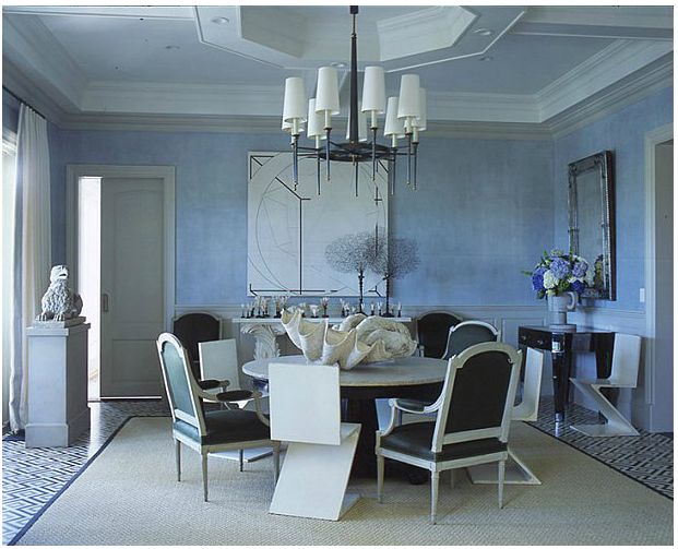
A mod herringbone floor joins peacock-blue walls in a New York City living room designed by Albert Hadley for attorney Frederic R. Coudert III in the 1970’s.
Hadley applied the same jazz age energy to his own New York apartment in the 1970’s.

San Francisco interior designer John Dickinson introduced minimal-traditional style with great originality in the 1970’s. Photo by Jeremiah O. Bragstad.

Classic contemporary style in a New York apartment designed by Arthur E. Smith in the 1970’s introduced a new direction in American style. Photo by Peter Vitale.
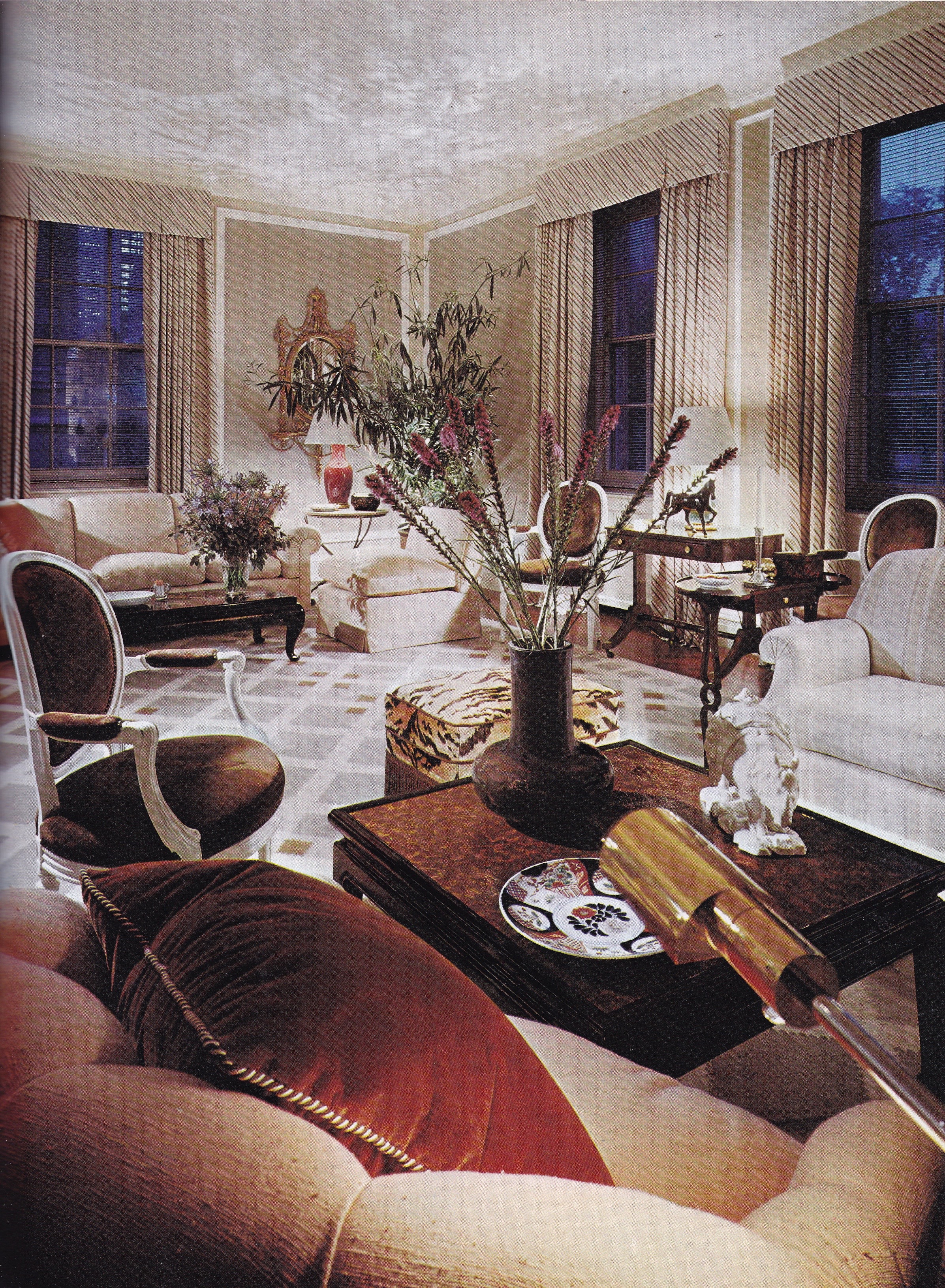
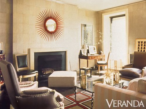
The classic-contemporary living room Mark Hampton designed for Susan and Carter Burden in the 1970’s while working for McMillen Inc. reveals the influence of his prior employer, David Hicks.

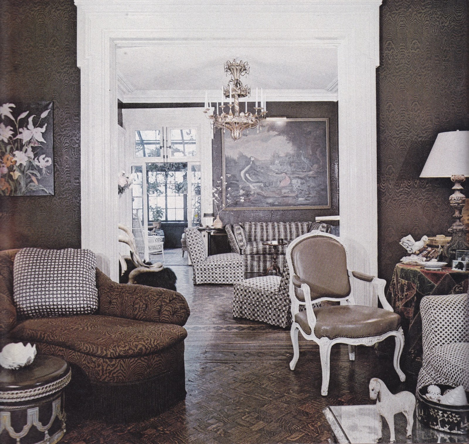
A brown-and-white scheme utilizing small-scale rep-pattern textiles for a Manhattan townhouse by Thomas Morrow sometime in the 1970’s. Photo by Richard Champion.
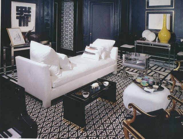
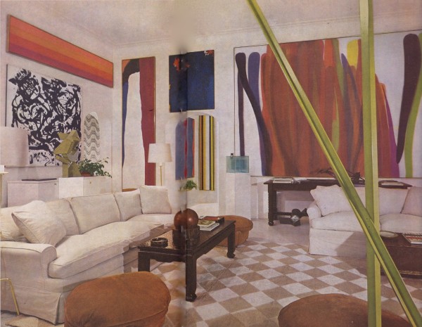
Angelo Donghia’s New York apartment in the latter 1970’s remains the epitome of classic-contemporary chic. Photo by Jaime Ardelice.
William (Billy) Gaylord’s Russian Hill, San Francisco, home featured in Architectural Digest in 1977 elicited a new taste for tailored yet glamorous rooms with a tactile quality. Photography by Russell MacMasters.
A calmly elegant update to a New York Georgian apartment by Jimmy Potucek, featured in AD in 1978. Photo by Jamie Ardiles-Arce.
Stephen Mallory’s design for the Kips Bay Decorator Show House, c. 1970’s, channels the modern classicism of David Hicks.

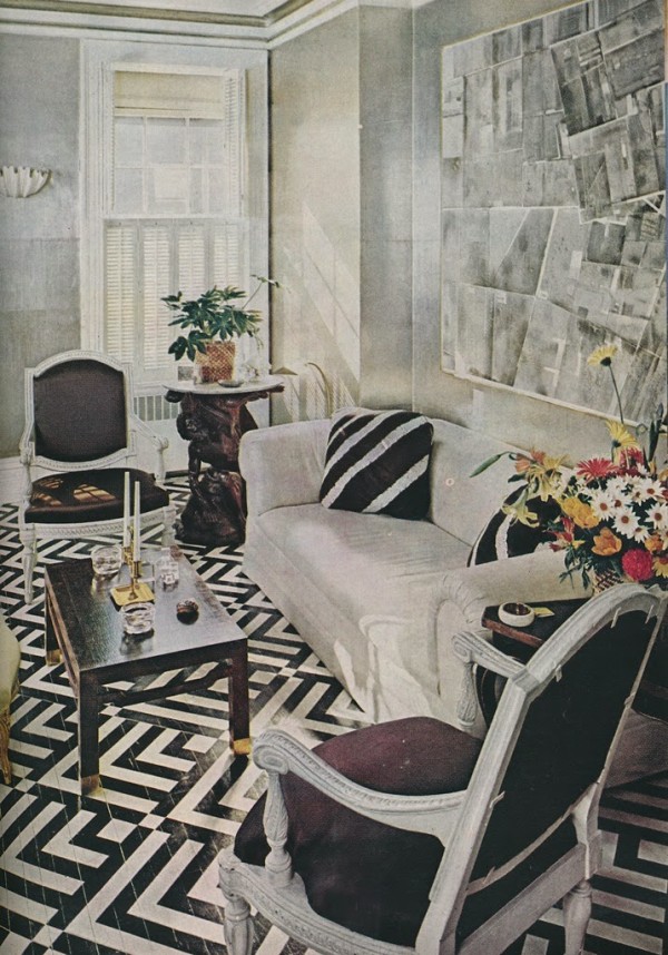
Pearl walls, graphite floors, neutral upholstery and chamois accents reflect a trend toward subtle color in the Manhattan living room of designer Richard Lowell Neas in the latter 1970’s. Photo by Norman McGrath.

Kevin McNamara enlivened the traditional decor in his own residence utilizing restraint and fresh color. From Architectural Digest.

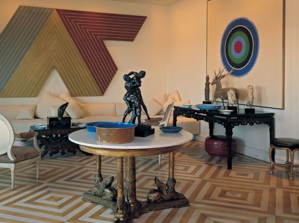
A living room designed by Kevin McNamara for the 1981 Kips Bay Decorator Show House reinterpreted classic elegance for contemporary living and modern art.
Michael Taylor’s design for Frances and John Bowes in San Francisco in 1985 would be his last before succumbing to AIDS. A black-and-white palette provides a crisp backdrop for gold damask covered Louis XV-style chairs and modern art.
Albert Hadley’s Manhattan living room in the 1980s — with tea-paper-clad walls, a neutral scheme, sculptural chairs and decorative flair — has influenced generations of designers past, present, and future. Photo by William Waldron.
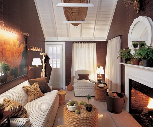
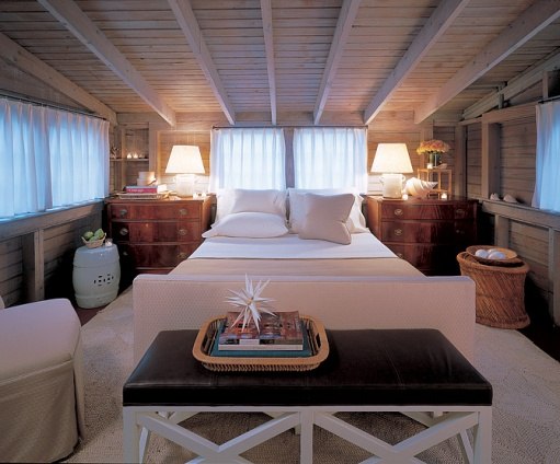
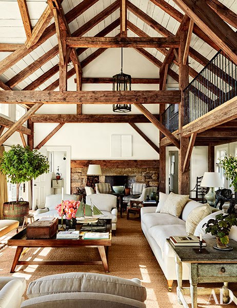
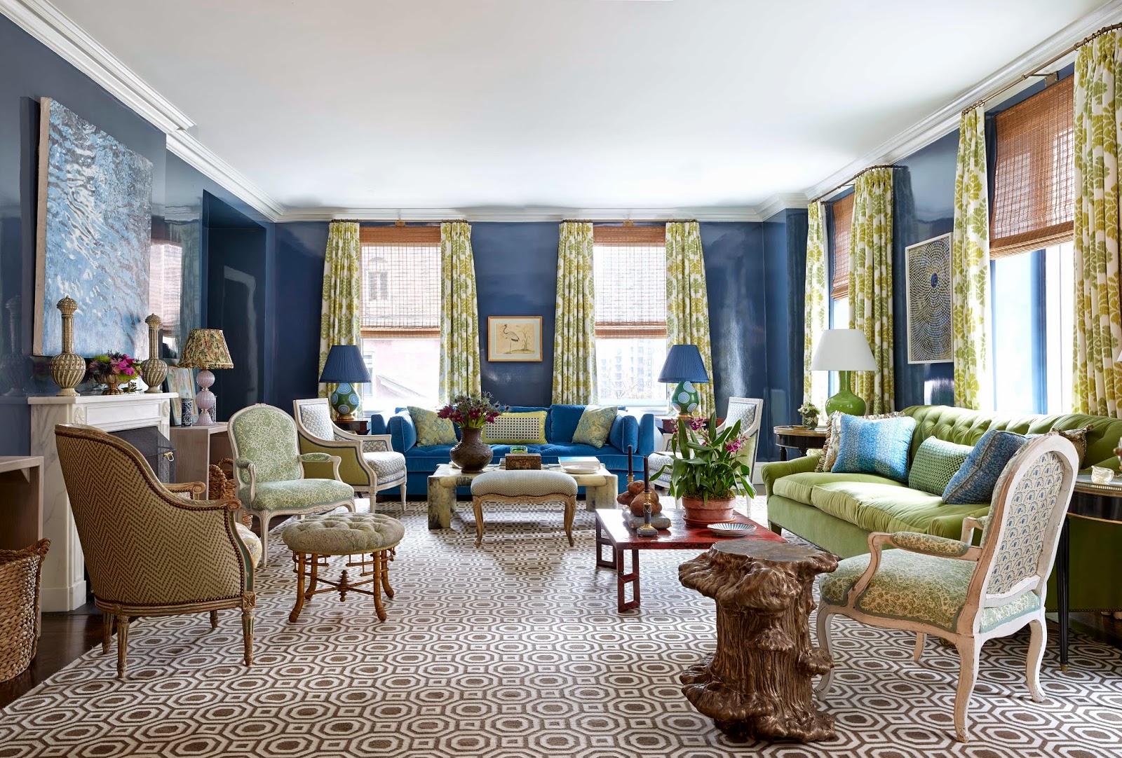
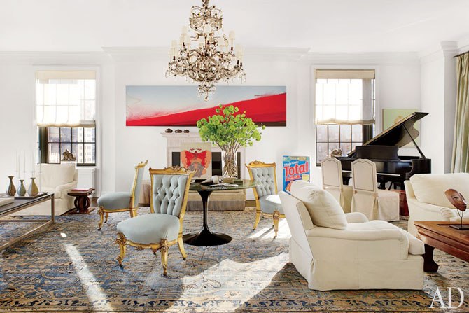
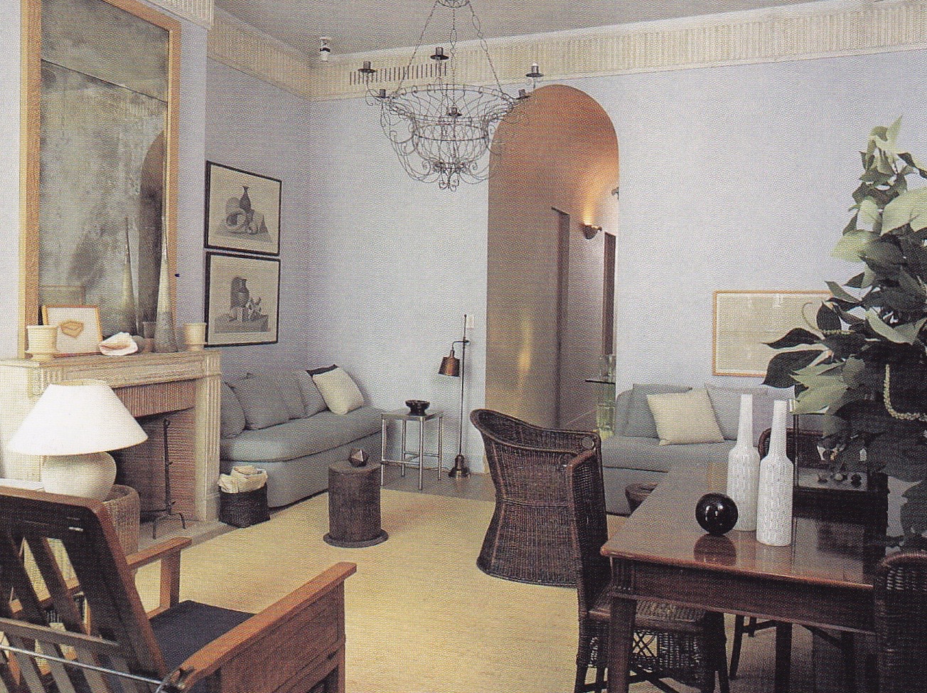
Fast forward to generations since, today we find a host of interior designers who follow in the footsteps of these pioneers of American Chic. The first to make a lasting impression on me was then design duo Stephen Sills and James Huniford. If there is such a thing as design alchemy then they proffer it. With their love for classicism they rendered youthful interiors for the intelligent set with a penchant for classicism. You’ve heard me say it before, and you’ll hear me say it again: “Atmosphere”. Atmosphere, in my opinion, is the single most determining factor of success and achievement of the sublime in design. And Sills and Huniford possessed it in spades. And they still do, now singularly. American Chic navigates the waters of classicism within a modernist context, producing alluring spaces that captures the spirit of time and place. While appearing effortless, a great many informed decisions and attention to detail produce these rooms with seeming insouciant flair. From the east coast to the west, interior designers define the meaning of American Chic in their respective and unique stylistic vocabularies.
Perhaps no residence of a fashion designer has had more impact on the psyche of the interior design world than that of Bill Blass. Effortlessly classic and chic, the masculine yet restrained and calm spaces he created in collaboration with MAC II shall withstand the test of time for centuries to come.
The epitome of classic chic, fashion designer Geoffrey Beene’s Long Island dining room made quite the impression on me when it was published in House & Garden in 1989.

Turkish-born Kalef Alaton imbued a Dallas living room with understated glamour in the 1980’s. Photo by Peter Vitale.
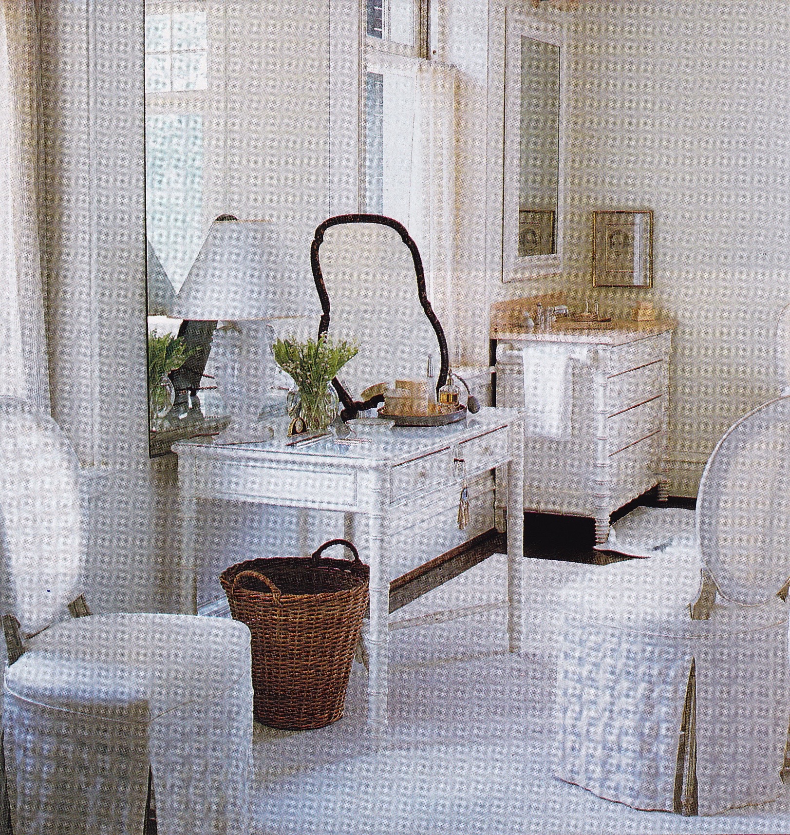
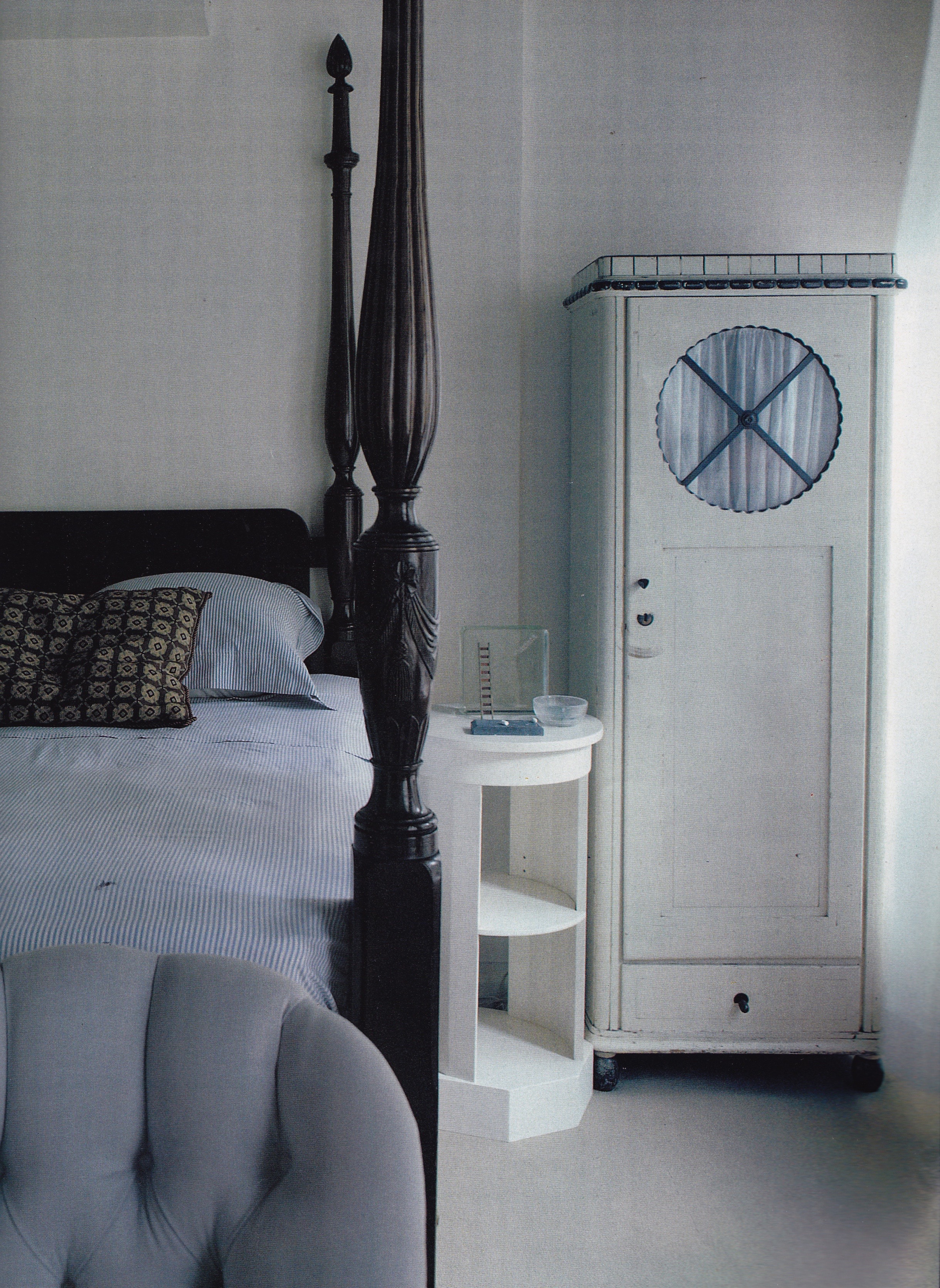
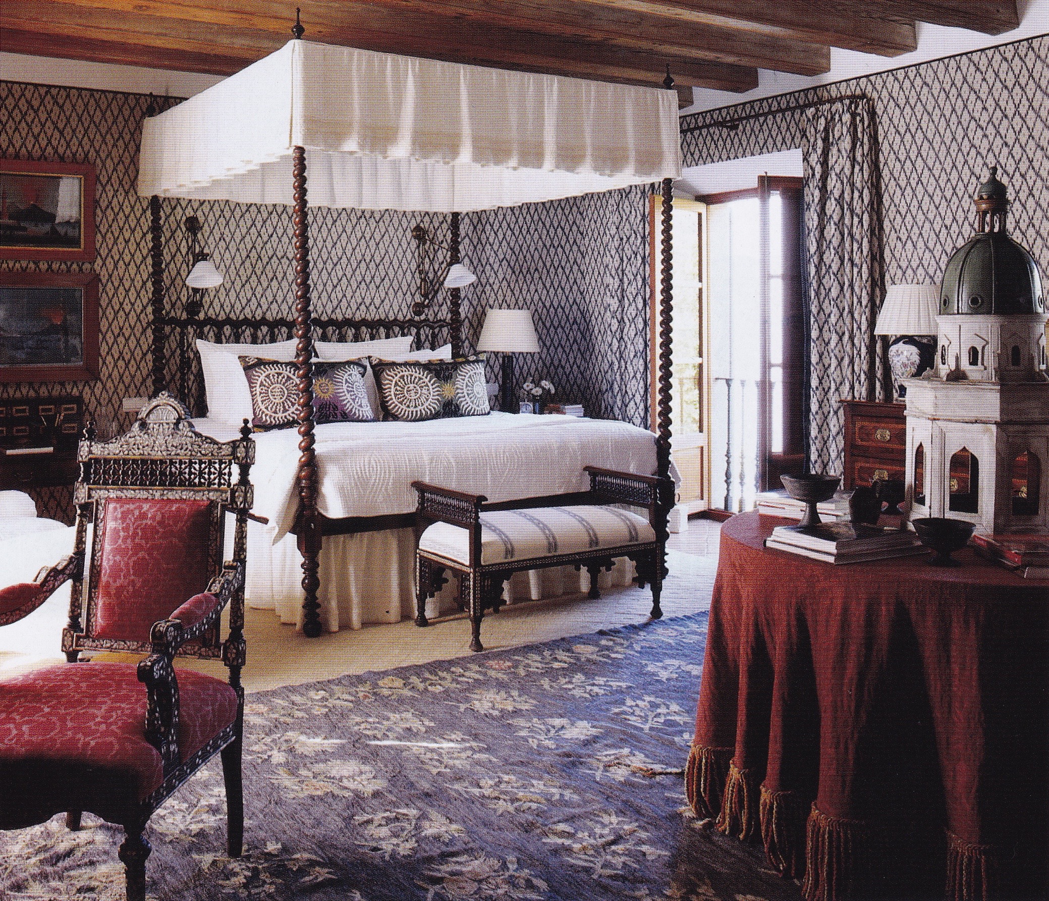
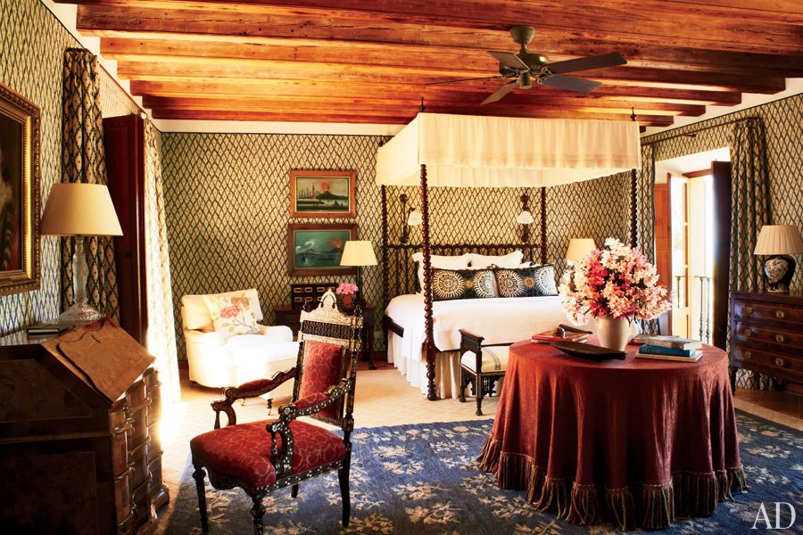
The bedroom Alaton designed in the Dallas house showcases the designer’s talent for mixing styles and periods with understated yet glamorous flair. Photo by Peter Vitale.
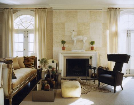
A mix of classic contemporary and traditional English furnishings in a neutral setting for a Kips Bay Show House room decorated by Tom Scheerer and Jeffrey Bilhuber in the early 1990’s. Photo by Feliciano.

Proclaimed by Karl Lagerfeld as “The chicest house in America”, Stephen Sills and James Huniford set a new standard in the lexicon of American chic at their Bedford, New York, residence in the 1990’s. Photo by Thibault Jeanson.

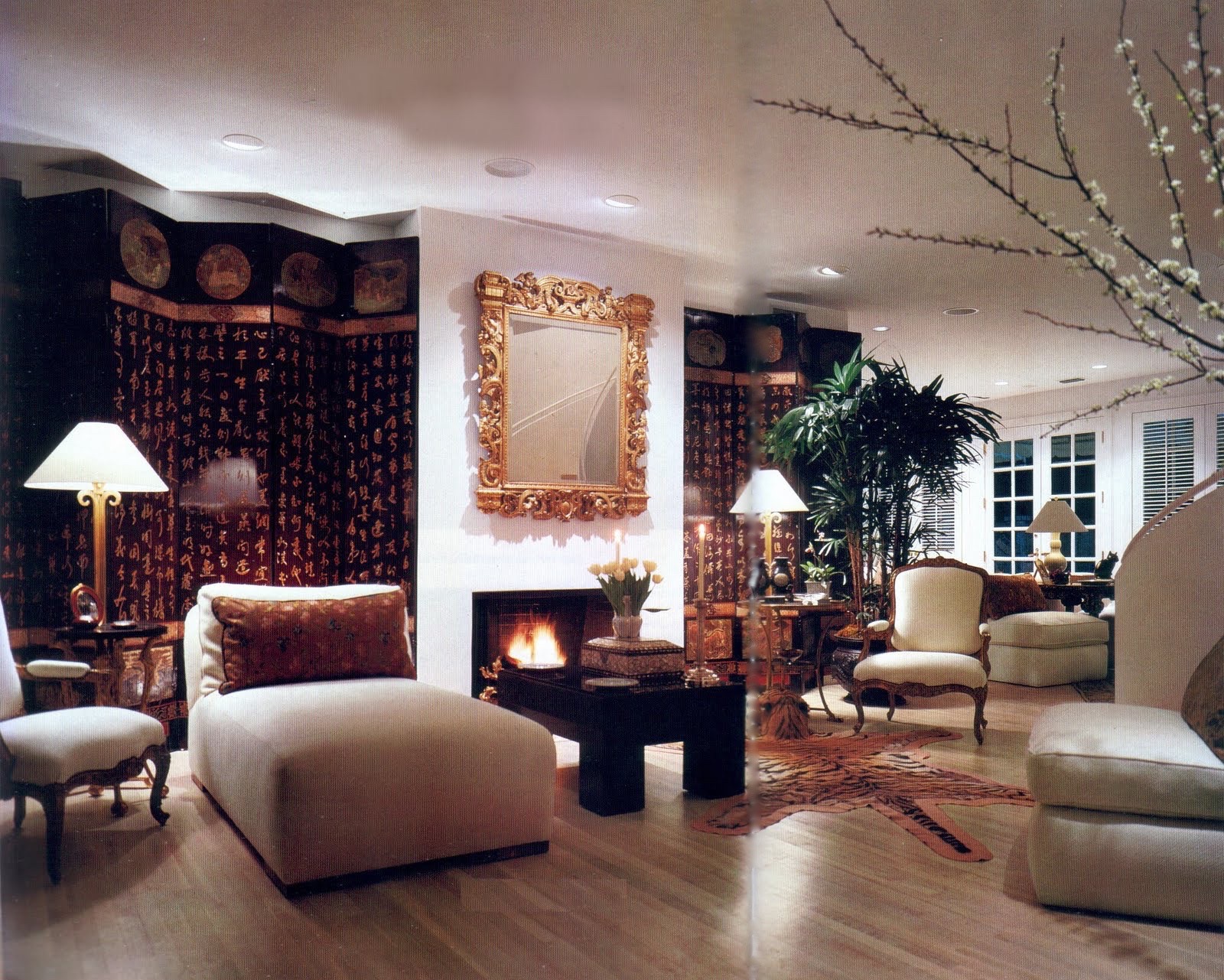
While the living room designed by the late Jed Johnson consists of mostly French furniture from the 1920’s and 30’s the understated yet luxurious background he developed as a foil for important 20th-century modern art is distinctly American. Photo by Jaime Ardiles-Arce.
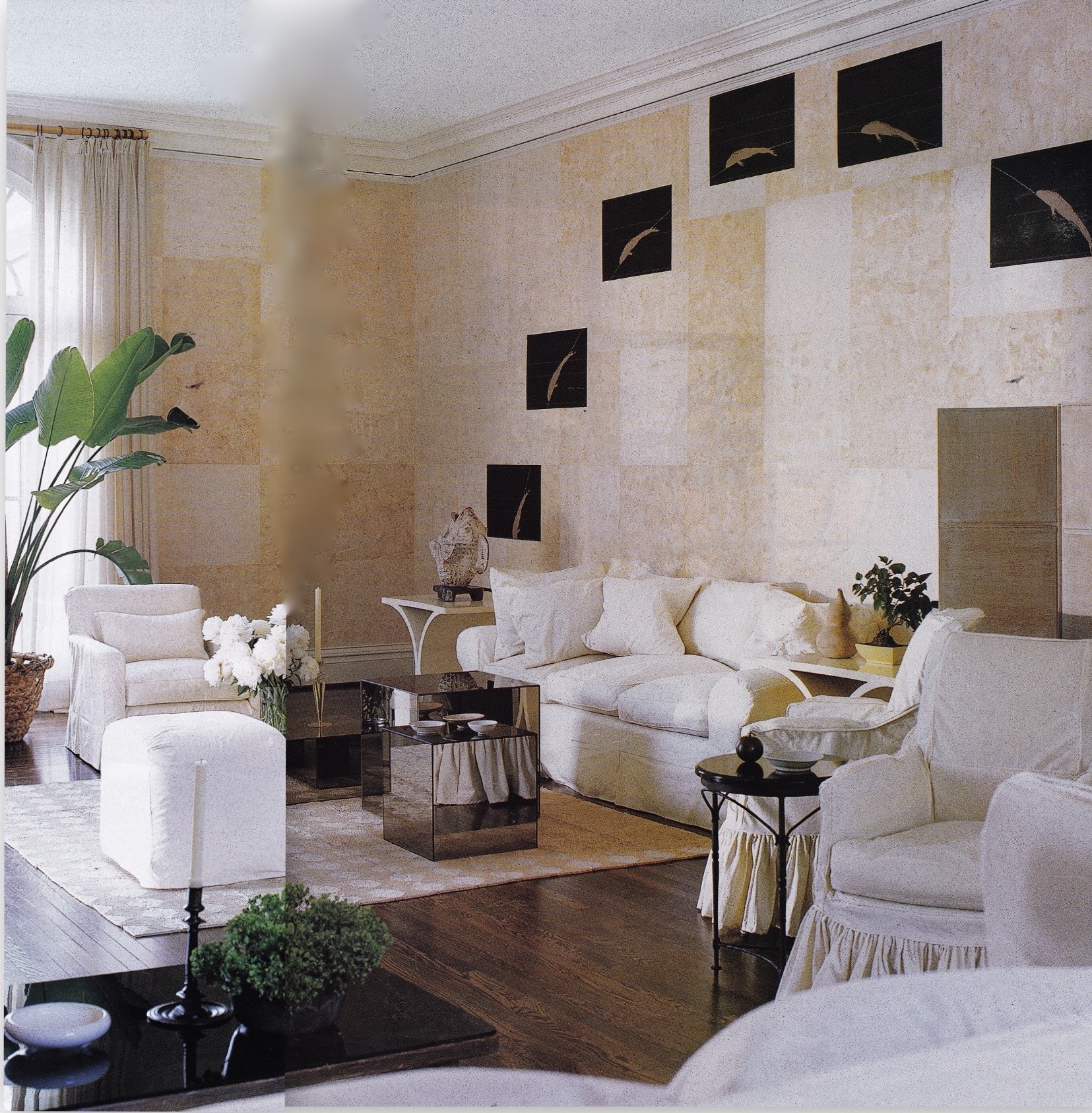
Though Cuban-born, Vicente Wolf has embraced American chic throughout his thirty-plus years as an interior designer. Here he brought classic contemporary flair to a Manhattan apartment with Old World architectural detailing. Photo by Michel Arnaud.

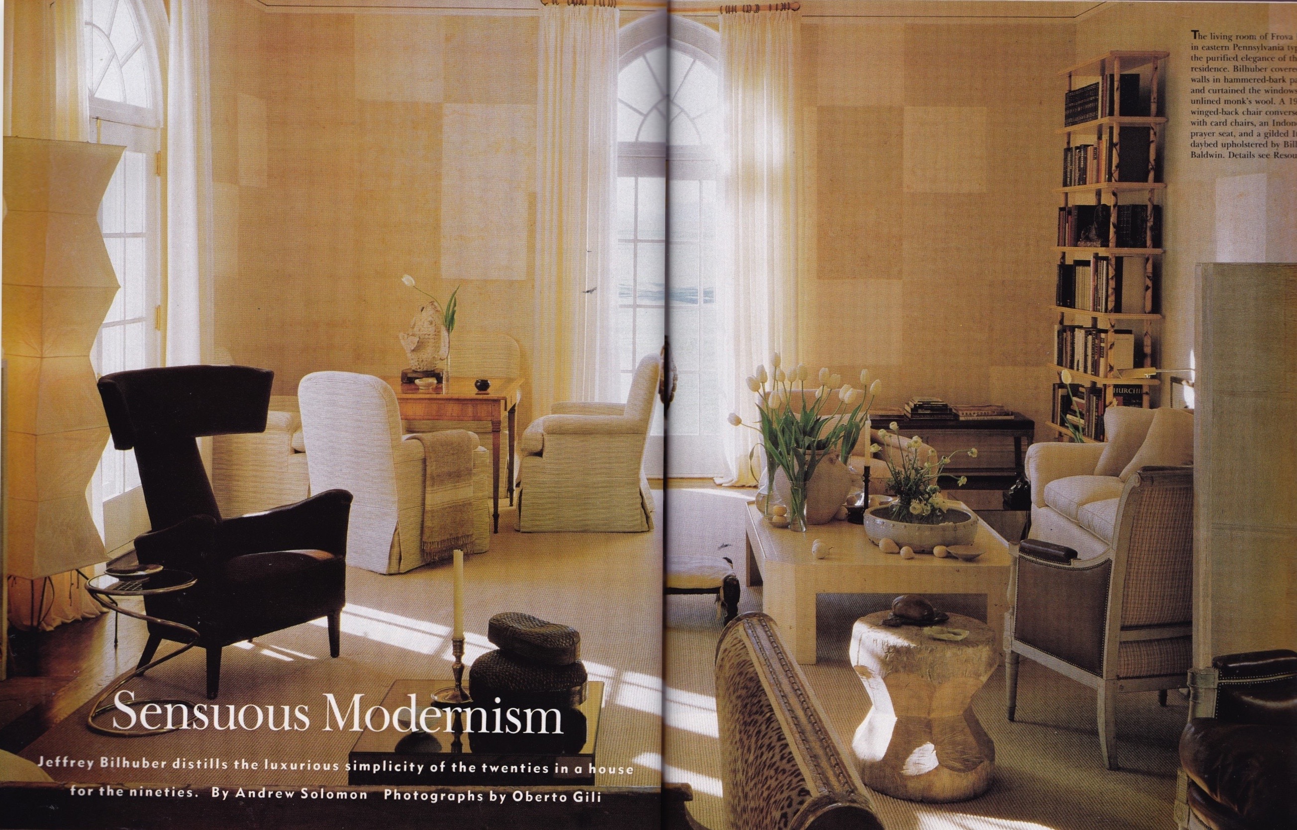
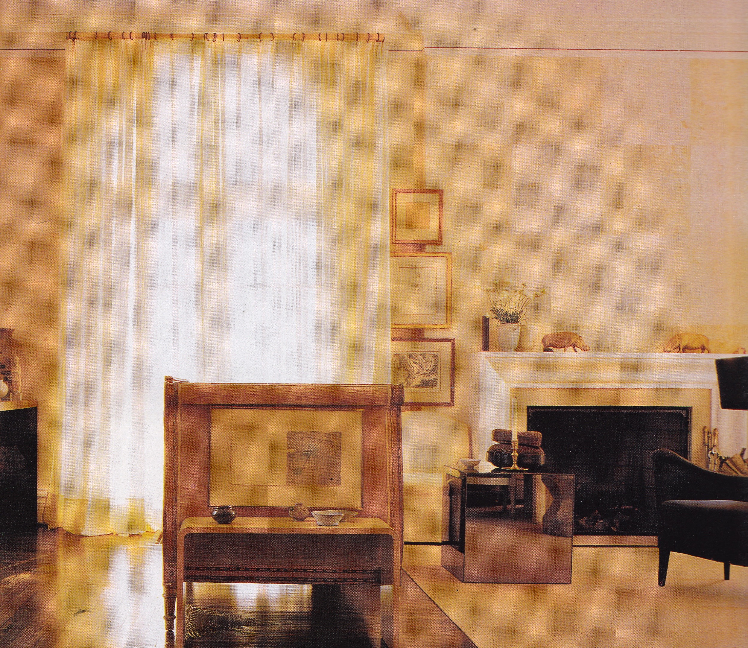
Featured in Jeffrey Bilhuber’s Design Basics, the designer’s early New York apartment was an homage to Billy Baldwin.
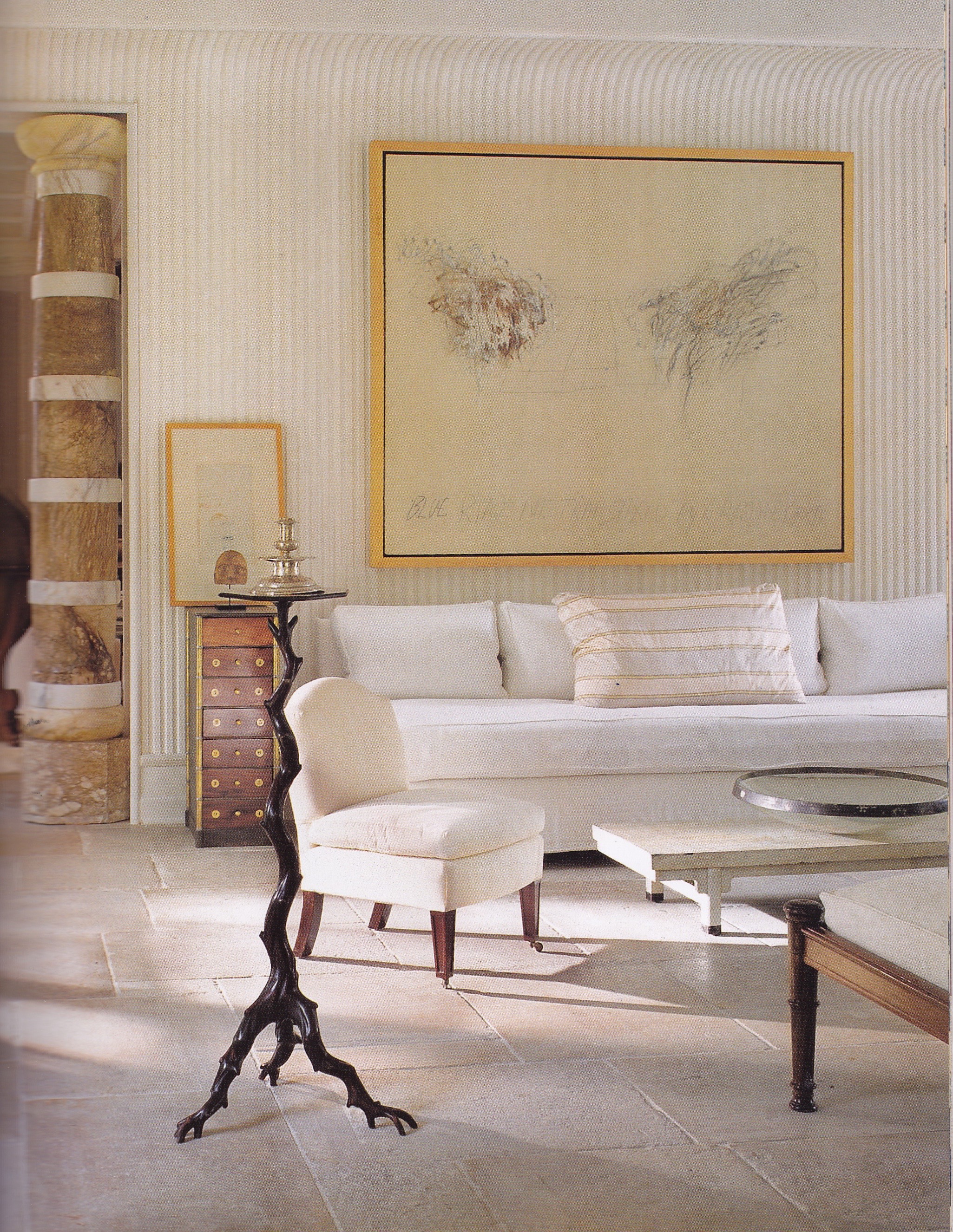
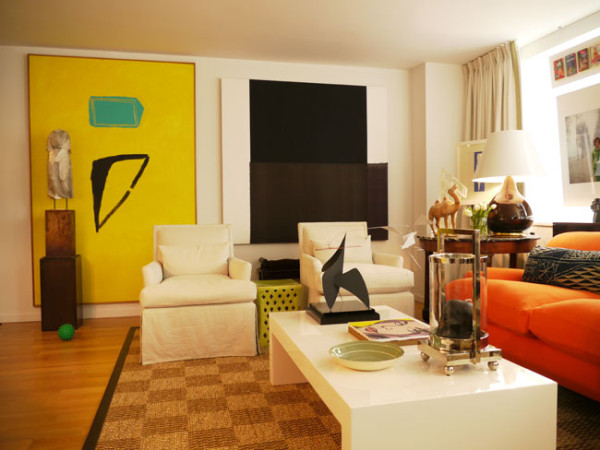
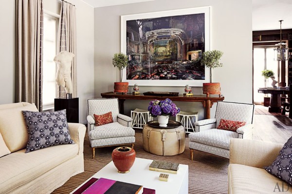
A neutral palette offsets modern art in a Manhattan apartment designed by Randall Ridless. Photo by Simon Upton.
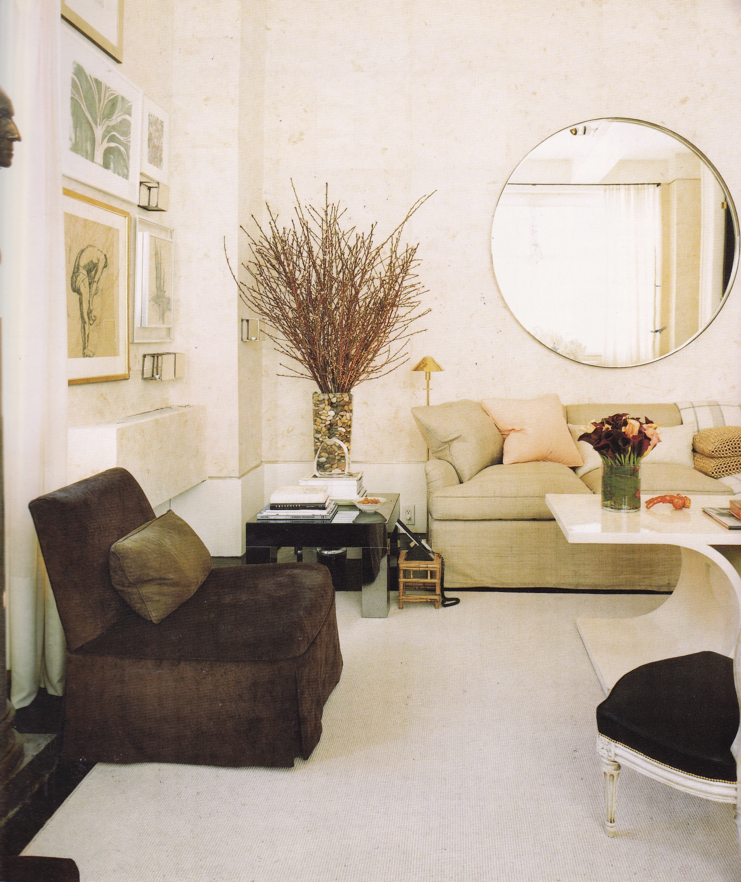
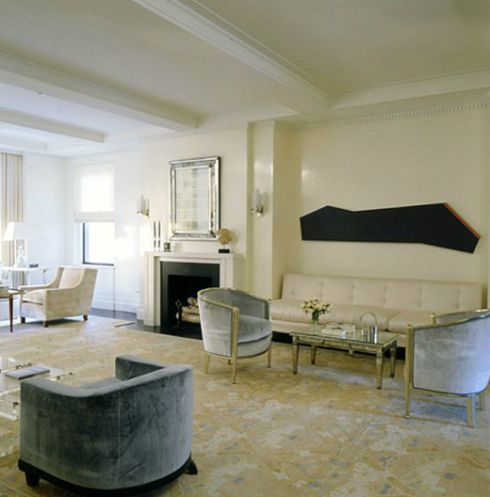
Crisp and classic contemporary furniture provides a foil for modern art in Eric Cohler’s New York apartment. Photo by Jeffrey Hirsch.

Classic elegance is updated in a New York apartment designed by Sills & Huniford in the 1990’s. Photo by Thibault Jeanson
Minimal elegance uniting classic and contemporary design in a Manhattan apartment designed by Timothy Haynes and Kevin Roberts. Photo by Simon Upton.
A decorator show house dining room designed by Haynes-Roberts is alluring in its classic-modern mix. Photo by Eric Bowman.
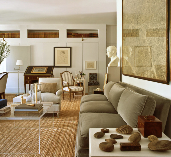
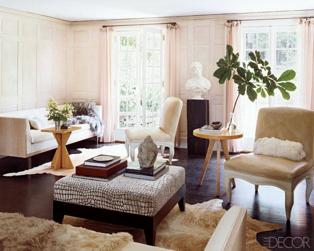
A classic, understated mix in the previous home of interior designer Bruce Budd brings to mind the homes of Bill Blass.
Thom Felicia’s New York loft apartment is crisp, classic. and youthful. Photo by William Waldron.
James Huniford’s New York apartment features a sculptural chair from the estate of Bill Blass. Photo by William Waldron.
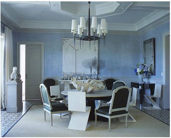
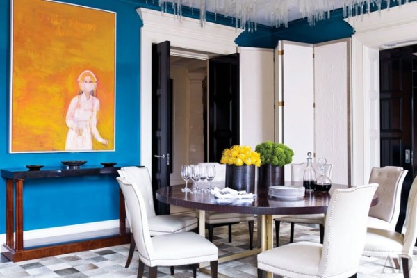
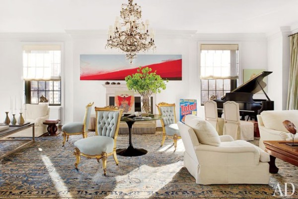
A fresh, dynamic color palette and modern art updates traditional decor in a dining room designed by Jeffrey Bilhuber. Photo by Trel Brock.
Man-about-town and interior designer James Andrew’s New York apartment pays homage to Elsie de Wolfe, Sister Parish and Billy Baldwin. Photo by Jeffrey Hirsch.

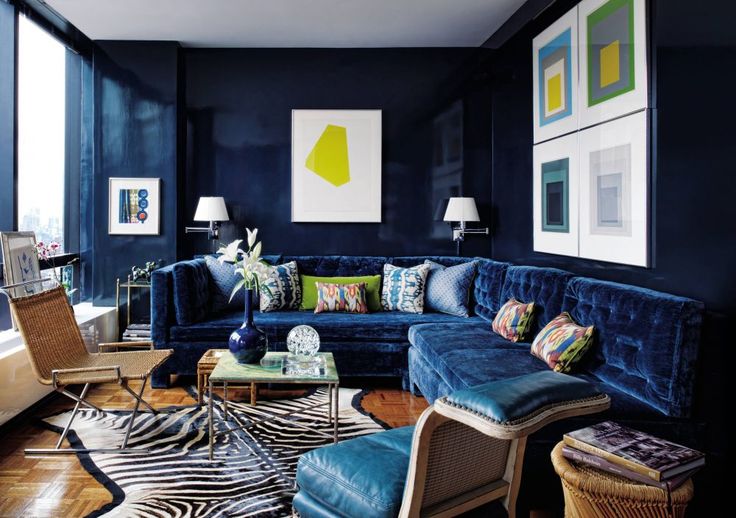
Todd Alexander Romano’s New York apartment channels the 1970’s with blue lacquered walls and a Ward Bennett wicker sled chair. Photo by Thomas Loof.
Crisp and classic, the Manhattan living room of Tory Burch, designed by Daniel Romauldez. Photo by François Halard.
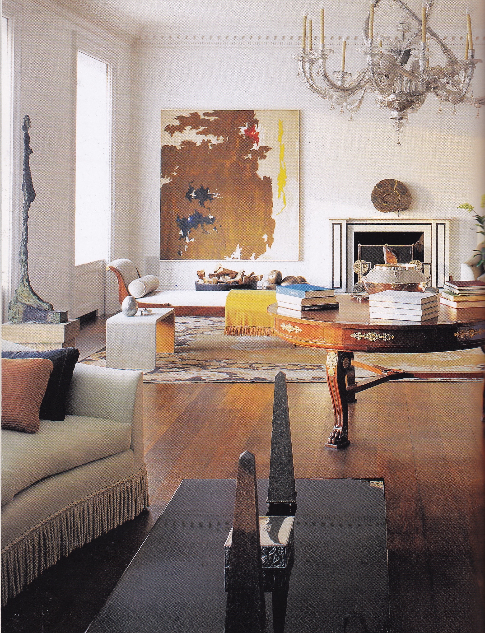
An elegant neutral scheme shot through with red informs updated classicism with a dose of glamour in a Manhattan living room designed by Brian McCarthy. Photo by William Waldron.
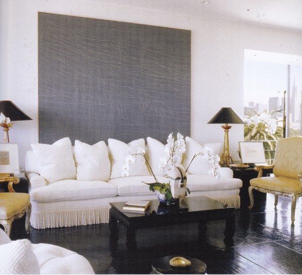
Luxurious, glamorous, classic and uniquely American. A Bel Air, California, living room by Brian McCarthy brings to mind the work of Kalef Alaton.
A soothing palette of cream and pale blue reinforces the classic calm of a 1920’s Manhattan apartment designed by David Kleinberg. Photo by Simon Upton.
Crisp and classic design by Parish Hadley alumni David Kleinberg. Photo by Eric Piasecki.
The living room of a Monaco townhouse designed by American designer Timothy Wheelon reintroduces small-rep patterns favored by American designers in the latter 1970’s. Photo by Simon Watson.

Linda Zelenko imparted the traditional interiors of her Connecticut country house with a modernist sensibility. Photo by Miguel Flores Vianna.
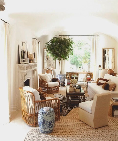
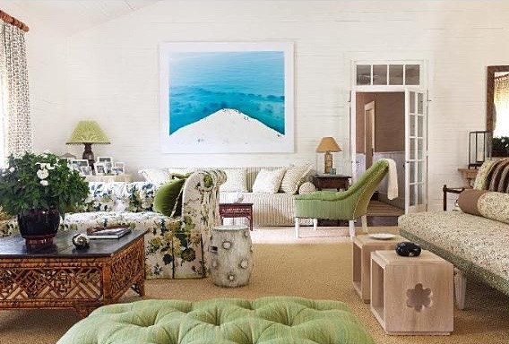
Easy-going California chic defines Mark D. Sikes Hollywood Hills home. Photo by Amy Neunsinger.
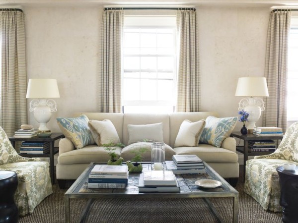
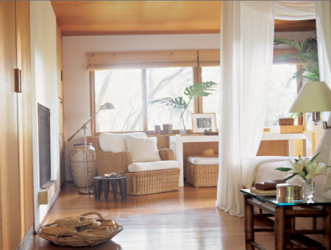
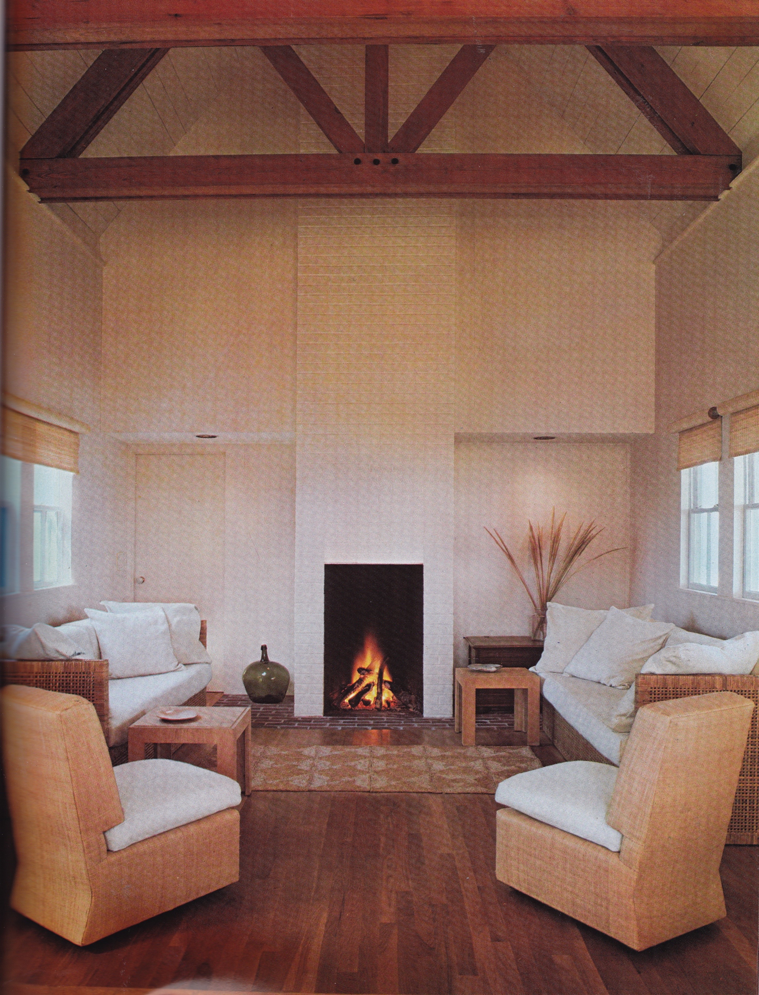
An informal airiness informs a living room designed by Tom Scheerer. Photo by Francesco Lagnese.

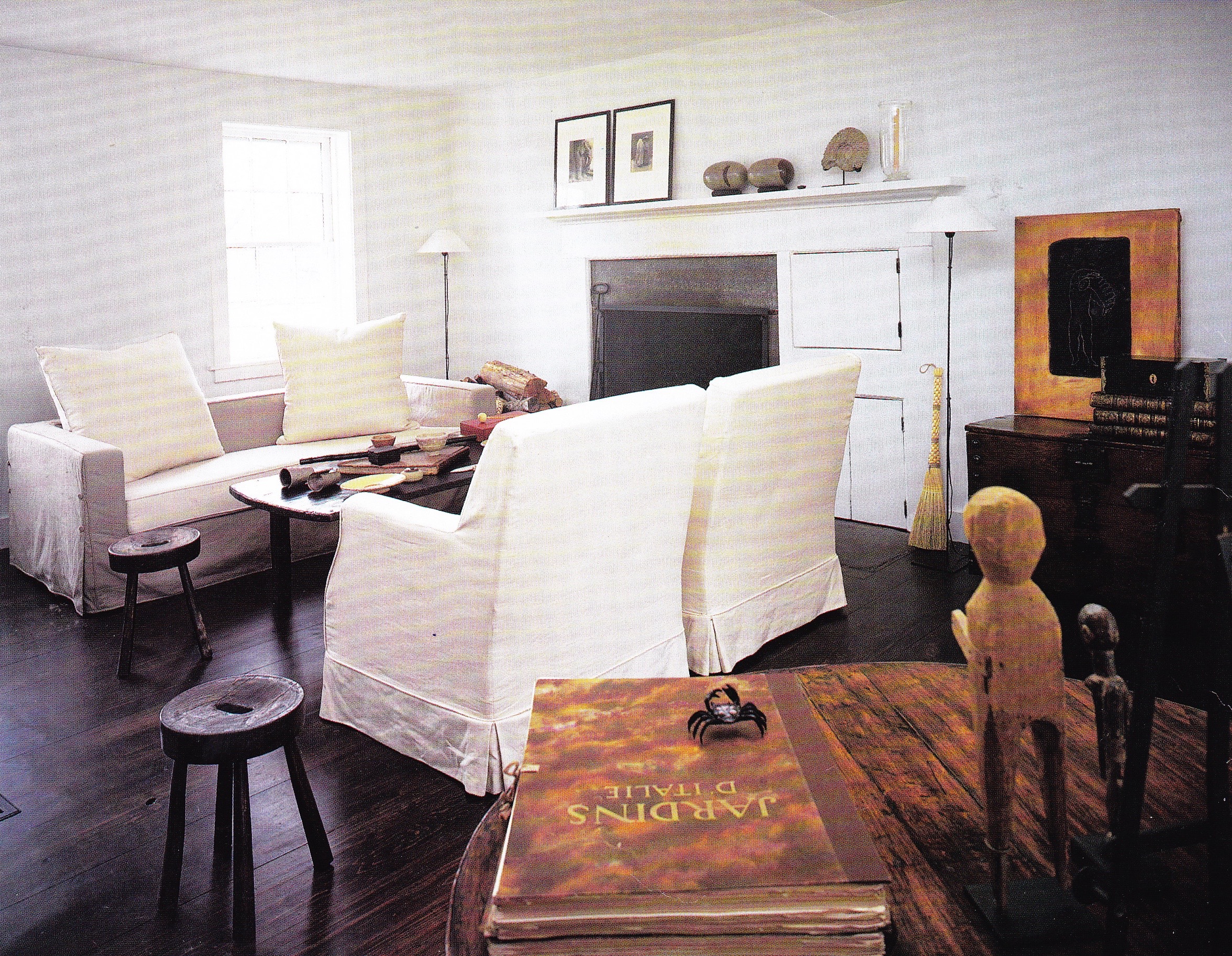
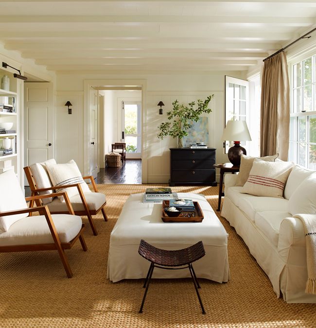
This crisp and classic living room designed for modern living by Markham Roberts brings to mind Kevin McNamara. Photo by Nelson Hancock.
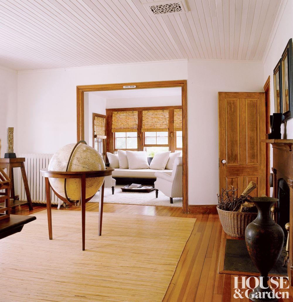
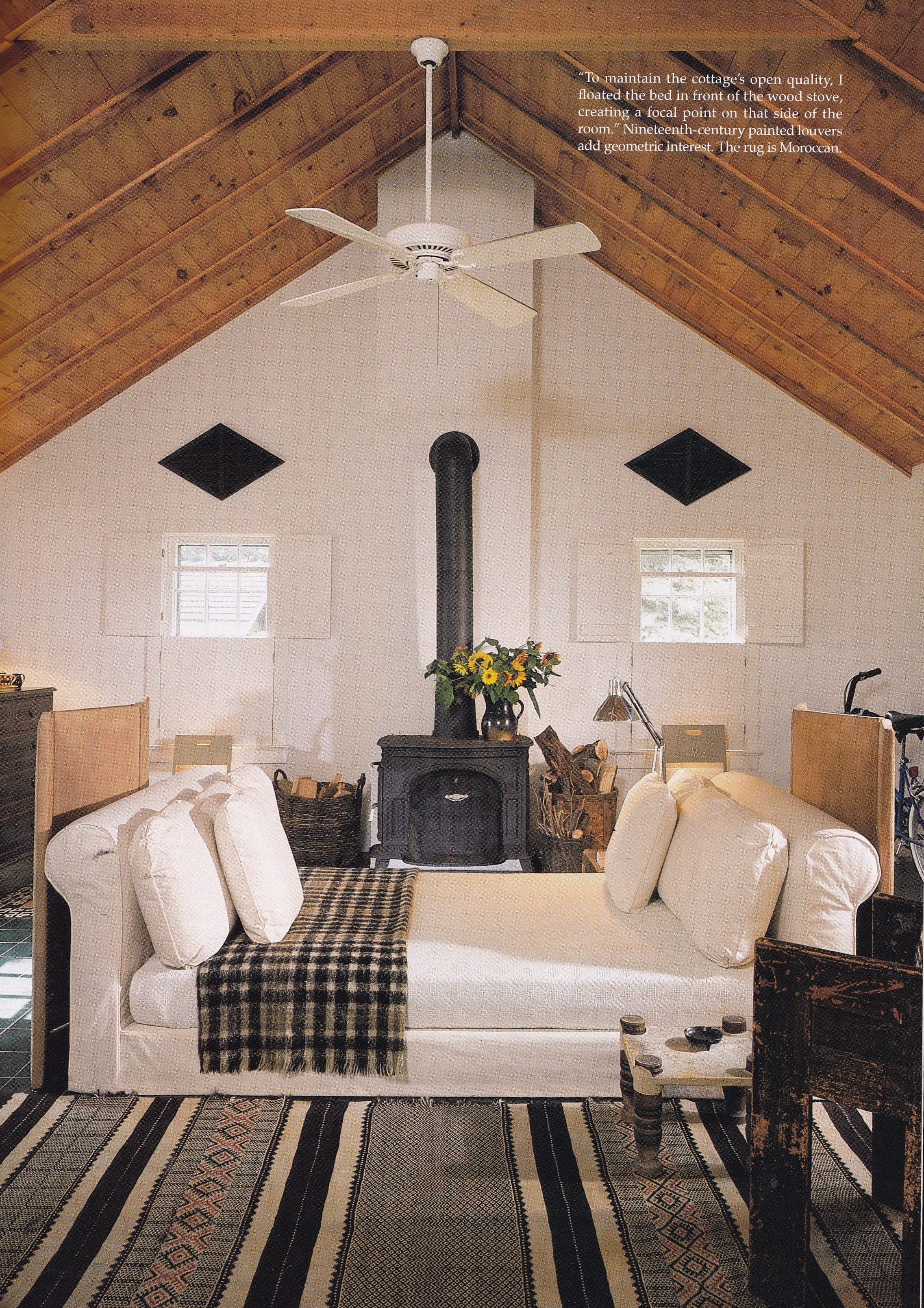
An all-American summerhouse designed my Markham-Roberts is crisp and casual. Photo by Massimo Vitali.
Today, Vincente Wolf continues to embrace understated elegance, mixing classic and contemporary design elements in high style. Photo by Pieter Estersohn.
Could it be we are entering a renaissance in American design? I ask this because the prior paragraphs were written a week ago, then shelved due to commitments. Enjoying a leisurely Saturday morning at home I was finally freed to read the August issue of Town & Country. And there, on page 102, is California-based interior designer David Netto sitting in an all-white living room next to a caption that reads “In designing a Park Avenue apartment for a Manhattan bred WASP and a west coast transplant, David Netto set out to find the new meaning of American Chic.” Is it possible that I have my finger of the pulse of the future of American interior design? Are we entering a new decorative zeitgeist? For a moment I felt as though I were channeling Faith Popcorn.
I nearly didn’t write this post having read Netto’s erudite and spot-on evaluation of the meaning of American Chic, and his quest to answer the question: “Where are today’s equivalents?” Introspection led the designer to assert that he would design an apartment that contained “young energy” unburdened by the ghosts of a preppy or patrician past. His sentences flow like water and contain a wealth of insight and learned consult gleaned from a life well lived on the East and West coasts. Such eloquence can be daunting, if not intimidating. “What can I add to this?”, I asked myself. But soon that, too, did pass, and I returned here to finish this post. To be honest, I feel I’ve discovered a kindred spirit in Mr. Netto, not only in reverence of style and taste but in sense of humor. This guy is very witty!
The New York apartment David Netto designed for a Manhattan-bred WASP and a west coast transplant. Photos by Jean-François Campos for the August issue of Town & Country, on sale now.
READING LIST
The Finest Rooms by America’s Great Decorators, 1964
The New York Times Book of Interior Design and Decoration by Norma Skurka, 1976
Architectural Digest American Interiors, 1978 Architectural Digest, June 1978
House & Garden, December 1989
Rooms With A View: Two Decades of Outstanding American Interior Design from the KIPS BAY DECORATOR SHOW HOUSES by Chris Casson Madden, 1992.
Parish Hadley: Sixty Years of American Design by Sister Parish, Albert Hadley and Christopher Petkanas, 1995
Van Day Truex: The Man Who Defined Twentieth-Century Taste and Style by Adam Lewis and Albert Hadley, 2001
Architectural Digest, January 2002
Dwellings: Living With Great Style by Stephen Sills and James Huniford, 2003
Jeffrey Bilhuber’s Design Basics by Jeffrey Bilhuber and Annette Tapert, 2003
Michael Taylor Interior Design by Stephen M. Salny, 2008
Defining Luxury: The Qualities of Life at Home by Jeffrey Bilhuber, 2008
Decorating the Way I See It by Markham Roberts and Nelson Hancock, 2014
Tom Scheerer Decorates by Mimi Read, 2015
Luminous Interiors: The Houses of Brian McCarthy, 2015
Town & Country, August 2015