Throwback Thursday: Geoffrey Bennison

Posted October 9, 2014. Filed in Classic Contemporary, Geoffrey Bennison

Geoffrey Bennison-London Flat-Interior Views:Design at its Best-Michael Boys

Sometimes I start things without giving them due attention. My Throwback Thursday series might just be one such example. Posting “vintage” – and I use the word loosely – interiors is hardly breaking my mold. I post about classic and timeless interiors from the past – traditional or modern, and everything in between – more than I do current projects. While there is much to admire in the world of interiors today the point is that these interiors are accessible, and many of them on-line. And, many an interior design hound, such as myself, is already blogging about them – rushing to be the first to hit the “Publish” button. To further my annoyance with myself, I’m actually becoming bored and irritated by TBT.  I’ve never been one much for trendy trends, only the established kind that evolve and morph over time. But, oh well, I’ll get over it! For now I’ll embrace Throwback Thursday until, one day, I decide to leave it where I should have when I thought it would be such a fun and clever spin on daily blogging: as just another one of my many daily musings.

Geoffrey Bennison-London Flat-Interior Views:Design at its Best-Michael Boys

Most of us are familiar with le style Bennison – rich, layered, and often times opulent interiors informed by warm color palettes and expert editing. Editing isn’t the first word many would come to associate with Bennison but, if you’ve read any of his interviews, he tormented himself over every item in a space he was creating – from each piece of furniture and light fixture to the paintings on the walls and objets d’art, which he painstakingly coerced into clever compositions. As luxurious as his rooms could appear, he knew when to stop. Controlled eclecticism is one description that is fitting. “I use a lot of object but — and I do compare this to minimalism — everything I put in a room is necessary. If you took one or two pieces out of any room I’ve done, the whole thing would fall apart” Bennison argued.

Geoffrey Bennison-London Flat-Interior Views:Design at its Best-Michael Boys

 Bennison’s ability to reign it in and compromise proved fruitful for a flat in London he fashioned for a publisher in the 1970’s. More contemporary in style than we would associate with his body of work he, like many designers from the 1970’s, worked in the style of his time. Just look at Mark Hampton’s early projects. His association with David Hicks produced crisp yet classic rooms with punches of color and graphic appeal. So it goes with Bennison, when early in his career he opened a shop selling singular objects that led to commissions to fill entire rooms. For his London client comfort and a feeling of spaciousness  for entertaining were his key objectives.  The first room you enter is the red drawing room – fashioned from four smaller rooms – which has a rich sedateness about it. The only pattern in the room comes from the carpet and art hanging on the walls. It feels almost like a room in a palazzo that has been modernized, with its Pompiein red walls, simply upholstered furniture, gleaming modern cocktail table and classical art hung salon style.

Geoffrey Bennison-London Flat-Interior Views:Design at its Best-Michael Boys

The dining room opens, via mirrored doors, into another area of the cavernous drawing room. Along one wall is a 17th-century tapestry from Brussels. Surrounding the draped dining table are 18th-century Irish giltwood chairs. Mirrored doors were installed to give depth to the room.

Geoffrey Bennison-London Flat-Interior Views:Design at its Best-Michael Boys

Bennison had the atmospheric library walls painted glossy-black and lined with bronze-edged bookshelves in the style of Billy Baldwin. The desk at the window is English Regency inlaid with brass. Above the fireplace mantel is a Francis Bacon painting of Pope Innocent X.

Geoffrey Bennison-London Flat-Interior Views:Design at its Best-Michael Boys

The walls of the nocturnal master bedroom were covered with a flocked wallpaper made from a 17th-century design to Bennison’s color specifications. The snowflake-patterned brown-and-beige carpet is continued in the adjoining library.

From Interior Views: Design at Its Best by Erica Brown, published 1980. Photography by Michael Boys.

Permalink         Comments (2)        

Sir John Richardson’s Palladian-Style Villa in Connecticut

Sir John Richardson-Palladian Villa-CT-HG 1987-Oberto Gili

Two Dutch landscapes attributed to Van Styr light up the dark green flocked walls of the oval living room. A Directoire billiards-table lamp hangs over the table and a pair of large 18th-century English brass urns stand in front of the Regency gilt sofa.

Not long after Sir John Richardson, the inveterate collector and foremost Picasso biographer, opened the doors of his Manhattan brownstone apartment to House & Garden in 1985 he invited them back to see his Palladian-style country house in Connecticut, which was photographed by the great Oberto Gili for the November issue of that year. By now you have probably seen photos circulating on Pinterest of the Greek Revival-style “library”, as he refers to it, that he constructed in the early 1990’s on the same property – which has recently been covered by several design bloggers. You can see photos of it at Cote de Texas and T Magazine.

Sir John Richardson-Palladian Villa-CT-HG 1987-Oberto Gili

In the entrance hall a Russian chandelier hangs above the Regency marble bust, and Anglo-Indian portraits frame the door painted by former owner Robert Moore.

I had almost forgotten that the main residence had been photographed all those years ago, as I have never seen signs of it circulating on the Internet. I had always assumed the later structure, the Greek Revival-style library, was a guest house and that the Palladian-style villa was the main house. But Richardson maintains that the feature of today’s post is the guest house, and the Greek-Revival structure is the library, where he resides today. My guess, however, is that, back in 1987, when he was about sixty-three years old, he likely resided in the Palladian-style villa, his main residence, before erecting the library as an architectural folly to retreat to and ultimately retire to.

Sir John Richardson-Palladian Villa-CT-HG 1987-Oberto Gili

A set of 18th-century mezzotints by Thomas Frye in their original frames are on either side of the living room doorway, which looks though to the dining room. A mid-18th-century Irish portrait is over the door, and a swordfish tail and collection of blue john and jasper eggs are on the left.

While touring the area in the 1980’s Richardson and his real-estate agent came upon a house that immediately grabbed his attention, a house he thought he recognized. It was a facsimile of a boathouse built in 1803 by Robert Mylne in the park of Syon House. He knew this to be true because its owners, the Northcumberland’s, had leased it to their aunt, a great friend of his, Diana Daly. His hunch was confirmed by the owners who built it, the designer Robert Moore and actor William van Sleet. As the story goes, Moore and van Sleet toured Syon House on a vacation and decided to snoop further, on their own, and discovered the boathouse. They agreed it was the perfect Neoclassical model on which to base the design of their new house and proceeded to ring the door bell. Diana Daly answered, gave them a tour around … and the rest is history. The duo set about building a pared-down version of the boathouse in Connecticut.

Sir John Richardson-Palladian Villa-CT-HG 1987-Oberto Gili

An architects table displays a group of drawings in front of the dining room window.

Enter Sir John Richardson: “I must confess that when I bought it, it did look a bit mausoleum-like. At least so my arbiter elegantaie, Mrs. Paley, told me when I have her a tour. ‘Cut down those common hemlocks, have a pool made of slate so that it blends with the lawn, and exorcise the mausoleum look with some pretty creeper.’ The first decree would have opened the house up to the road; the second would have bankrupted me; the third, however, was easy enough to arrange, thanks to various hydrangeas, striped awnings, large pots of agapanthus, and later the addition of a small pillared orangery.”

Sir John Richardson-Palladian Villa-CT-HG 1987-Oberto Gili

A portrait by Reynolds of Frederick, Prince of Wales (top photo), hangs over the fireplace in the living room. Alfie, his parrot, perched on the medallion of Caligula alongside a collection of blue-and-white hat stands. Below, on the dining room sideboard a pair of Sheffield plate shields by Elkington depicting scenes from Paradise Lost set off a multicolored marble bust after the antique. The late 18th-century sconce is Dutch.

To his new rooms Richardson enhanced the already fine architectural detailing by adding acanthus leaves, one by one, to the heavy cornices, which grainer Malcomb Robson went over in faux bois, imitating maple wood and mahogany to accentuate its design. For furniture Richardson shipped over the inventory from his just sold Albany residence in London, much of it in the worn and cozy vernacular of English country house style, a look Richardson felt would give these somewhat new rooms the advantage of appearing older than they were.

Sir John Richardson-Palladian Villa-CT-HG 1987-Oberto Gili

A club fender supported on stag hooves surrounds the fireplace in the master bedroom. A corner of the Directoire lit bateau is just visible on the left. The portrait of a woman is by Paul Jean Gervais, 1884.

In the same spirit of his New York apartment (John Richardson: New York, 1985), and for his love of dark and cozy spaces, Richardson covered over the bright yellow painted walls of the oval living room with dark green flocked wallpaper from Cole’s of London. To that he added rose-covered chintz from Colefax & Fowler to a sofa and hung pictures stacked one over the other, flanking two monumental Dutch landscapes. Every available surface is chockablock with piles of books, magazine, potted plants, vases filled with blooms and his endless collections. This room, with its dark walls, chintz sofa and dramatic appeal reminds me very much of Cecil Beaton’s salon at Reddish House.

Sir John Richardson-Palladian Villa-CT-HG 1987-Oberto Gili

Thoughtfully sited a good distance off the road on a sloped hill the property enjoys privacy and pleasing views, replete with formal gardens created as an enfilade of rooms terminating with a statue of Diana set within dramatic ellipses of Japanese yews.

This concludes our tour of Sir John Richardson’s homes in New York and Connecticut, circa 1985. To see recent incarnations of this home and his guest house – or “library”, as well as his present day New York apartment and London flat – click on the links provided at the beginning of this post.

Photography by Oberto Gili for the November, 1987, issue of House & Garden.

Permalink         Comments (1)        

John Richardson: New York, 1985

Posted October 7, 2014. Filed in English Style Eclecticism, John Richardson, The Collectors

John Richardson-New York Brownstone-The Englishman's Room-Derry Moore

John Richardson sitting on the fireplace club fender in the living room of his New York brownstone apartment as photographed by Derry Moore in 1986.

Much has been written lately about Sir John Richardson, the nonagenarian British art historian and foremost Picasso biographer. The New York Times blog, T Magazine, recently interviewed him at his Connecticut country house, and fellow decor hounds such as myself have posted photos of that residence’s guest house, featured in House & Garden in the 1990’s. Most recently interior designer and blogger Mark D. Sikes shared photos of Richardson’s New York apartment featured in a 1999 issue of Vanity Fair. I have included links to these articles at the bottom of this post.

John Richardson-New York Apartment-HG March 1985-Oberto Gili

Nineteenth-century Aubusson tapestries made for an English family frame the door leading from the living room into the front hall. A needlepoint coat of arms of Queen Anne hangs in center. A Baroque 17th-century Florentine bust sits left of a marble model of the Temple of Castor and Pollux. Against the yellow faux-marbre walls of the hall painted by English wood-grainer Malcolm Robson is one of a pair of 18th-century lead urns. Photo by Oberto Gili.

As you know, if you follow my blog, I have hundreds of shelter magazines that date back to the 1970’s, and a few even beyond. When I saw Mark’s post on Richardson’s New York apartment it rang familiar; I knew I had seen these rooms, or some version of them, before. So I consulted my library catalog (yes, I have created a system to locate articles and features by designer, style or some such other category) to see what I could find. And there they were, four entries for John Richardson: one for his Connecticut guest house blogged about numerous times recently, an earlier House & Garden from 1987 featuring his Palladian-style Connecticut home, and two entries for his New York residence – the one he inhabited before moving sometime in the 1990’s to a more spacious loft apartment, as photographed for Vanity Fair.

John Richardson-New York Apartment-HG March 1985-Oberto Gili

In the living room next to a cinnabar lacquer vase on the table in the foreground is a painting of green foliage by Simon Bussy. On the table in front of 18th-century blue brocade curtains made for an English country house is a collection of antique sculpture and bronzes, among them the large 1st-century bust of a man from Asia Minor. On the right a mirror contrived of carving after Grinling Gibbons hangs behind two Tibetan copper-and-brass horns and 19th-century Chinese vases. Photo by Oberto Gili

Richardson opened the doors of his lower-level brownstone apartment on East 75th Street in New York to photographer Oberto Gili in 1985 for publication in House & Garden magazine and to photographer Derry Moore at about the same time, before it appeared in The Englishman’s Room published in 1986. Sir Richardson wrote the features for both publications; in fact, his story for The Englishman’s Room was taken straight from the House and Garden feature.

John Richardson-New York Brownstone-The Englishman's Room-Derry Moore

The heraldic tapestry emblazoned with the red hand of Ulster is guarded by a savage cheetah. Photo by Derry Moore.

The brownstone Richardson settled on, which he described as seedy, had to be furnished on a shoestring budget – which he had no idea of how to go about doing. He did know that he didn’t want a churned out facsimile of yet another Colefax & Fowler style interior – what he refers to as his reaction against “Fowlerism”. “I was sick of the way house after house in England was falling victim to fashionable gentility. Austerely masculine rooms were being cosied up and prettified — too often emasculated in the process” wrote Richardson for The Englishman’s Room. To his further dismay he discovered, upon landing in New York, that this very same style was becoming embraced by American interior designers — a look Richardson describes as “a spurious English look — syntheticized beyond recognition.”

John Richardson-New York Apartment-HG March 1985-Oberto Gili

John Richardson and his dog Rosie in front of drawings by Simon Bussy, Hans Bellmer, and Drian, among others. Photo by Oberto Gili.

Instead, Richardson left the decoration of his new home in New York in part to chance, beginning with a “wrecking party” that included several benevolent artists and craftsman, as well as a few synchronistic discoveries of his own volition. Soon his home filled up with cast-off treasures he discovered combing the streets of the Upper East Side and art given to him by Braque and Picasso, whom he knew when he lived in France in the 50’s, as well as art by Warhol, Frank Stella and Robert Rauschenberg. Ellsworth Kelly even frescoed the dining room with monumental still lifes that eventually faded (they were executed in Worcester sauce, ketchup mustard and Tabasco). And it didn’t hurt that he landed a job running the U.S. branch of Christies, affording him access to many more treasures, some at bargain prices.

John Richardson-New York Apartment-HG March 1985-Oberto Gili

On the mahogany colored flocked wallcovering in the living room a collection of drawings and prints by Picasso, Braque, Juan Gris, Nadia Legér, and Mucha are to the left of the fireplace. Photo by Oberto Gili.

John Richardson-New York Apartment-HG March 1985-Oberto Gili

The dining table is surrounded by architectural drawings and a photograph of Queen Alexandra can be seen at the foot of the Empire bed. Photo by Oberto Gili.

John Richardson-New York Apartment-HG March 1985-Oberto Gili

An 18th-century Sicilian sofa of verre églomisé faces the dining room table and, behind, a pair of 1st-century Roman busts of members of the Imperial family frame the French doors leading to a garden. On the right is a Second Empire painted screen in the style of Bérain.

As Richardson’s collections expanded he fashioned for himself something of an aesthetes lair,  insulated from the cacophony of city life outside his windows. Dark and cozy spaces with walls covered in mahogany-colored velvet overlaid with decadently draped windows set the stage for sumptuous seating and layer after layer of collections grouped along every inch of the the walls and tabletops, producing an opulent scene out of Mario Praz’s Romantic Agony. Though heavy and dark by today’s standards he succeeded in synthesizing disparate elements into one cohesive whole through color, pattern and classically-informed arrangements.

John Richardson-New York Apartment-HG March 1985-Oberto Gili

John Richardson-New York Apartment-HG March 1985-Oberto Gili

A Frank Stella hangs over a 19th-century silver-plated console made for the Indian market Photography by Oberto Gili.

The resulting heterogeneous mix of disparate styles, periods and provenance produced a rather fetching conclusion in Richardson’s hands. With a taste for cozy bohemianism, his style is akin to the late Mark Birley, proprietor of Annabel’s in London, who contributed in making the masculine and clubbish English room very chic and in demand. His personal style, while eclectic in the best sense, is informed by the classical traditions of scale and proportion, accentuated by an eye for layering and building up of a decorative dialogue through his collections. Opulent, and perhaps overwrought, by today’s standards Richardson’s home remains a testament to the eye of an aesthete who has brought his own brand of British tradition to New York City.

From what I can tell, Richardson’s Palladian-style villa in Connecticut as it appeared in House & Garden in 1987 has not been blogged about. Stay tuned for the final installment on the homes of Sir John Richardson in my next post!

For more on Richardson’s New York apartment refer to the March, 1985, issue of House & Garden, and The Englishman’s Room edited by Alvilde Lees-Milne, published in 1986.

To see photos of Richardson’s Connecticut home visit Cote de Texas’ post here and T Magazine here. To see Richardson’s current New York apartment visit Mark D. Sikes here.

Permalink         Comments (3)        

Throwback Thursday: Anthony Hail

Posted October 2, 2014. Filed in Anthony Hail, Classic Elegance, Understated Luxury

Anthony Hail-SF apt-AD May/June 1972-


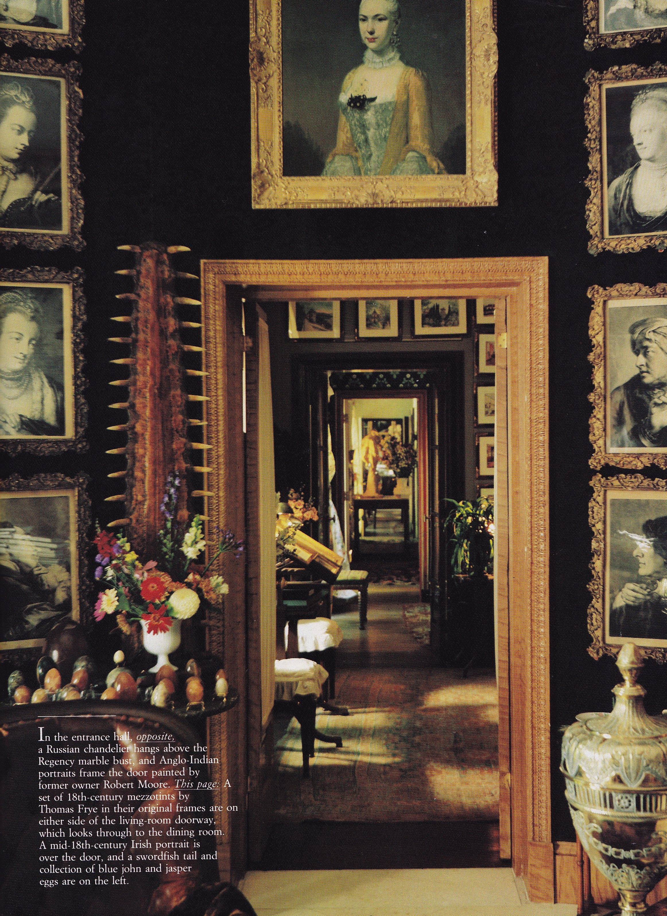
In today’s Throwback Thursday post we visit, or revisit as your own personal experience may indicate, the one time Nob Hill home of Anthony Hail in San Francisco. It was featured in the May/June issue of Architectural Digest presented in interview format. In past posts I haven’t borrowed directly from a feature’s copy but I thought, in this case, it would be interesting for you to experience much of the interview as it appeared all those years ago. Though I won’t include every word the essence of Hail’s personal design philosophy and opinions will shine through and make for an interesting up close and personal experience with one of America’s preeminent but surprisingly seldom written about interior designers of the 20th-century.


Anthony Hail-SF apt-AD May/June 1972-

TONY HAIL TALKS ABOUT HIS OWN APARTMENT

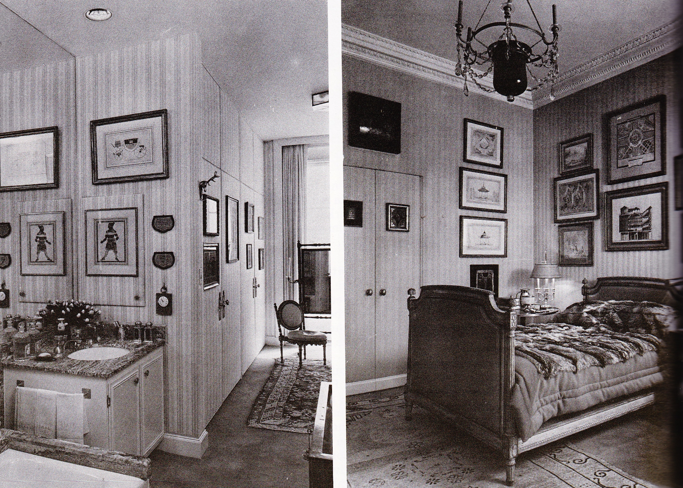
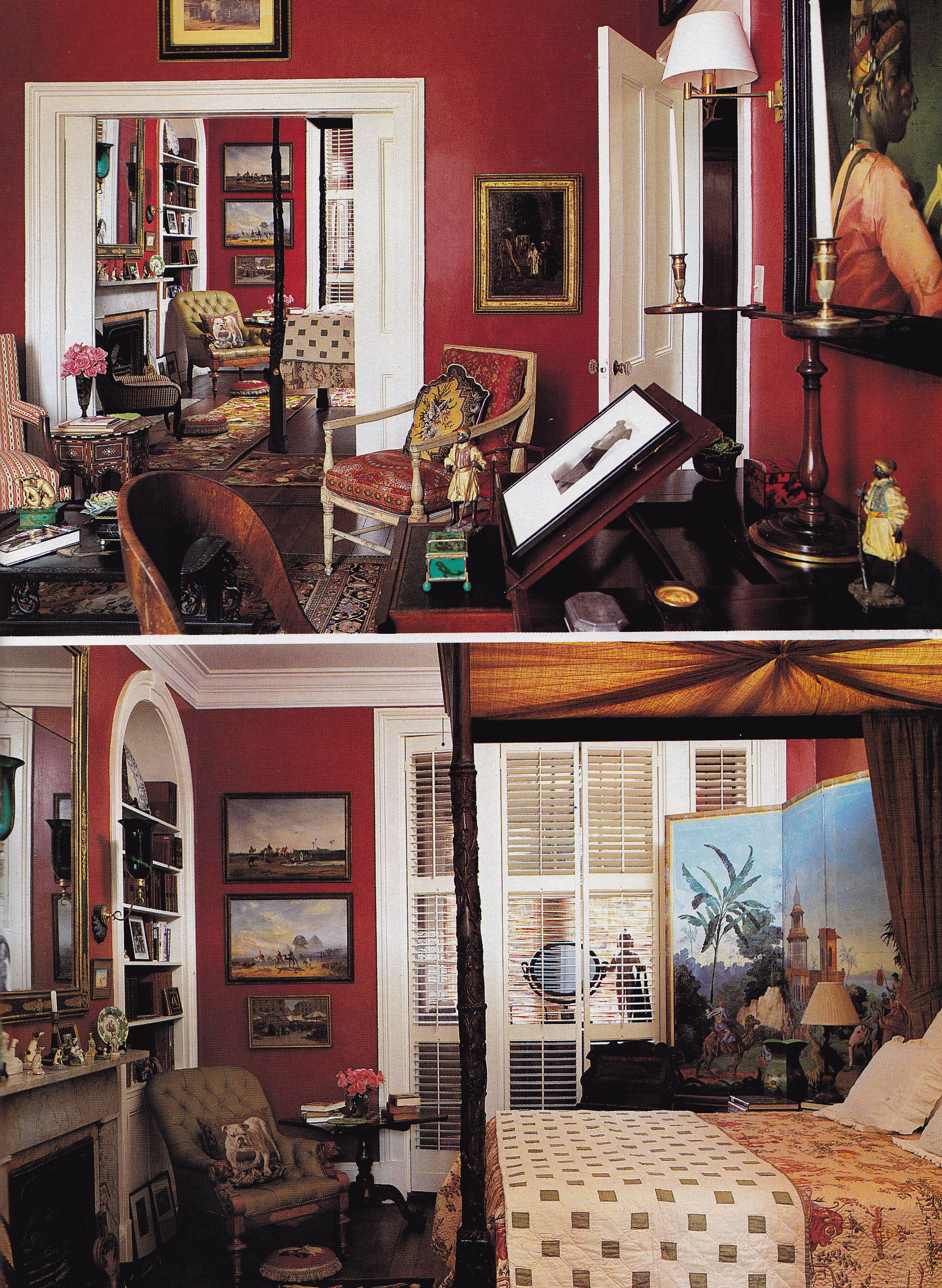
“I didn’t want to do a re-creation of an eighteenth-century apartment. After all, I live in a very cosmopolitan city, San Francisco. The building, by the way, is next to the Huntington Hotel on Nob Hill. When it was built, in the twenties, it was decorated by Elsie de Wolfe.”

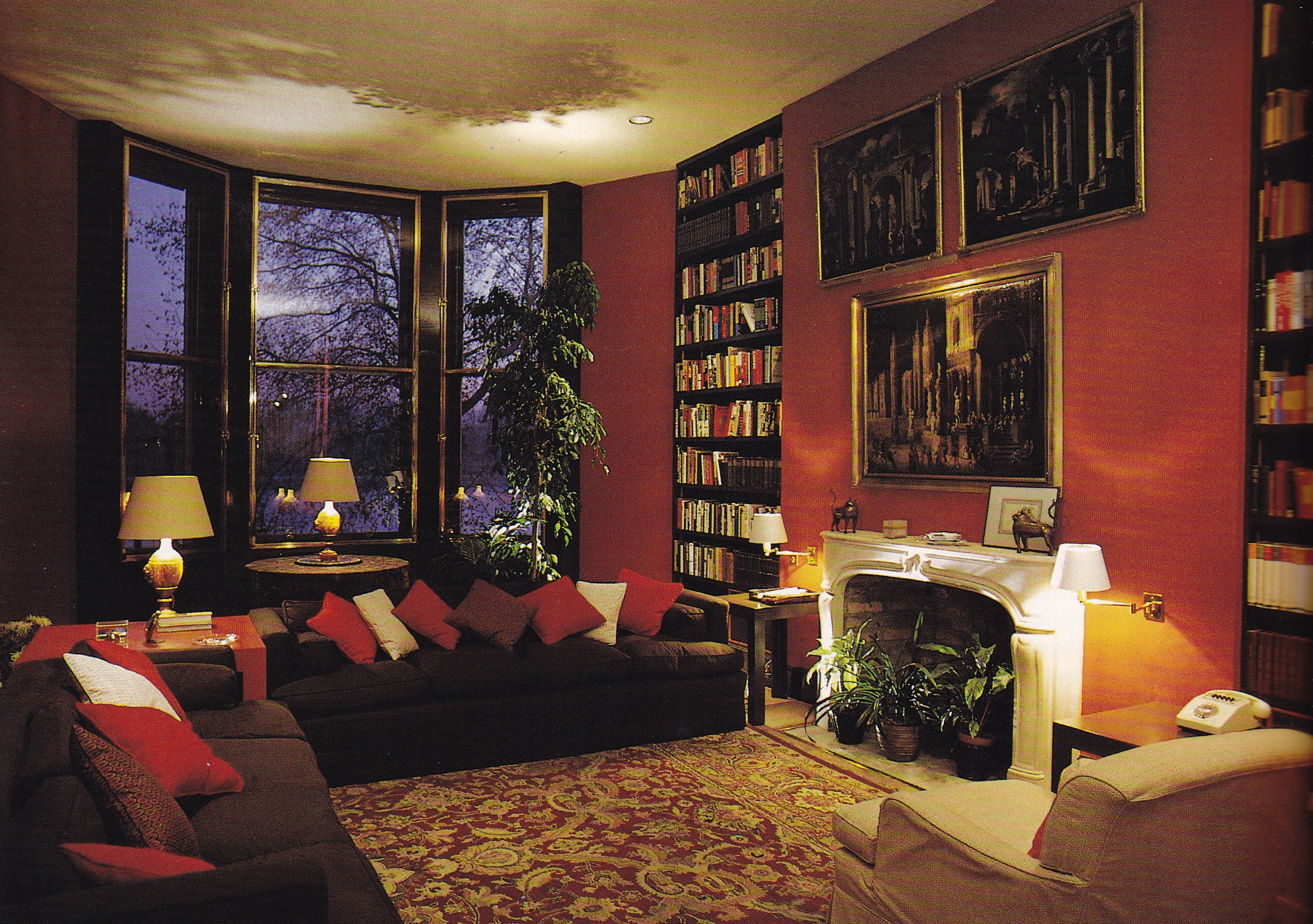
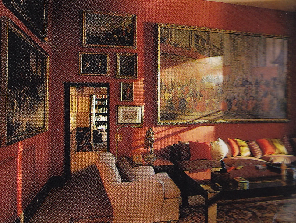
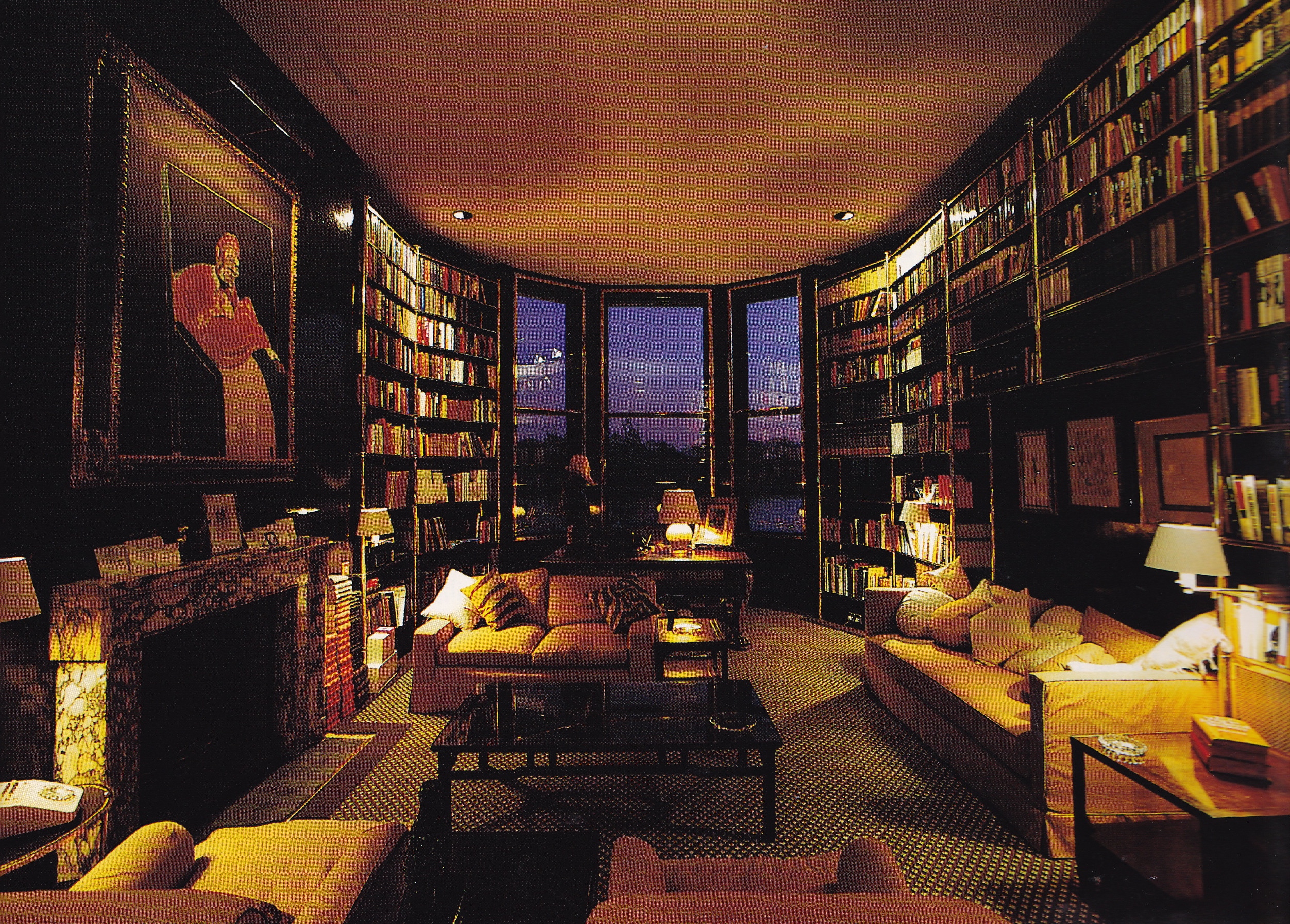
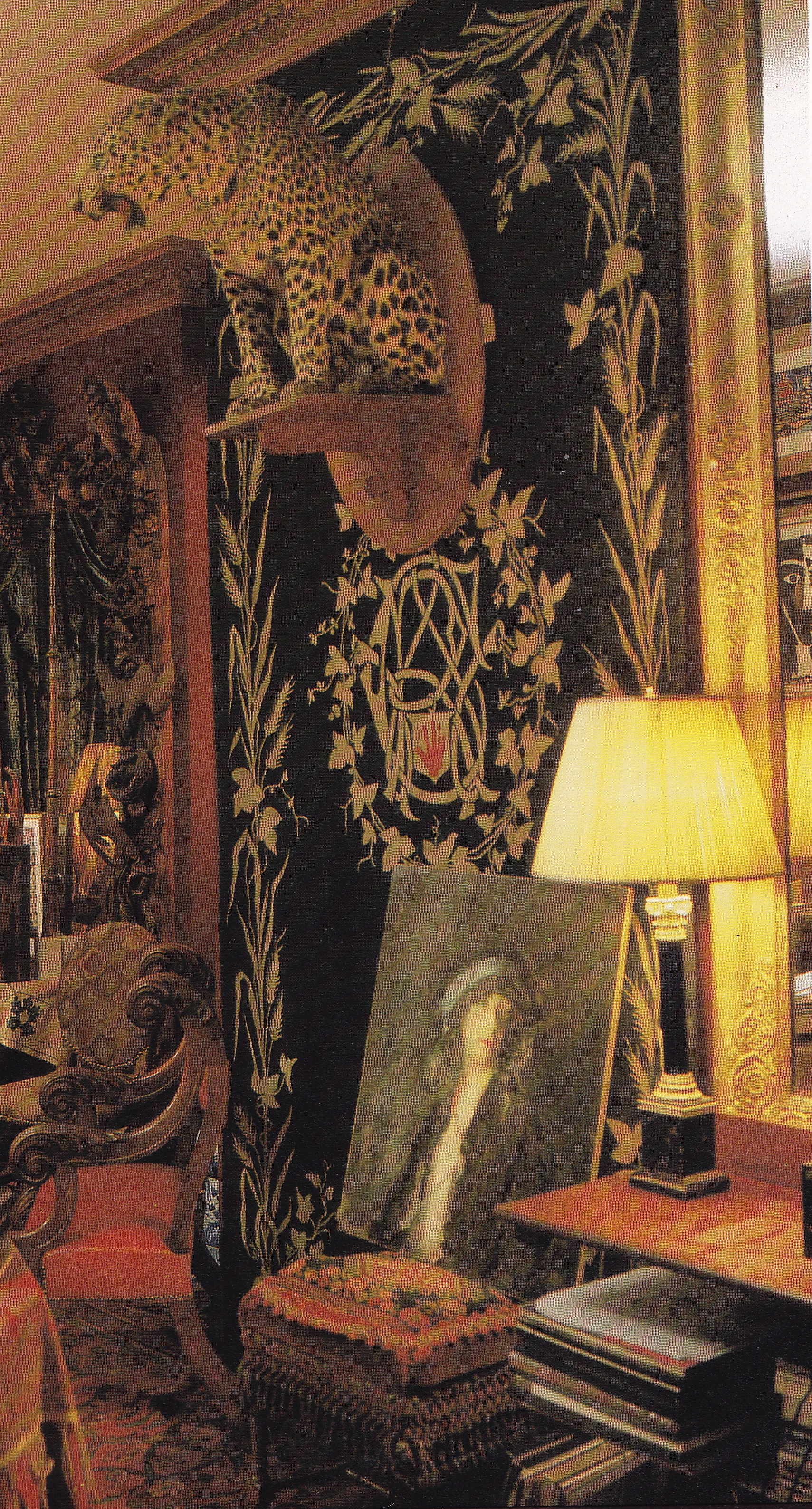
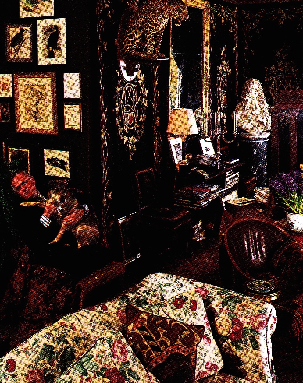
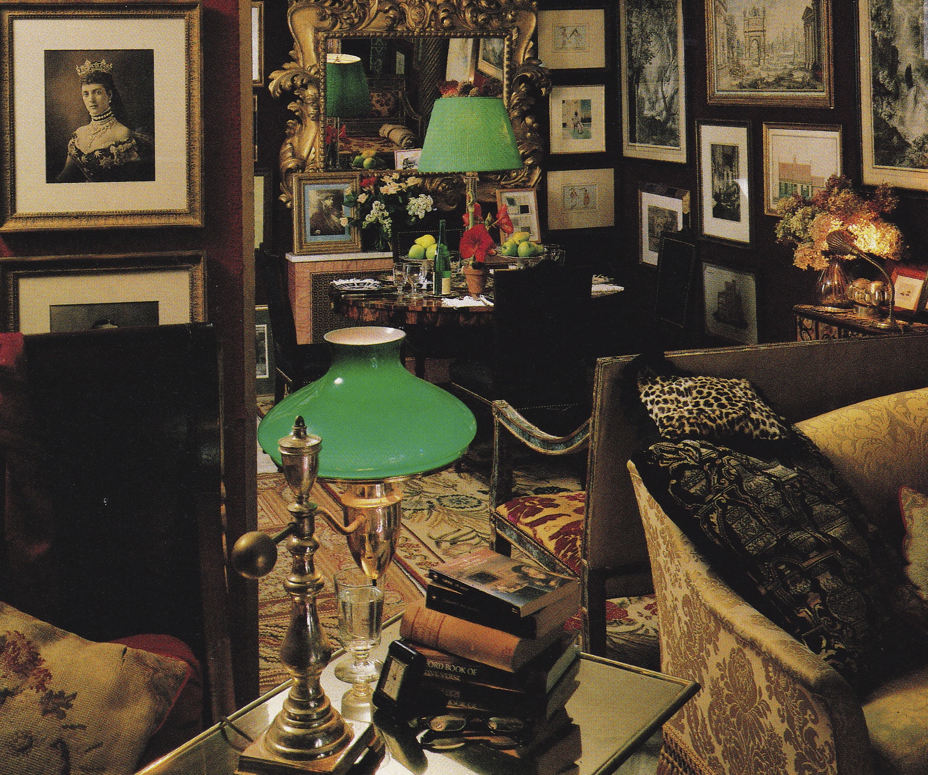
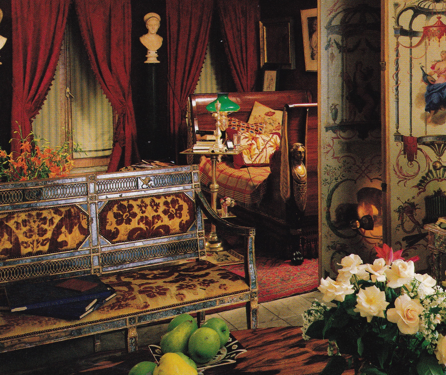
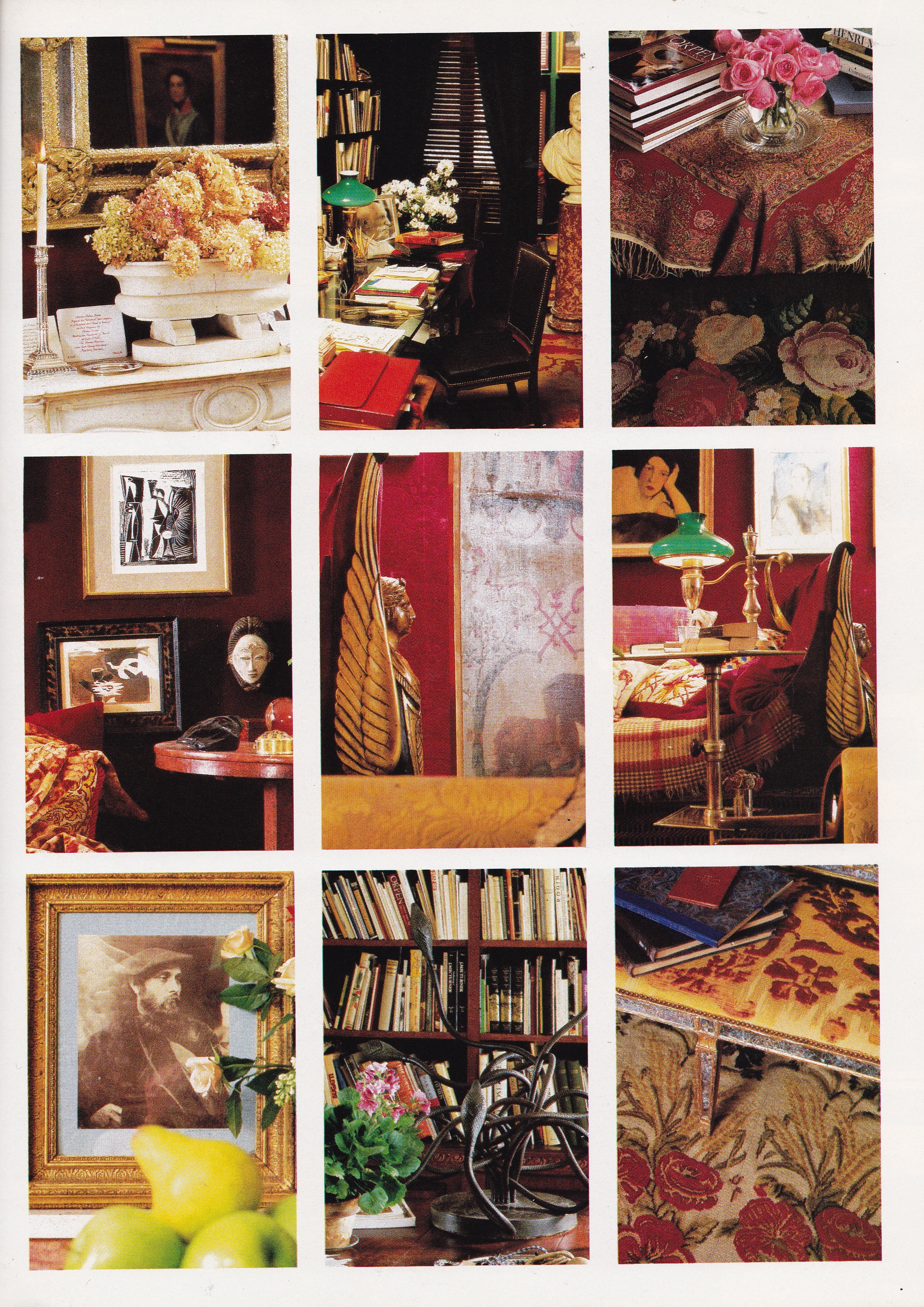
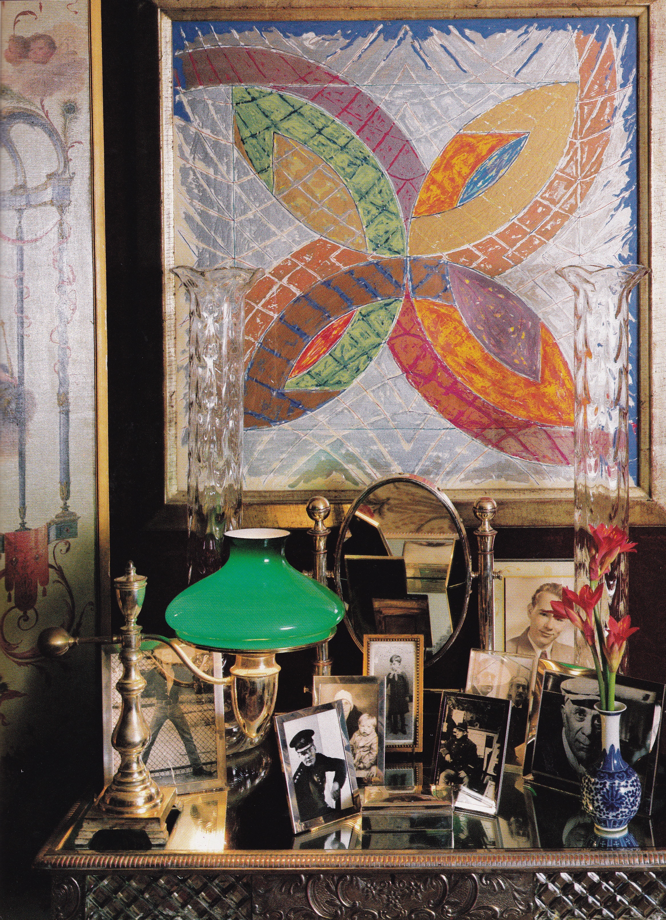
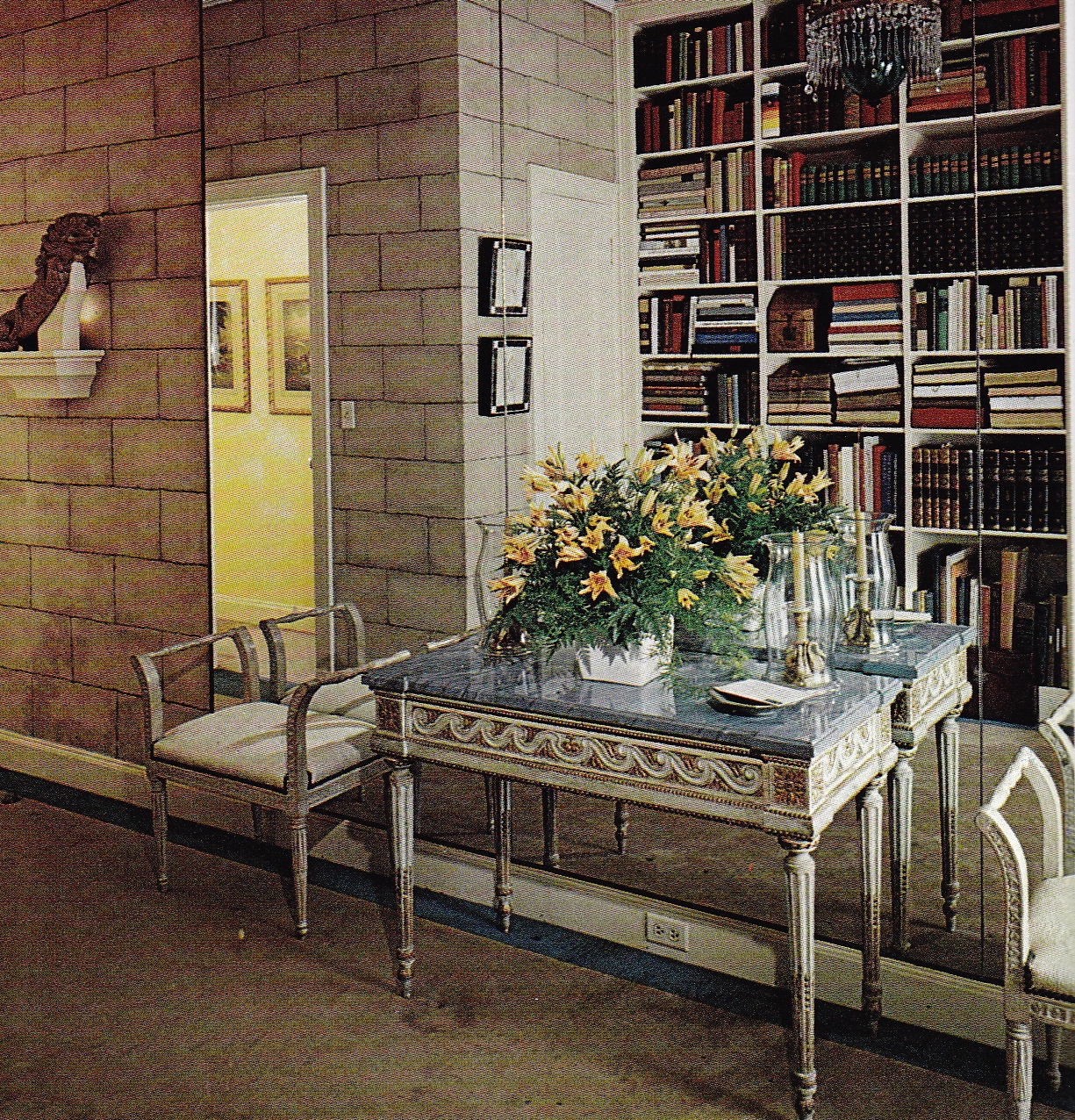
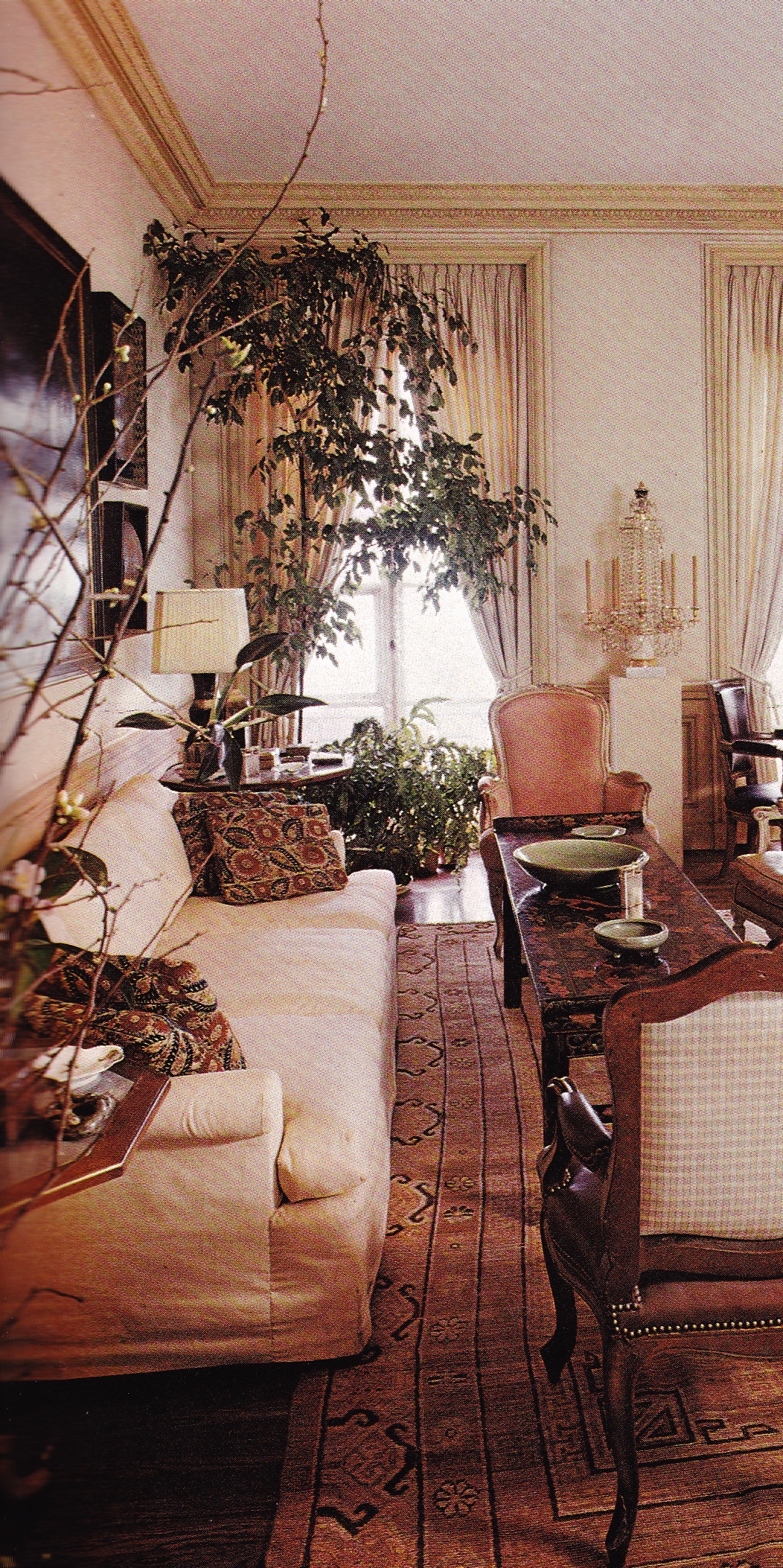
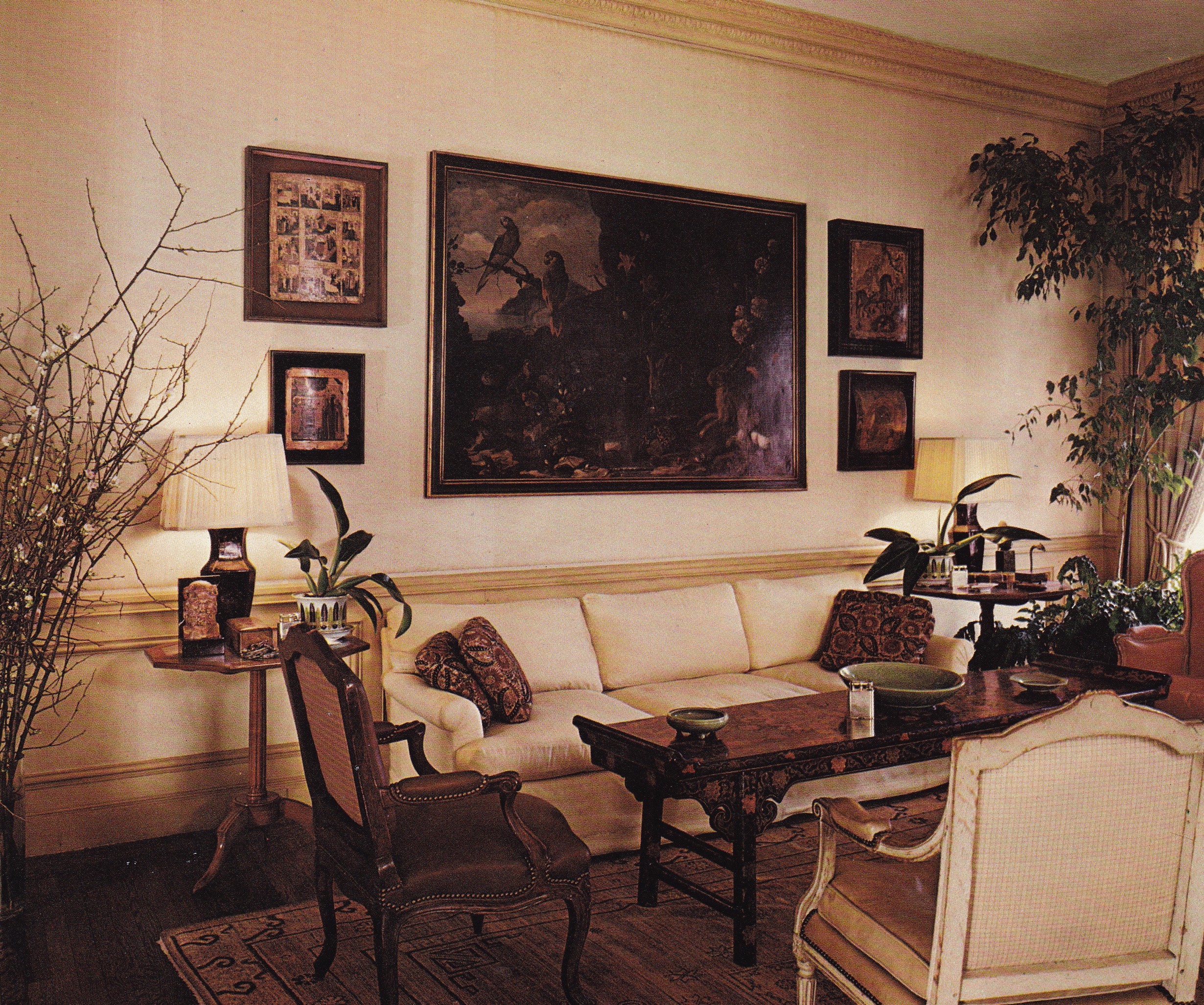
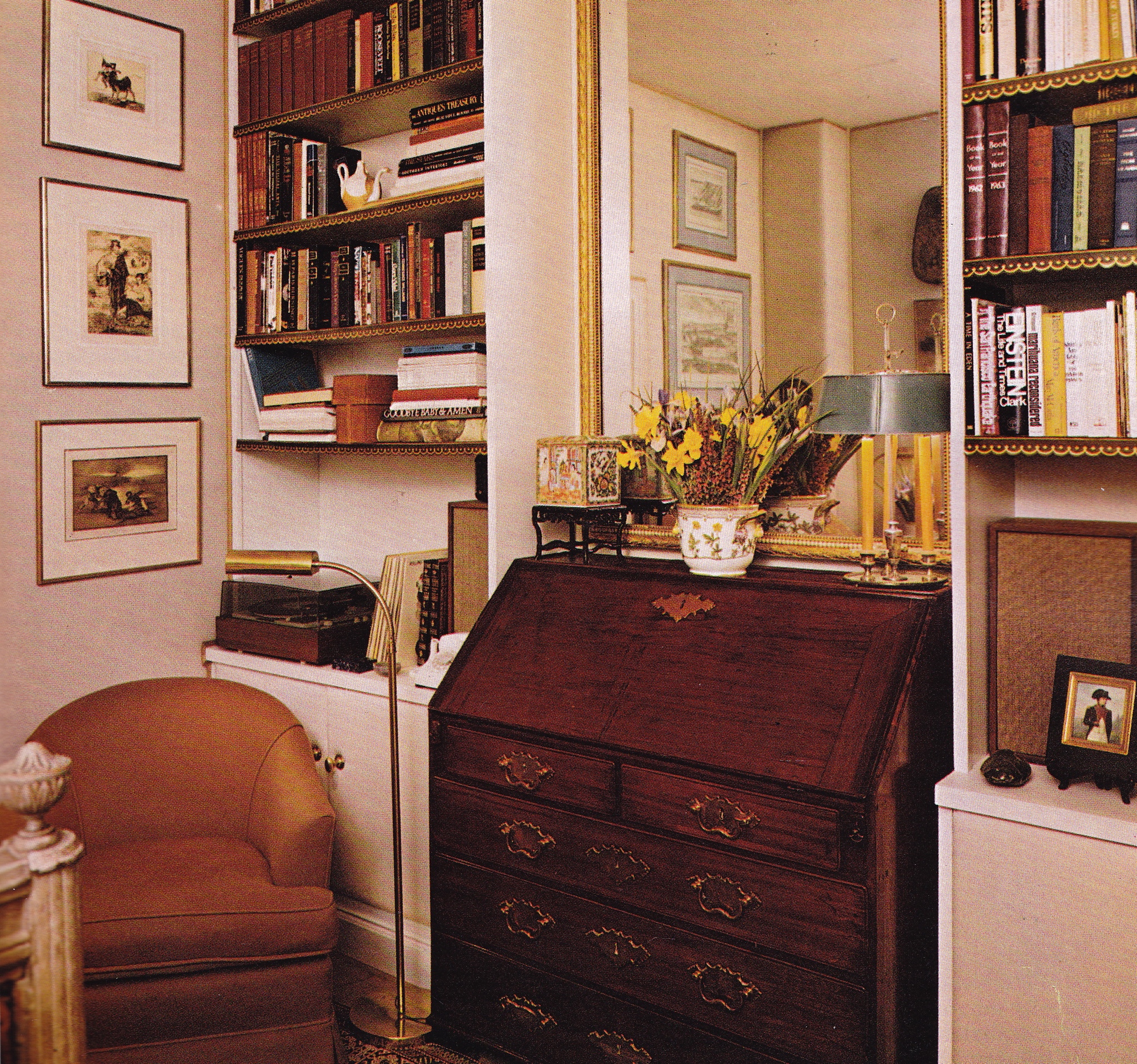
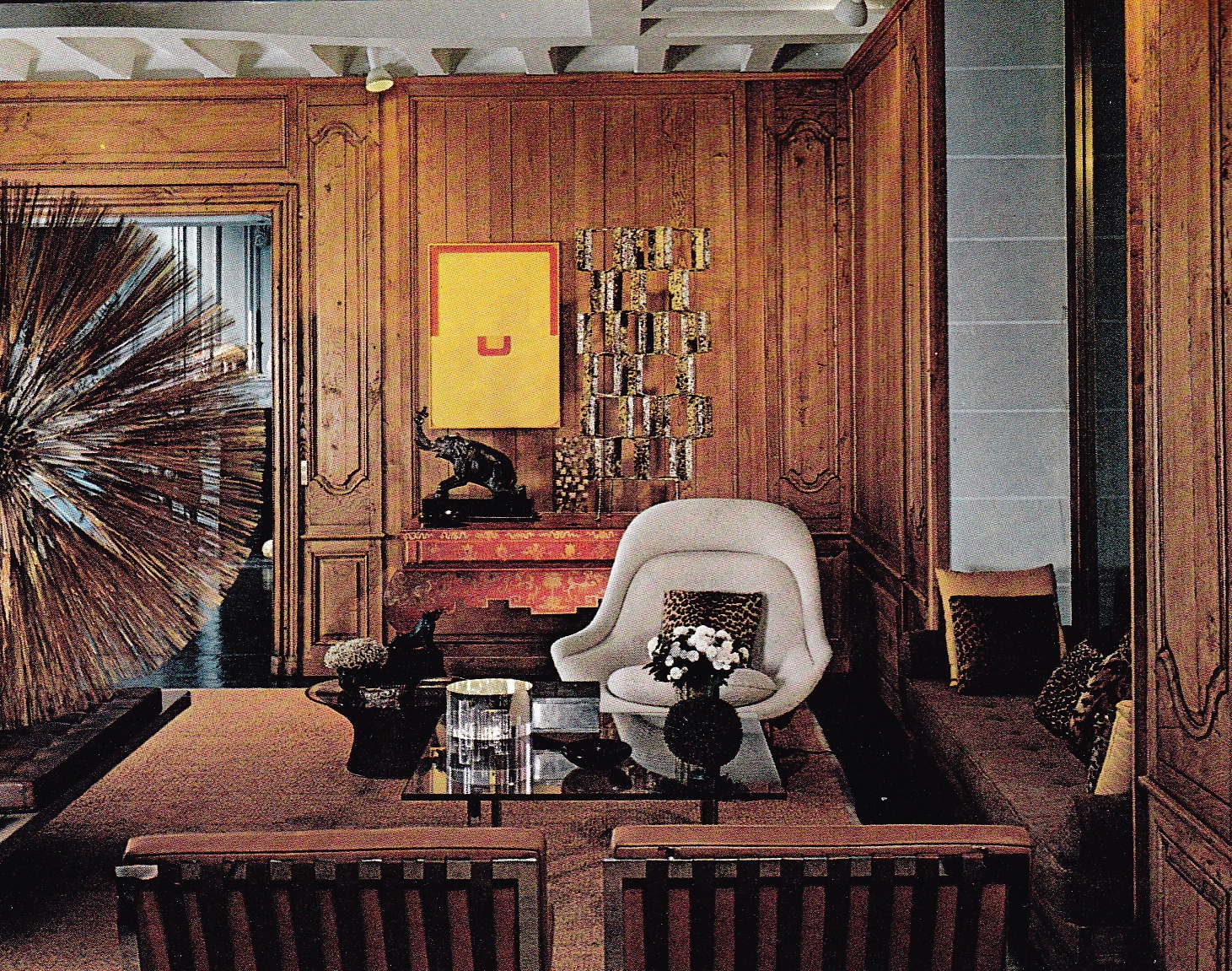
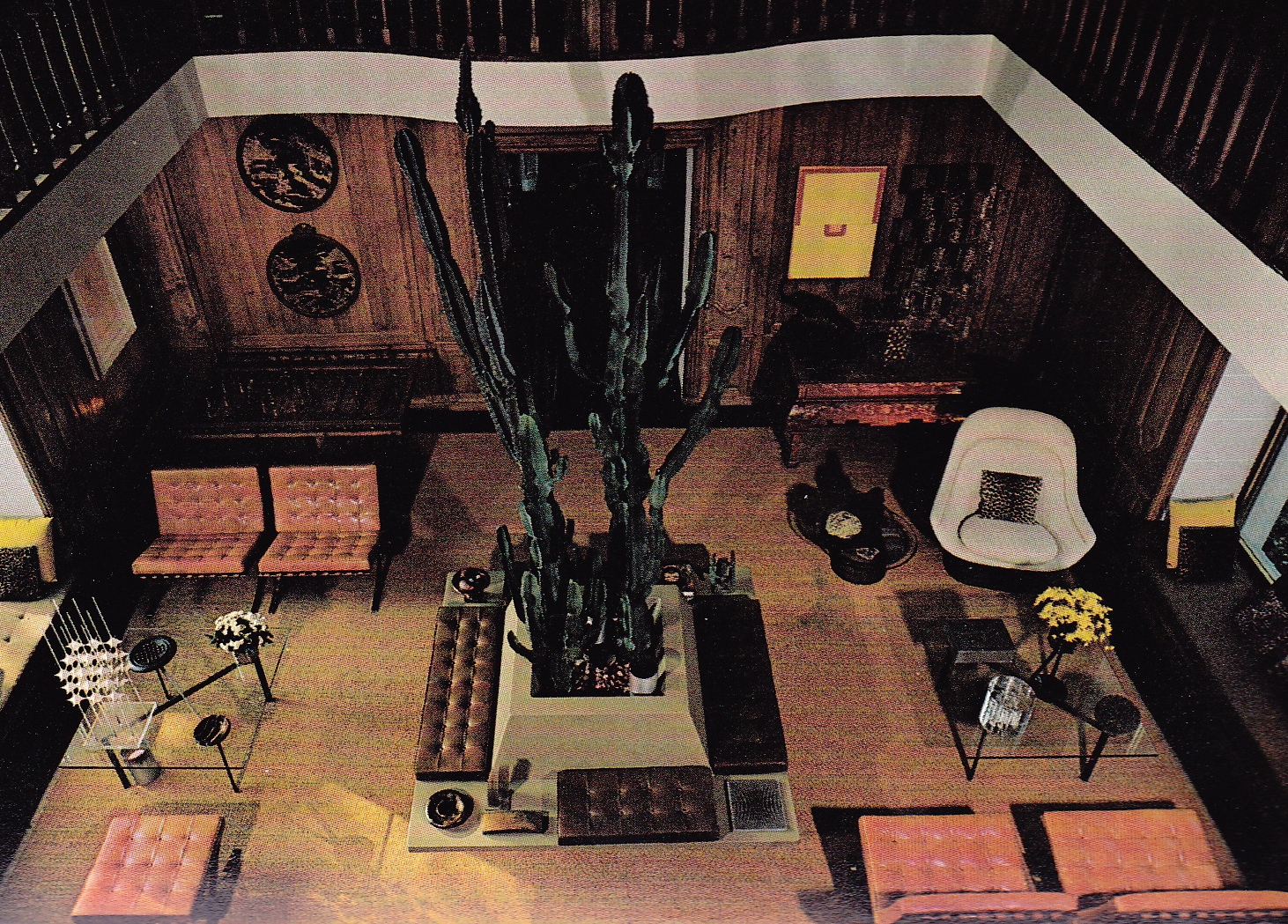
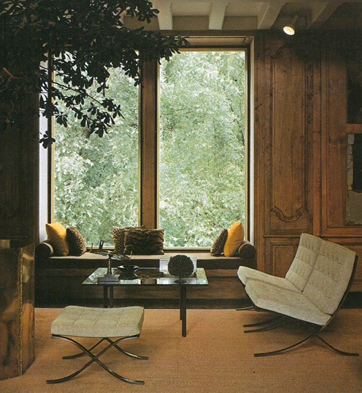
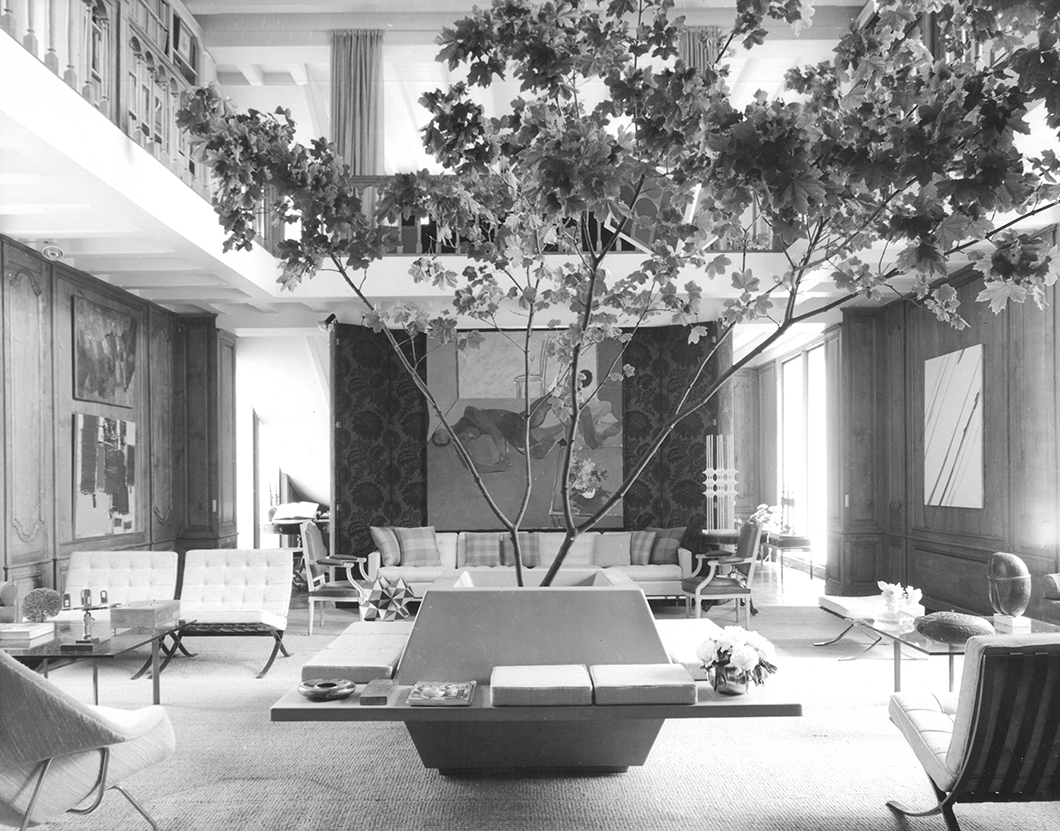
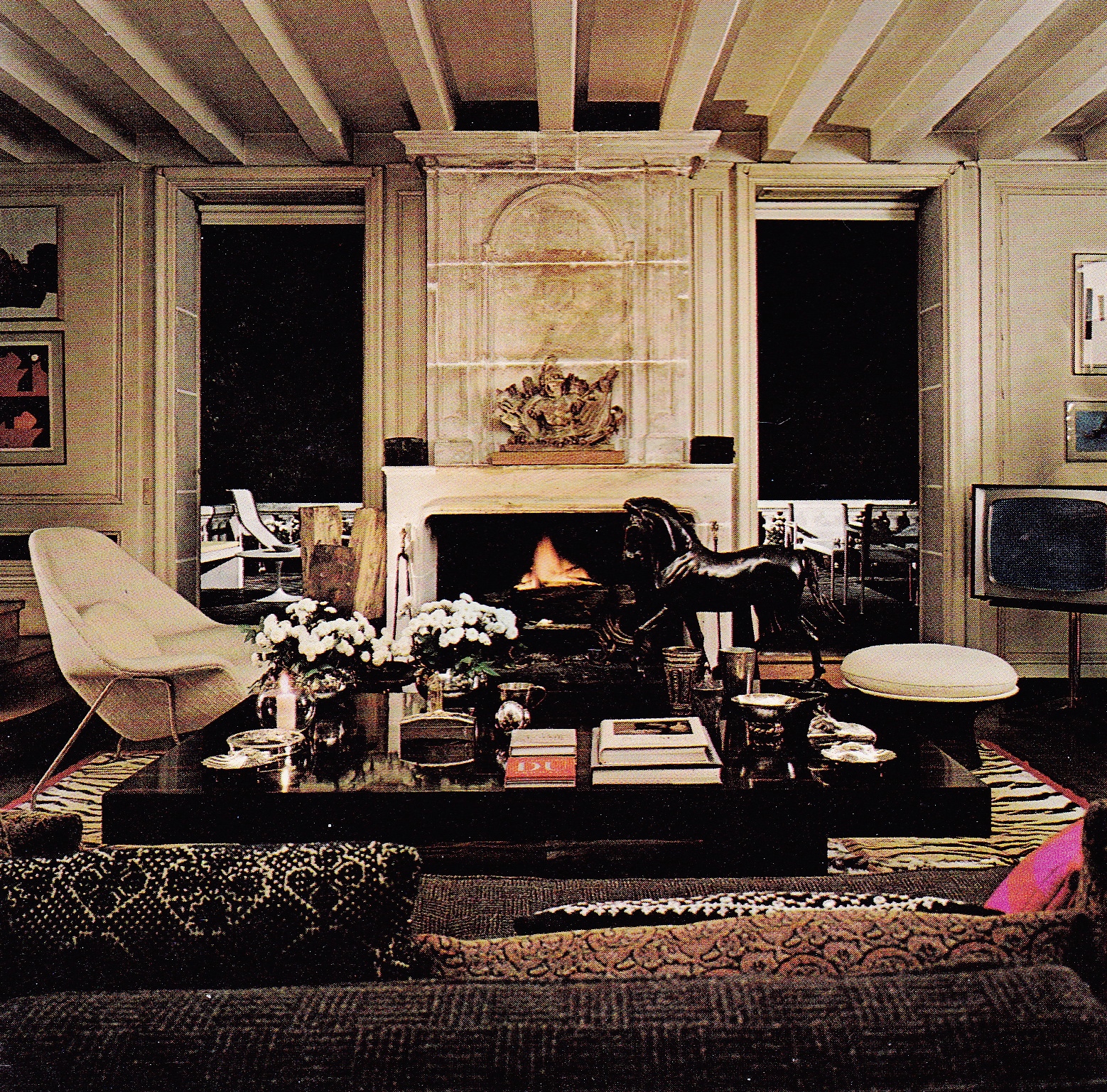
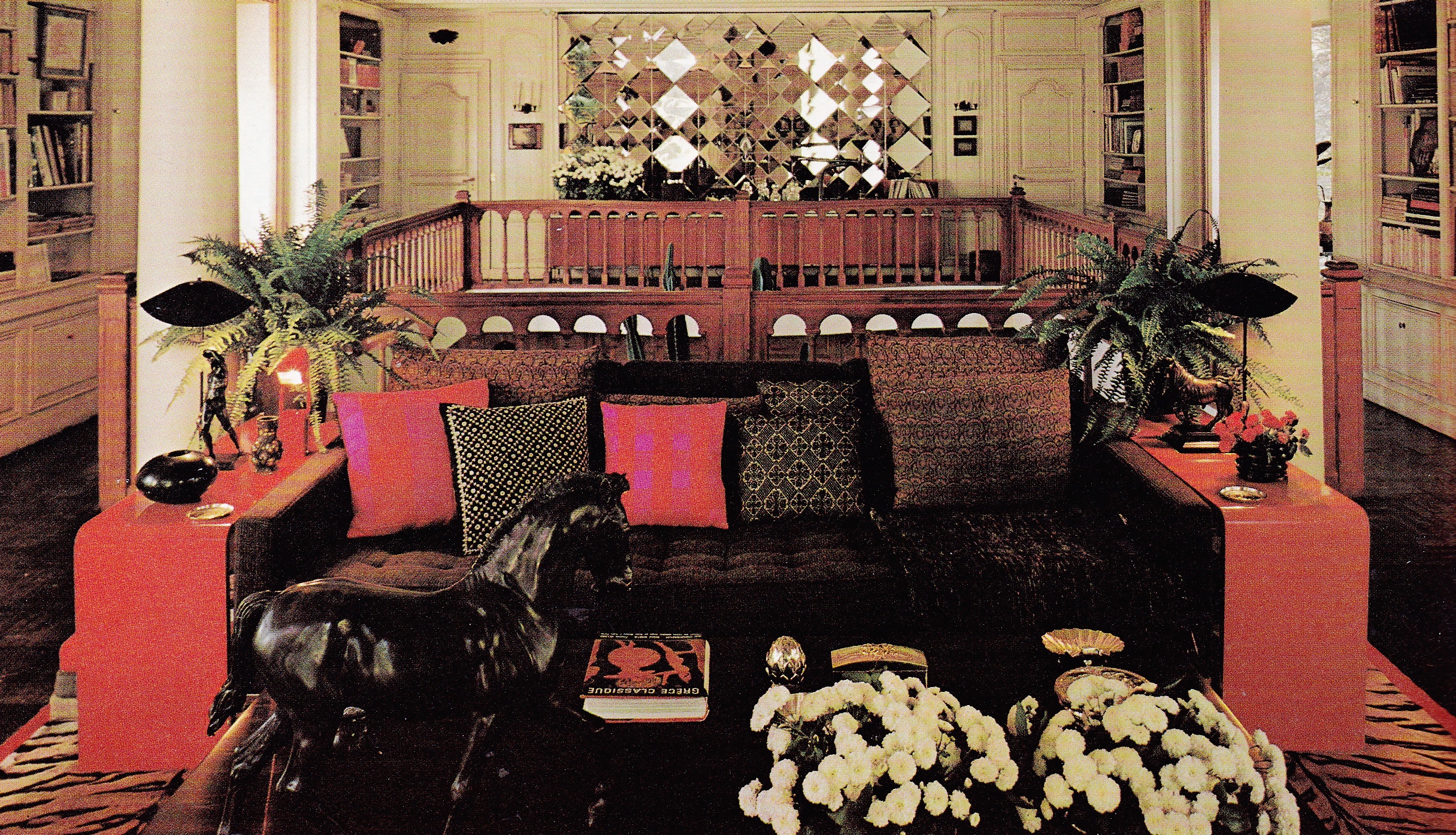
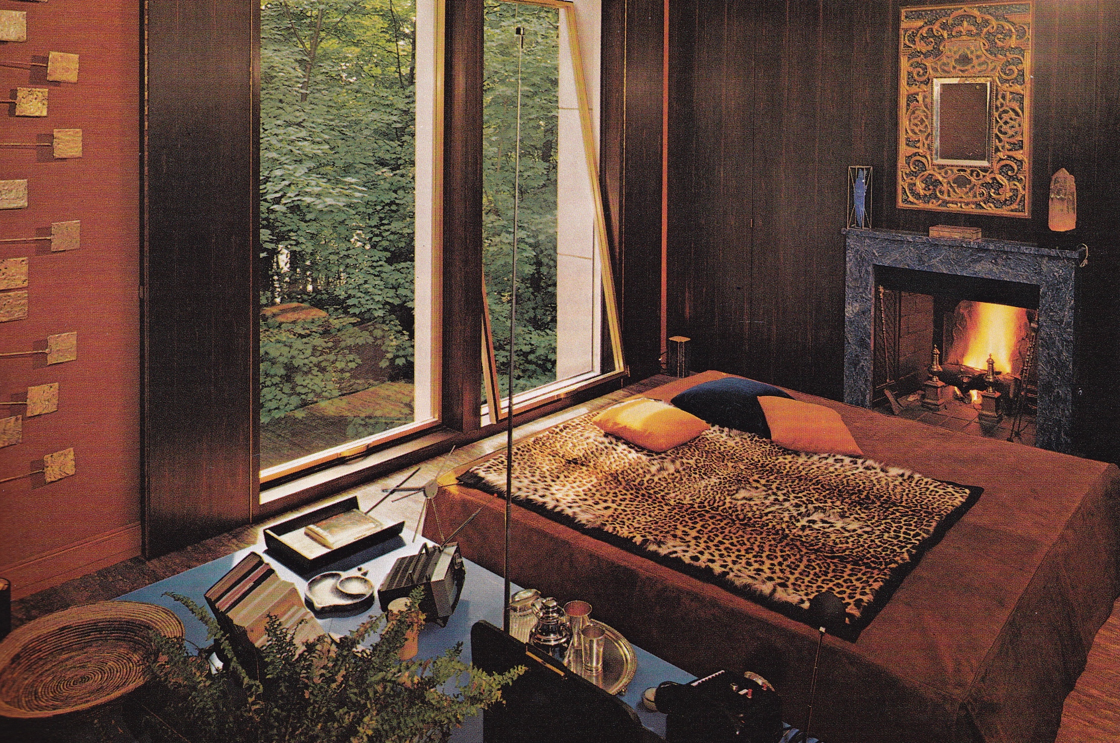
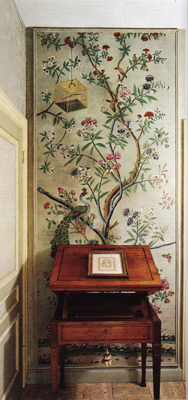
“I’ve deliberately created a rather monochromatic room because I work with color all day and I want to come home to no color. In ten or fifteen minutes I can change the whole color scheme with flowers and pillows. Basically, I just wanted to make a warm, comfortable background for mixing furniture, things I’ve inherited and objects I like. I do like to use rather grand things in an everyday way.”

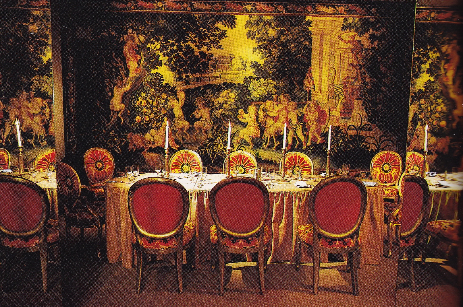
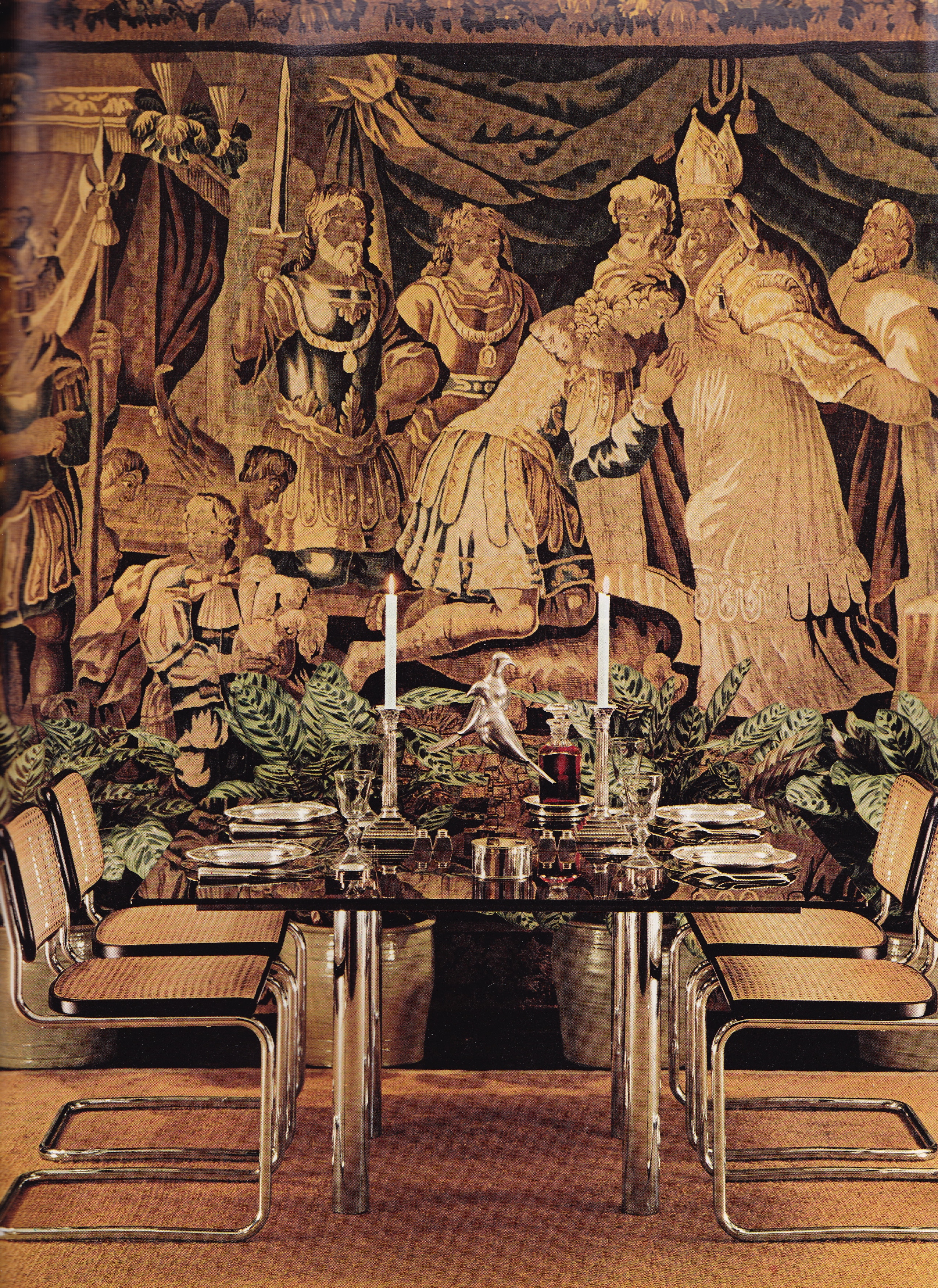
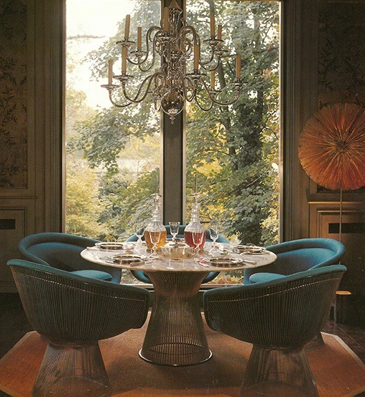
“The apartment is small, just right for a bachelor, and I made structural changes to make it perfect for the way I live. I tore out the dining room because one of the things I don’t like is lingering around a table after dinner … I often serve dinner around that big Chinese table in the living room. People seem to have a festive feeling about visiting a bachelor’s apartment. I think part of it is the informality. I never have a black tie dinner.”

What different times Mr. Hail lived in, in the 1970’s!


Anthony Hail-SF apt-AD May/June 1972-

A TONY HAIL LOOK?

“No. I’d say there isn’t. That’s exactly what I don’t want. Of course, there are certain things I prefer, such as natural materials — wool, silk, linen, cotton — and I don’t care if they do rot. I hate synthetics because you never know what they’re going to do. A decorator should be expert in telling people out of his own experience what things will have value and stand up. But a Tony Hail look? My decorating theories are exactly the opposite of that. I work with people to create rooms they will really live in. Sometimes I use things a client treasures from a previous residence even if they’re not really usable. I just hide them by using a multitude of nice things.”

Mostly what a decorator really wants is a woman who lives in the house beautifully. I say a woman because that is usually my client. She has a beautiful dinner, marvelous food, good coffee, fine wine, flowers, good light, candles … all create the general feeling. Her living well is as important as anything I can do, so we work together. This is the ideal.”

Oh, how times have changed!


Anthony Hail-SF apt-AD May/June 1972-

ART

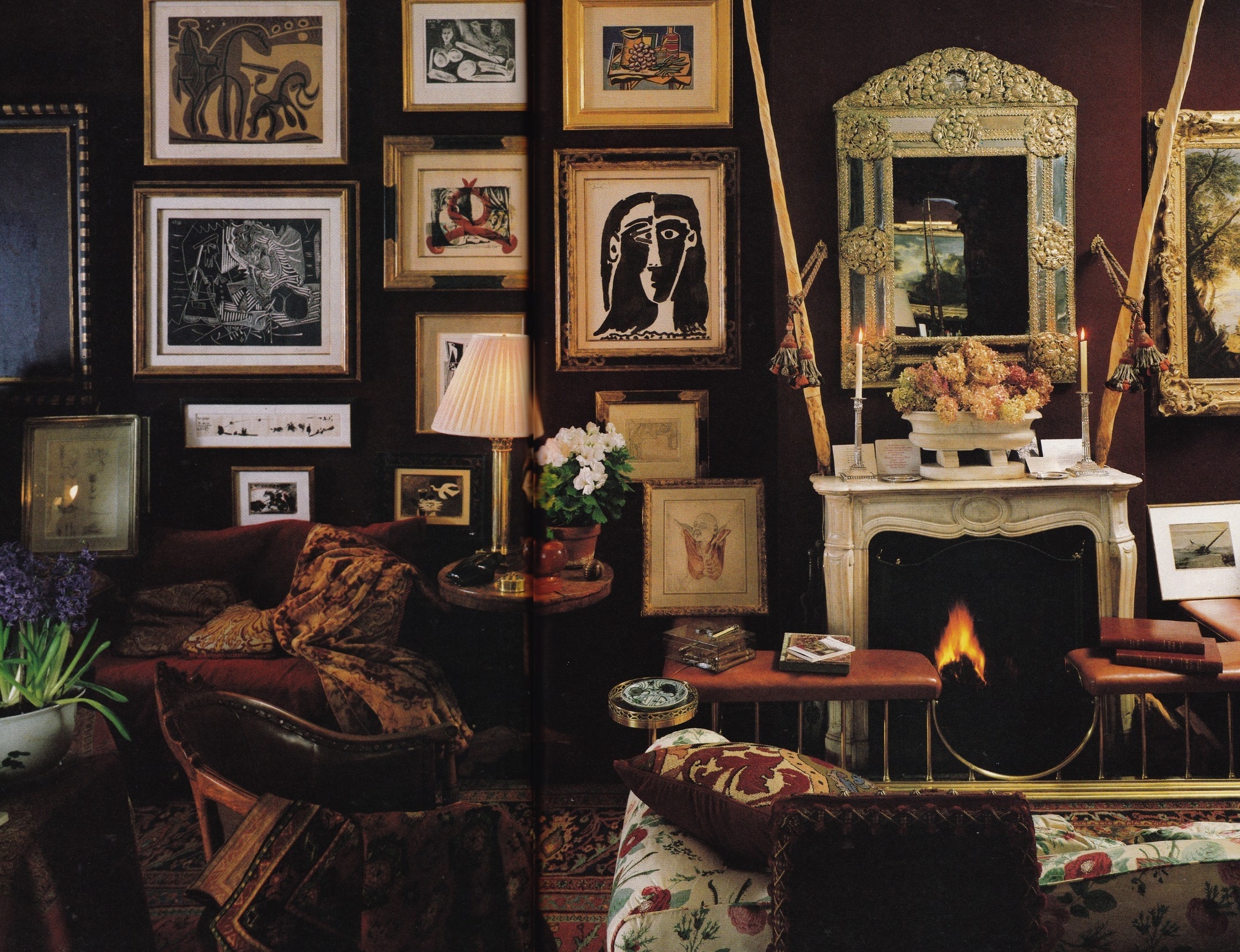
“I try not to get into art with any client, a man or a woman. Art is too personal and much more serious than interior design. I always leave blank walls and say ‘Something wonderful has to be there, and when you find it I will come and look at it if you want.’ I would rather they do it even if it ruins the job. If the people already own important art I try to come up with something complimentary. What any real designer stays away from is to look at a painting and say, ‘I’ll take the yellow out of the left-hand corner, the red from that flower and pink from another and there’s my color scheme.’ I think we’ve all heard that cliché far too often.”


Anthony Hail-SF apt-AD May/June 1972-

COLLECTING

“In England, I love to go to Oxford or Ascot and wander through the stores and galleries. I return to this country with twenty things checked off a list of one hundred, and half of them work, which is good … I may go off the beaten path, but I’m not one to go into the backwoods. In Paris, I leave the Flea Market and Left Bank to others. I shop on the best streets because I am only interested in the best.”


Anthony Hail-SF apt-AD May/June 1972-

CLICHÉS

“Patterned wallcoverings that match the curtains make me actually go up the wall. And, those very elaborate apartments that cost a fortune when all the objects are second rate, or nineteenth-century when they should be eighteenth. I am awfully tired of Fine French Furniture and those endless pompous rooms with boiseries. Even if the furniture is absolutely marvelous it doesn’t help much.”

“I think the most appalling thing we Americans are guilty of is French Provincial country furniture in New York City … eighteenth-century French furniture in a suburb of Detroit. If you are living in the country, it should be reflected in everything you touch … pottery instead of fine china … rattan mattings instead of Aubusson rugs. In the South, they say, ’tain’t fittin.’ The suitability of everything is so important. I hate this American thing of a living room that is never used because there is a secondary room with television, fireplace, books and a bar. You know that family will never go near the living room. That is not suitable.”

Anthony Hail-SF apt-AD May/June 1972-

WHERE IS THE BEST INTERIOR DESIGN?

“I think it’s in the United States. In the best that is going on in this country there is great quality. You’ll beat Paris hands down. There are lots of heavily publicized things happening in Paris and maybe the South of France but the rest of France is completely dead.  That’s not true of this country … I think the most important architect in this country is in Portland, John Yeon. In London, of course, there is a huge amount of activity. But there’s nothing very pretty in Birmingham or Liverpool. We are way ahead of Scandinavia.”


Anthony Hail-SF apt-AD May/June 1972-

INFLUENCES

“Robsjohn Gibbings. Now that’s the look I like for today. If he had not retired, he would  be tremendously busy. Of course, I learned all about furniture design when I worked with Edward Wormley who was Dunbar’s designer for thirty years. Then, of course, at Harvard I was under Gropius so I was heavily influenced by that.”

“Billy Baldwin, who is one of my great friends and advisers, is someone I look up to professionally and personally. We’ve worked together on a number of jobs.”

THE IDEAL OBJECT

“I am tremendously interested in objects. That’s evident in my apartment. The monolith in the motion picture 2001 is an object I would give my head to own. I think it is the most marvelously exciting object in the world. It’s the kind of thing I’m after. I try not to do anything that has a date to it. I would like you to be able to say that a piece of upholstery or a table that I did ten years ago would be just as good ten years from now, or twenty.”

IF YOU DID ANOTHER INTERIOR FOR YOURSELF

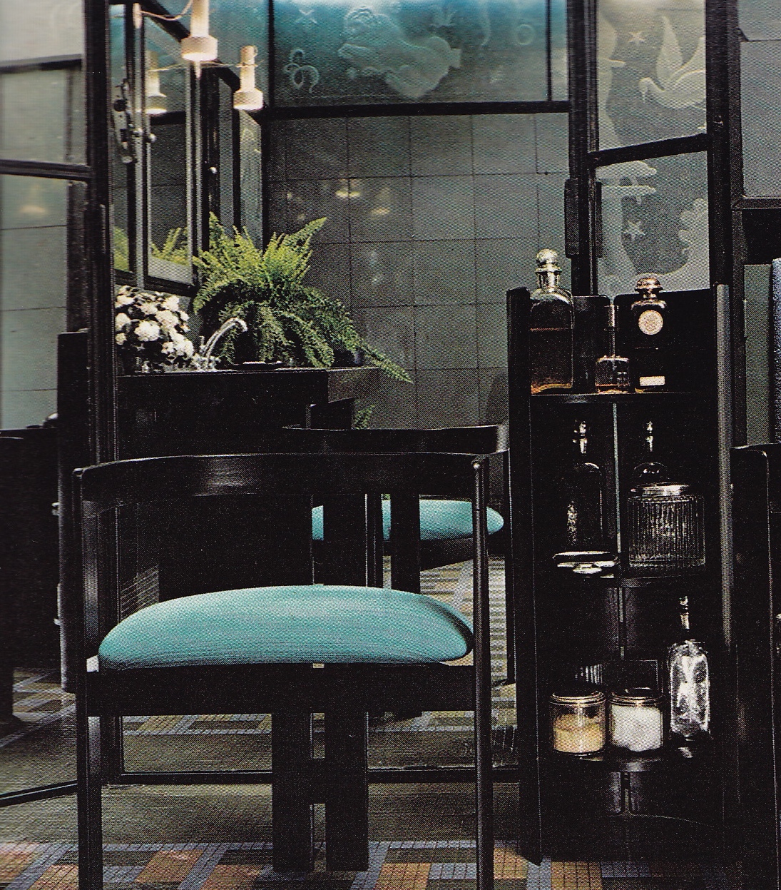
“It wouldn’t look a bit like mine does now. I would do lots of lacquer finishes and the colors would be deep burnt oranges and reds. And I would take advantage of the most advanced lighting you can build in. I’d do mirrored and granite baths; no padded walls; a much more assured thing, depending far less on Europe. I would have the most superb icon and eliminate all the other ones. I”d like nothing else. I’d have a much slicker, harder interior. Less full of antiques and things. Bleached floors. This new look I am doing for certain clients now is exactly what I would do for myself if I were starting over.”

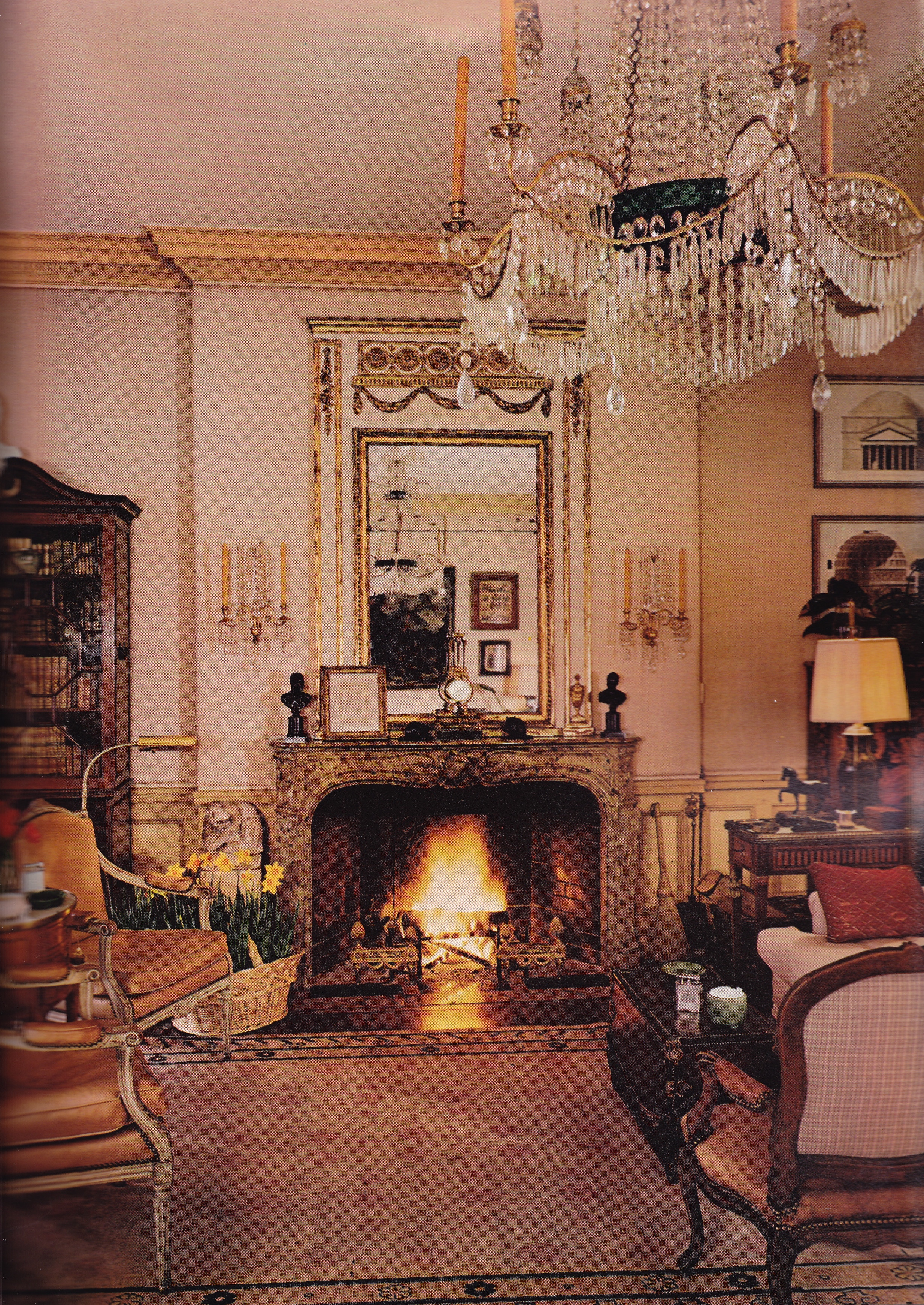
Hail ended up moving twice more – first to a townhouse on Russian Hill before retiring to another in Pacific Heights, where he passed away in 2006.  He never did embrace his enthusiasm for “a much slicker, harder interior” as described in this 1972 interview. His next two homes would continue his penchant for classic, timeless yet understated interiors defined by fine antiques and vast collections of his beloved objects. In his last home in Pacific Heights he finally embraced lacquered walls fashioned in chrome yellow, not burnt orange, paired with a Russian red for curtains. You can see his Pacific Heights apartment in my post Hail, Anthony! here.

Excerpts and photos taken from the May/June issue of Architectural Digest. No credits given to author or photographer.

Permalink         Comments (2)        

Of Craft and Comfort

Posted October 1, 2014. Filed in Arts & Crafts/Mission Style, James Huniford

01VER-Huniford-living-room

With the change of season into autumn I can’t help but feel the nesting instinct come over me. Cooler weather, the changing colors of the trees, and farmers markets introducing autumn’s bounty incites images of interiors bathed in golden light and a crackling fire on a brisk morning. When I opened the October issue of Veranda and my eyes fell on this Marin County, California, home designed by James Huniford I felt I had arrived at the autumnal home of my dreams.

The home and its interiors are an expression of the California Craftsman Shingle-style house in the true sense: hand-crafted spaces utilizing natural materials, honest construction methods, and unfussy decor. Yet, once you step inside, you could easily be in the English countryside of Edwin Lutyens. With an artist’s eye Huniford composed layered rooms devoid of the usual suspects. You won’t find suites of Stickley furniture or amber stained-glass lamps here. Instead,  Huniford crafted comfortable and homely spaces with a collector’s eye that celebrates the rich heritage of the Arts and Crafts movement without reproducing period rooms. The interiors are lighter and brighter, finished out with natural and painted wood surfaces and layered with antiques culled from England, Italy, France, and the United States. The results produced a gracious and comfortable home that connects with the natural beauty of its surroundings.


VER-Huniford-dining


VER-Huniford-walkway


VER-Huniford-desk


VER-Huniford-kitchen


VER-Huniford-kitchen-dining


VER-Huniford-bedroom


VER-Huniford-outdoorspace

For the full story subscribe to Veranda here. From the October issue of Veranda. Photography by Max Kim Bee. James Huniford can be reached here.


Permalink         Comments (0)        

Le Pavillon des Rêves de Jacques Garcia

Posted September 29, 2014. Filed in Jacques Garcia, Orientalism, Pleasure Pavilions

ad_131003_garcia_bassinext_jpg_9182_north_700x_white

Jacques Garcia has been renovating and perfecting his 17th-century château, Champ de Bataille, for over twenty-years, the subject of his second monograph recently released that I covered in A Man and His Castle: Château du Champ de Bataille. As with many grand estates of its period the decorative fantasies of its owner were expressed as architectural follies in the form of small structures created for the sole purpose of delighting the senses. Idiosyncratic by nature, every whim and caprice could be exploited for the sake of pleasure. For Jacques Garcia it was presented in the form of le pavillon de rêves – “the pavilion of dreams” – which he lovingly imbued with mystery and exoticism.

Le Pavillon des Rêves transports you to the India of the 18th-century. As viewed from the main pavilion, a basin surrounded by wild irises reflects the crenellated sandstone wall of the “fortress” containing a temple and a tromp l’oeil “tent” of painted lead sheeting. The orientalist folly, or “factory” – as such a structure intended to beautify gardens was referred to in the 18th-century – is incorporated into the wall and made invisible from the outside by a lush hedge of poplars approximately twenty-six feet high.

2013_10_04_img_1485portrait_jpg_7000_north_700x_white

A portrait of Jacques Garcia dressed as a Maharaja sets the tone for a tableau including an Indian carved wood head of a donkey and a model of a temple. “A girlfriend created this collage of me from an old photo. I find it humorous – the true gift is the frame” remarked Garcia.

ad_garcia_salonrecep_jpg_7669_north_700x_white
The main salon is dominated by a Turkish chandelier hovering above a set of Indian furniture sumptuously appointed with leopard pelts and Mughal silver. The frescoes of elephants around the windows comes from Indian houses.
ad_garcia_sdb_jpg_581_north_700x_white
A succession of niches framed in violet taffeta adorned with leopard heads creates a theatrical atmosphere in the bathroom. The chaise longue is covered in quilted taffeta and 19th-century embroidery.
ad_garcia_chjaune_jpg_3260_north_700x_white
An 18th-century yellow Indian paisley covers the walls of a room in the main pavilion, which offers a view into the iris blue bathroom.
ad_131003_garcia_bassinint_jpg_3396_north_700x_white
Between 18th century white marble columns decorated with polychrome paintings, acquired in Rajasthan, the exotic indoor pool is illuminated by hanging candlelit glass cloches.
If you are as fascinated with pleasure pavilions as much as I am you can read about Jacques Garcia’s other flight of fancy at Champ de Bataille in my post Folie de Jacques.
French AD, July 2104. Photography by Mai-Lihn.
Permalink         Comments (1)        

Throwback Thursday: Mimi London 1973

Posted September 25, 2014. Filed in Elemental Design, The California Look, Uncategorized

Mimi London-Hollywood Bungalow-AD Jan 1973-Jay Steffy

The year is 1973. Imagine receiving your January/February issue of Architectural Digest in the mail and laying your eyes on these rooms for the first time. Had you ever seen anything like it? Chances are you were witness to the inception of the California Look attributed to Michael Taylor. Alongside Taylor was interior designer Mimi London crafting earthy high style interiors inspired by nature and far flung locales, a look for which she became known throughout her career and parlayed into her eponymous showroom to the trade.

The living area of London’s 1930’s Hollywood bungalow is still quite fetching, you have to admit. I think many of us became burned out on the California Look but there is something particularly worldly about this space. It  could be anywhere – Paris, Spain, Australia, Tahiti or a California beach house. Very few would dream of placing mattresses, covered casually and loosely with industrial canvas, as seating in their living areas today. While there is definitely a hippy-chic vibe you will also notice a style informed by classical principles, from the symmetrical arrangement of the furnishings to the background of wall hangings, and trees and plants that fill in for columns.

A foil of white plaster walls and white slip-covered banquettes was layered over with black and the color of bark, defined by walls hung with Fijian and Tahitian tapas of mulberry bark, hung in vertical panels to create architectural interest and to formerly frame the windows which have hand-wrought eucalyptus grilles placed over them. A synthesis of classical and primitive elements and and contrasts in color and texture is woven throughout the room, with black African candelabra atop classical marble capitals, tree trunks standing in for columns, and a large clam shell as sculpture.

Mimi London-Hollywood Bungalow-AD Jan 1973-Jay Steffy


Mimi London-Hollywood Bungalow-AD Jan 1973-Jay Steffy

I’ve included photos of the bedroom to quench your curiosity, but they are of less interest to me. The days of straw covered walls and log framed beds I can hope are made for history. But I do relish the idea of creating a “bed nest”, as London referred to her’s. And I imagine I was quite taken by this heavily textured space when it first appeared to me … much later, of course!

Architectural Digest, January/February 1973. Photography by Jay Steffy.

Permalink         Comments (0)        

Spanish Designer Paco Muñoz in Castille

Posted September 24, 2014. Filed in Paco Muñoz, Spanish & Portuguese Country Houses

Paco Muñoz-Pedraza Country House-Spain-HG July 1992-Amparo Garrido

For several years now, since blogging took the Internet by storm, a photo of a bedroom I had once admired began to circulate. And, more recently, the same bedroom began showing up on Pinterest. I kept thinking to myself “If I love the bedroom this much the rest of the residence must be equally charming. But where had I seen it? Do I still have the magazine it was featured in?” I was quite certain I had seen it in House & Garden some twenty years ago. And sure enough, when I happened upon the July, 1992, issue of House & Garden last week there it was: Spanish interior designer Paco Muñoz’s country house in Pedraza, Spain.

Suddenly every room, not only the red ochre washed bedroom, came flooding back to me. It was like seeing an old friend after twenty-some odd years later, still as warm, gracious and inviting. It doesn’t hurt, either, that his patched collection of 18th-century structures in a medieval village represents what I love and admire about Spanish, as well as Portuguese, country houses with their inviting and timeless pared-down aesthetic – hand-troweled plaster walls, tile and wood floors, simple cottons and linens, earthen palette and regional decorative arts. As we welcome the autumnal colors of Fall I can’t think of a better place to be than at Senior Muñoz’s rustic yet refined country house in the Castille region of Spain.

Paco Muñoz-Pedraza Country House-Spain-HG July 1992-Amparo Garrido

The two-story library is defined by its original timbers and beckons the inquisitive eye to discover its hidden secrets. Oh, how I would love to have this space to work in every day!

Paco Muñoz-Pedraza Country House-Spain-HG July 1992-Amparo Garrido

At one end of the library is a seating arrangement dominated by an 18th-century door frame made into a mirror hanging above the fireplace.

Paco Muñoz-Pedraza Country House-Spain-HG July 1992-Amparo Garrido

Muñoz created a sunny atmosphere for the breakfast room with bright yellow painted walls and beams and country-inspired fabrics from Souleiado.

Paco Muñoz-Pedraza Country House-Spain-HG July 1992-Amparo Garrido

The spare yet warm gallery reminds me of the work of Axel Vervoordt, save for the obvious over-scaled and loosely draped sofas which hint of the 90’s. The triptych against the back wall is by Spanish artist Tapies and the sculpture is by Palazuelo.

Paco Muñoz-Pedraza Country House-Spain-HG July 1992-Amparo Garrido

The master bedroom is simply white and meditative, and void of extraneous decoration.  I would love to remove every tabletop item I see and strip it bare – along with the bows!

Paco Muñoz-Pedraza Country House-Spain-HG July 1992-Amparo Garrido

The bedroom that lived on in my dreams is reserved for guests. The stucco on the walls was tinted to create a warm background for 19th-century Spanish beds hung with Bennison fabric. It’s the absolute perfect Spanish country house bedroom!

Paco Muñoz-Pedraza Country House-Spain-HG July 1992-Amparo Garrido

Fifteenth-century grilles were fitted between stone walls to open up the view of the pool terrace.

Paco Muñoz-Pedraza Country House-Spain-HG July 1992-Amparo Garrido

Paco and Sabine Muñoz on a terrace as photographed in 1992 for House & Garden.

House & Garden, July 1992. Photography by Amparo Garrido

Permalink         Comments (0)        

John Rosselli & Furlow Gatewood

Posted September 23, 2014. Filed in English Country House Style, Gracious Living

John Rosselli-Furlow Gatewood-Savannah-HG July 1992-Oberto Gili

The names John Rosselli and Furlow Gatewood ring instantly familiar, two shining stars in the world of interior design – John with his now twenty-two-year old home decor emporium, Treillage, in New York, and Furlow basking in the current fanfare surrounding his charming compound of American Southern Gothic cottages in Georgia. But, did you know that just as Mr. Rosselli was opening Treillage in 1992 the home he shared with Furlow Gatewood in Savannah was featured in House & Garden?

I have had this issue of House & Garden since it arrived fresh in the mail back in 1992. And I recall these rooms very clearly. But, I suppose, my sights were on other styles at the time. My awareness of Rosselli was slight, and I wouldn’t learn of Gatewood until years later. I had wondered over the years what Rosselli’s home may have looked like before Bunny Williams, and now I know. Clearly, the two shared more than a home, as inveterate collectors they shared a taste for classic and gracious rooms washed in an aura of romance with a dash of the exotic.

John Rosselli-Furlow Gatewood-Savannah-HG July 1992-Oberto Gili

An intentionally spare background of simply painted walls serves as a foil for the pair’s collections. English antiques – a table by William Kent and 19th-century hall chairs – are paired with a French trumeau mirror, blue-and-white export porcelain, and fanciful gilt palm columns in the foyer (above two photos).

John Rosselli-FUrlow Gatewood-Savannah-HG July 1992-Oberto Gili

Just one glance at the furnishings and collections assembled in the parlor and there is no mistaking the hand of Rosselli and Gatewood. These are just the kinds of treasures you might find at Treillage on any given day. And the thoughtful and cozy seating arrangements, the Continental mix of antiques, and rich layering of art and beautiful objects is pure Gatewood. A French neoclassical painting over a 19th-century English desk separates two sides of the parlor, each anchored by black marble mantels. Do you recognize the hurricanes? A John Rosselli design, as is the trompe l’oeil screen hung with “framed art”. Though beautifully appointed it remains such a cozy and approachable room. Couldn’t you just settle in with those stacks of books in front of the blazing fire? There’s even a bed for Fido.

John Rosselli-Furlow Gatewood-Savannah-HG July 1992-Oberto Gili

The dining room is very similar to Gatewood’s current dining room by design. His penchant for classicism, symmetry, round dining tables, English antiques, and layering walls with decorative arts and sconces is telling. A collection of blue-and-white Chinese export porcelain surrounds the William V dining table. The floor is faux marble and the chandelier and consoles were designed by Rosselli.

John Rosselli-Furlow Gatewood-Savannah-HG July 1992-Oberto Gili

Savannah’s warm climate inspired the exotic undertones of the breakfast room sitting area. A Mexican primitive painting inspired Rosselli’s design for the folding screen. French, chinoiserie and American Victorian furniture adds to the mix. The walls were painted to imitate limestone.

John Rosselli-Furlow Gatewood-Savannah-HG July 1992-Oberto Gili

A peek into the informal dining room features French garden chairs around a Rosselli table, a country pine chest and, I dare say, a baker’s rack. Remember when baker’s racks were all the rage?! I imagine they referred to it as an étagère.

John Rosselli-Furlow Gatewood-Savannah-HG July 1992-Oberto Gili

The airy and quietly elegant guest room features a French campaign bed, top photo, and the master dressing room features a 1950’s chest on Billy Baldwin’s antelope rug design of the same year.

John Rosselli-Furlow Gatewood-Savannah-HG July 1992-Oberto Gili

An upstairs bedroom and sitting room likely shares the same footprint as the double parlor on the first floor, divided here by pocket doors. Rosselli had the walls painted Arabian red to bring out the exoticism of orientalist paintings. Fun bit: the Bierdermeier chair pulled up to the desk was purchased from the estate of Marilyn Monroe. In the bedroom, an antique bedspread with Chinese figures dresses the four poster bed and a screen by Rosselli features a Hindustani scene.

John Rosselli-Furlow Gatewood-Savannah-HG July 1992-Oberto Gili

The humid climate of Savannah creates a damp, mossy exoticism on the rear terrace, which is punctuated by a lead fountain and goldfish pool.

House & Garden, July 1992. Photography by Oberto Gili.

Permalink         Comments (2)        

Fit For Dutch Masters

Posted September 22, 2014. Filed in Belgian-Dutch Style, Uncategorized

cn_image.size.baton-rouge-louisiana-home-01-exterior-h670

I don’t usually post articles on current features in American shelter magazines because, for one, almost every other interiors blogger does and, two, the information is readily available both in print and on-line. Yet, this charming and romantic Cape Dutch-style house sited on a lake amidst a grove of oak trees elicited pause. Perhaps I’m feeling sentimental for the Netherlands, a place I once called home, and the spare yet warm elegance of Old World Dutch interiors. Of course, I’ve forever admired the pared-down elegance of colonial-style design and decoration as well, so it’s no wonder this project grabbed my attention.

It’s not everyday you witness a new-build South African Cape Dutch-style residence in America, and therein lies much of its magic. At first glance you would be hard-pressed to place its location: a bucolic setting at water’s edge; towering trees showing  first signs of autumn’s arrival; and an honest interpretation of Cape Dutch-style architecture, replete with symmetrical rows of chimneys piercing the roofline.  Where are we, Ulster County? Perhaps Montecito? Neither one, actually. You are correct if you guessed Baton Rouge, Louisiana.

Architect Bobby McAlpine and interior designer Ray Booth, of McAlpine Tankersley Architecture out of Alabama, realized their client’s dream of building such a residence for themselves on a plot of land oriented toward a lake of their design. True to form, the house’s exterior appearance is pure Cape Dutch Colonial. But inside the traditionally dark and heavy interiors give way to expansive spaces and abundant light. While retaining the same gezellig feeling inherent in traditional Dutch interiors through use of wood paneling, beams, beautiful wood-framed windows, tumbled marble tile and wood floors, hand-troweled plaster walls, and the ubiquitous Dutch brass chandeliers, these rooms are uplifting and made for living in the 21st-century. A sense of pared-down luxury pervades where simple yet luxuriously upholstered furniture mixes with mellowed antiques and art from Northern Europe. Take a peek at what’s in store in the current issue of Architectural Digest.

McApline-Booth-Baton Rouge-Cape Dutch-AD OCT 2014-Pieter Estersohn

item0.rendition.slideshowHorizontal.baton-rouge-louisiana-home-03-gallery


item2.rendition.slideshowHorizontal.baton-rouge-louisiana-home-08-kitchen

McApline-Booth-Baton Rouge-Cape Dutch-AD OCT 2014-Pieter Estersohn

For the full story read the October, 2014, issue of Architectural Digest (available here). Photography by Pieter Estersohn.

Permalink         Comments (3)        

Favorite Vintage Ads Friday: Atelier Martex 1983

Posted September 19, 2014. Filed in Favorite Vintage Ads

Atelier Martex- Musee Des Arts Decoratifs -“Beaucourt”-1983

If you have been following my recent installment, Favorite Vintage Ads Friday, you will know how taken I was, and remain, with regard to the Atelier Martex ad campaigns of the 1980’s. Often employing well-known designers to conjure seductive atmospheres for a waiting clientele, each setting evokes a particular mood and place in time. The setting for this ad from 1983 evokes a grand French country house inhabited by someone of great personal style who is a lover of classicism, art, travel, and a dose of the unconventional, if not bohemian. I believe, as I think back, this may have been the first time I had witnessed a bed placed in the center of a room, and I loved the idea of it. It instantly transforms the room into a room for living as opposed to one reserved for resting.

The neoclassical four-poster bed is dressed with “Beaucourt”, an inspired translation of an exquisite 18th-century porcelain design cataloged at The Musée Des Arts Decoratifs in Paris. But, as with all the Martex ads I love so much, it’s the “art of the room” that draws me in: the tawny palette punctuated by an inky Aubusson and those dazzling sapphire blue silk slip covered chairs; and the unexpected pair of chrome-and-glass side tables cozied up to the classical bed. Pure atmosphere! For all its grand gestures it is an inviting, liveable room seen through the eye of an artist.

Permalink         Comments (0)        

Charles Sévigny and Yves Vidal at Le Moulin des Corbeaux

Posted September 18, 2014. Filed in Charles Sévigny, Classical Moderne, Modernism, Yves Vidal

Charles Sévigny-Yves Vidal-Moulin des Corbeaux-AD March/April 1973

I was so delighted to rediscover the work of Charles Sévigny, who I featured in the last Throwback Thursday post, Charles Sévigny, that I pulled down more 1970’s issues in search of his work. I found it in the March/April issue of Architectural Digest. As I mentioned prior, M. Sévigny designed for the beau monde of the international jet-set, and early in his career, after he had moved to Paris, met Yves Vidal, a man of great means who would later become his partner in business and in life. Some twenty years after M. Vidal was placed as head of Knoll International he decided to leave his apartment on the rue du Bac in Paris for the Champagne region after discovering and falling head over heals for a mill built in 1480, named Moulin des Corbeaux, in Saint-Maurice on the tiny Ile de Corbeaux, or “Island of the Crows”. Very little structural work was required to make the mill livable when it was purchased in 1963. In fact, the mill was converted to a house in 1930 by a French architect but lacked a good many windows, which Sévigny and Vidal installed to open up the rooms to the beautiful views of the countryside.

Vidal furnished the home almost exclusively with designs by Mies, Saarinen, Platner and Bertoia. “It was a revolution,” Vidal recalled of its reception. “For all the designers, architects, decorators […] it was unheard of at that time—it wasn’t done.” Consisting of three floors, the ground floor contained the grand salon, dining room and kitchen; M. Vidal’s apartment consisting of a small salon, guest room and bath were above that; and, on top, a large studio and guest rooms with baths. The grand salon, above and below, measured over twenty feet wide, and soared high enough to make the cactus plant in its center appear diminutive. The partners’ penchant for blending classicism and modernism is evident in the disciplined seating arrangements and attention to scale and proportion and in their balanced juxtaposition of modern furnishings and art. An envelope of mellow 18th-century boiseries contain modern rooms furnished with Mies van der Rohe chairs and benches and a chair from Warren Platner. The large spherical metal sculpture in the top photo is by Harry Bertoia.

Charles Sévigny-Yves Vidal-Moulin des Corbeaux-AD March/April 1973

A view of the grand salon as viewed from the balcony reveals the ancient mill wheel resting within a built-in banquette, at right. Sévigny laid cocomats over the dark-stained parquet floors for pared-down contrast and texture.

Grand Salon of Yves Vidal -design by Charles Sévigny-AD Nov-Dec 1972

The grand salon features cactus as botanical sculptures, which inspired the room’s design.

Le Moulin des Corbeaux

A view of the window seat on the west side of the salon, perched above the tree tops.

Charles Sévigny-Yves Vidal-Moulin des Corbeaux-AD March/April 1973

In the same salon a grouping of Marcel Breuer’s Cesca chairs around a chrome-and-glass table juxtapose an Aubusson tapestry.

KMBT_C454-20151209113509

In a later photograph of the grand salon the rigid and architectural cactus were replaced with what appears to be the softer presence of an oak tree.

Charles Sévigny-Yves Vidal-Moulin des Corbeaux-AD March/April 1973

At the balcony level is a sitting room featuring a Louis XV sandstone fireplace flanked by large French windows opening on to an upstairs terrace.

Charles Sévigny-Yves Vidal-Moulin des Corbeaux-AD March/April 1973

On the other side of the balcony sitting room is the gallery-library that surrounds the well of the grand salon.

Le Moulin des Corbeaux

Two round tables placed on octagonal cocomats anchor either side of the dining room. An elegant fusion of classical and modern elements coexist between a Platner table and chairs beneath a silvered brass Dutch chandelier set within walls lined with 18th-century boiseries inset with Louis XV toile.

Charles Sévigny-Yves Vidal-Moulin des Corbeaux-AD March/April 1973

M. Vidal’s serene and Zen-like bedroom features a simple bed set directly on the floor and covered with a colt hide and leopard throw – unheard of today. The exotic lapis lazuli  fireplace came from a Roman palazzo.

Charles Sévigny-Yves Vidal-Moulin des Corbeaux-AD March/April 1973

The only room in the house the duo didn’t redesign was the period 1930’s Lalique bathroom of the mill’s previous owner, which retained its original glass and floor tiles. The chair is by Tobia Scarpa and the storage unit is by Kazuhide Takahama.

From the November/December 1972 issue of Architectural Digest, photographed by P. Hinous; and the March/April 1973 issue of Architectural Digest, photography by Peter Green.  Additional photos from the Knoll archives, here.

Permalink         Comments (0)