Throwback Thursday: High Style on Stinson Beach

Posted August 14, 2014. Filed in Coastal Chic, Sally Sirkin Lewis

Sally Sirkin Lewis-Stinson Beach-Walker & Moody Architects-AD-Tim Street-Porter


Note: I intended to post this last Thursday but lack of WiFi, and sketchy service pretty much everywhere, turned my vacation into … well, a bona fide vacation! Here’s more from Stinson Beach …

Is it Thursday already? Please, say it isn’t so! That can only mean that our time in Stinson Beach is soon coming to an end.

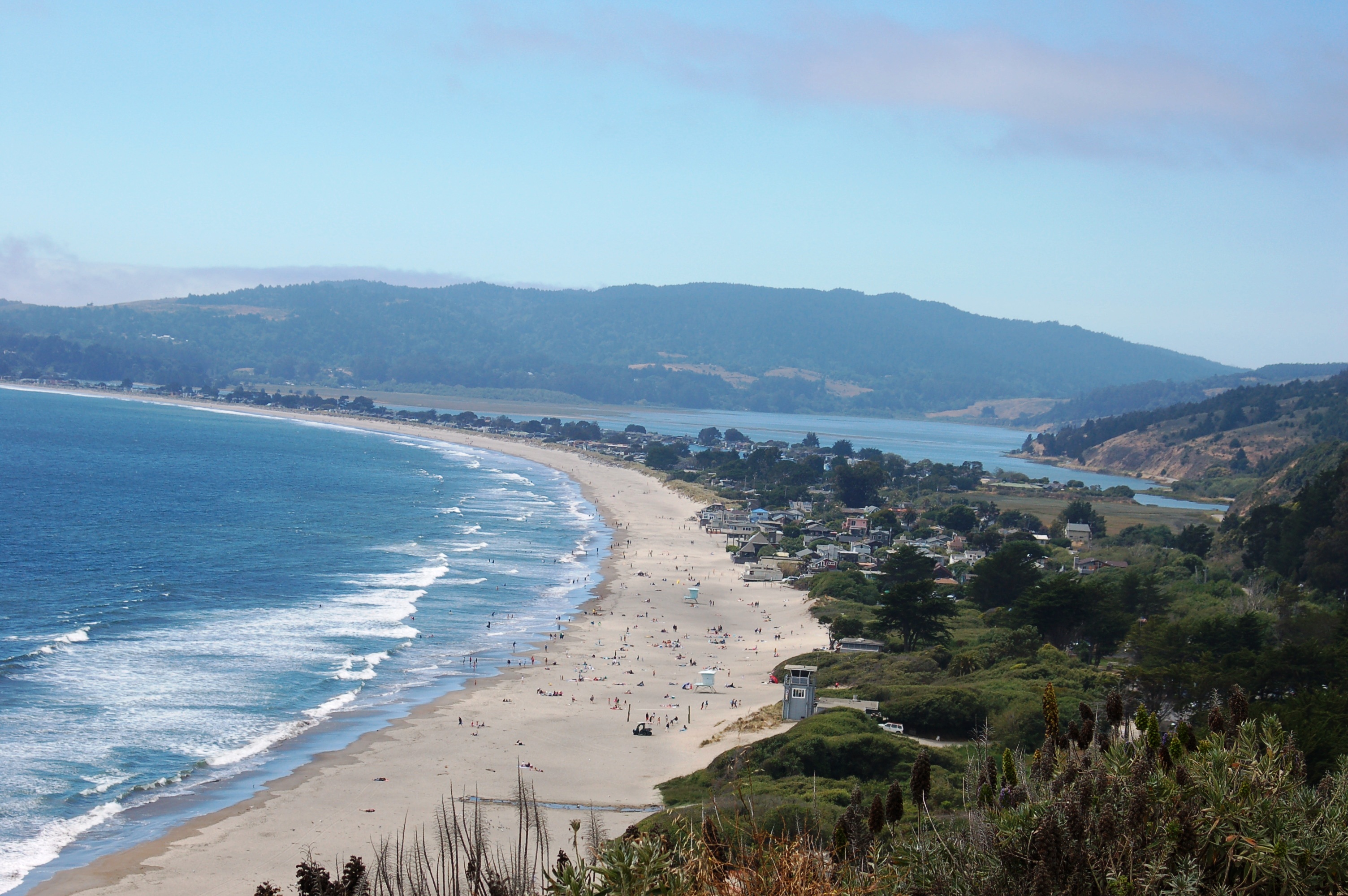
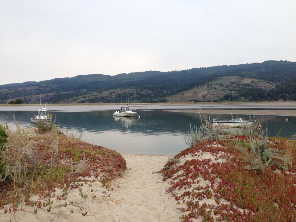
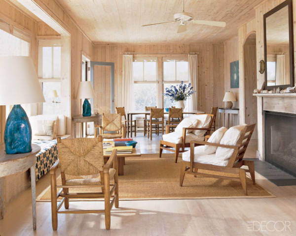
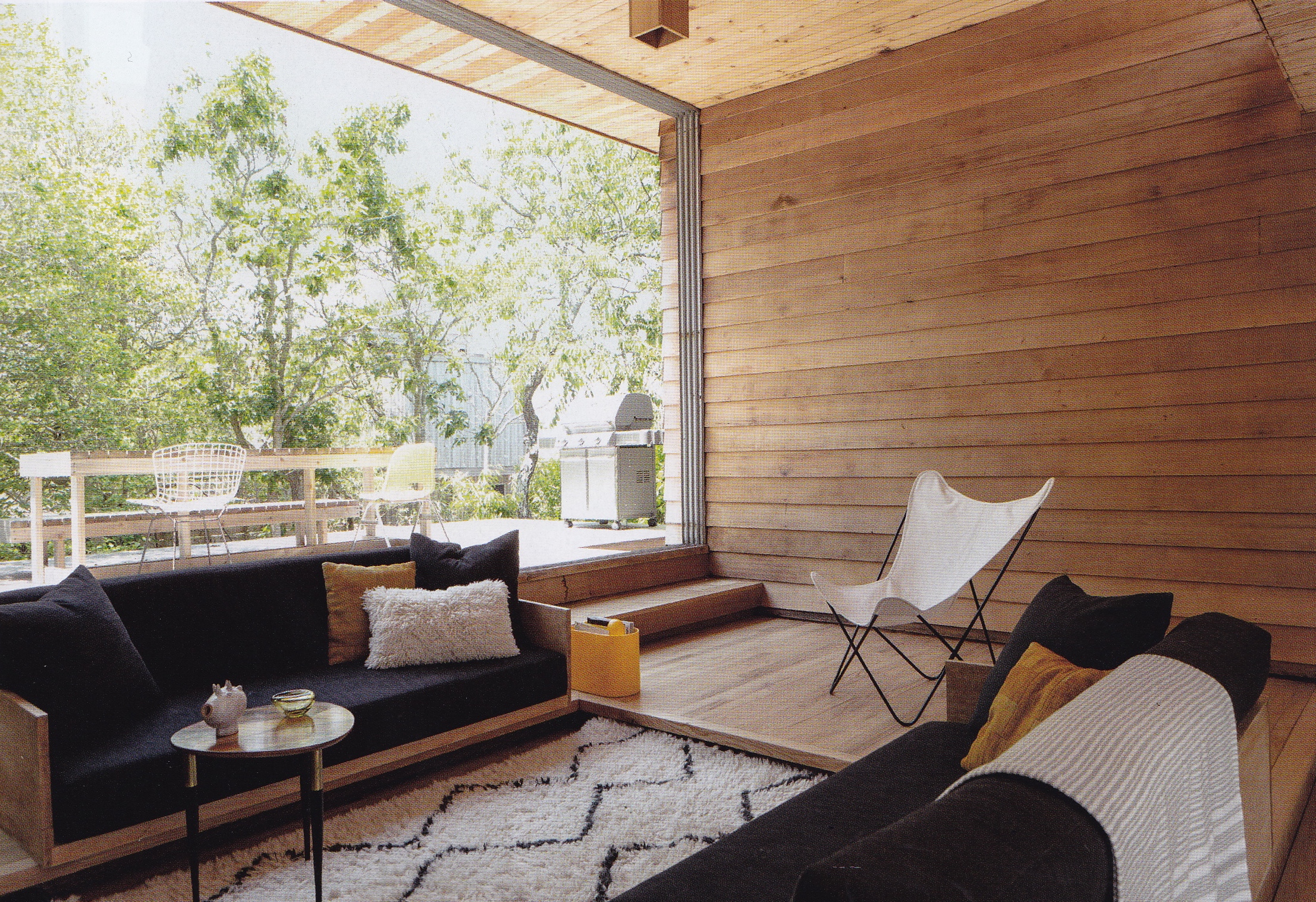
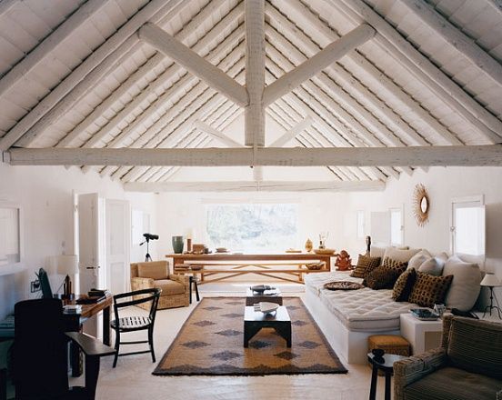
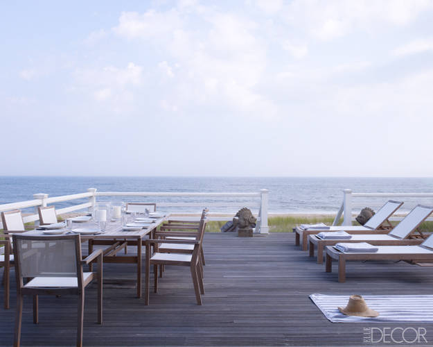
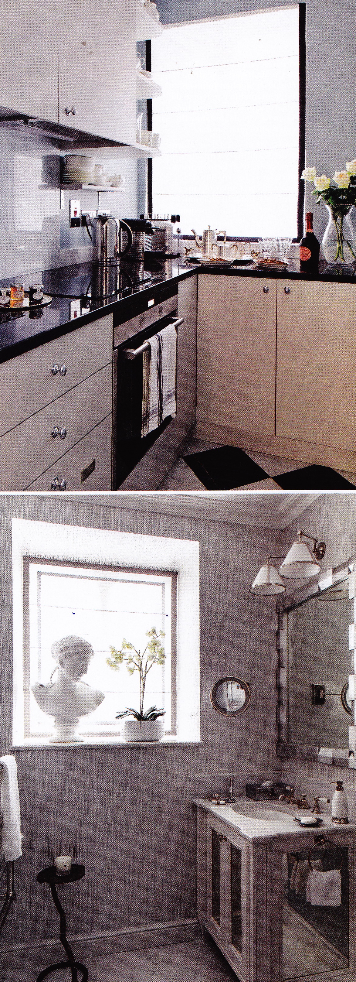
As smitten as I am with Stinson Beach it’s not exactly on everyone’s radar, especially for  those who have never visited or do not live in northern California. Whenever I wear my t-shirt printed with Stinson Beach on its front people ask me where it is, and almost always assume it’s somewhere on the Cape, for whatever reason. With zero development and limited access to large trucks to bring in building materials, Stinson Beach has remained pretty much the same as it always has been: a sleepy little beach town with a few hippies and a few millionaires.

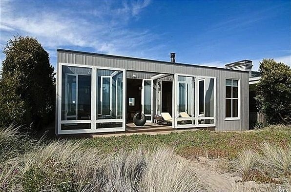
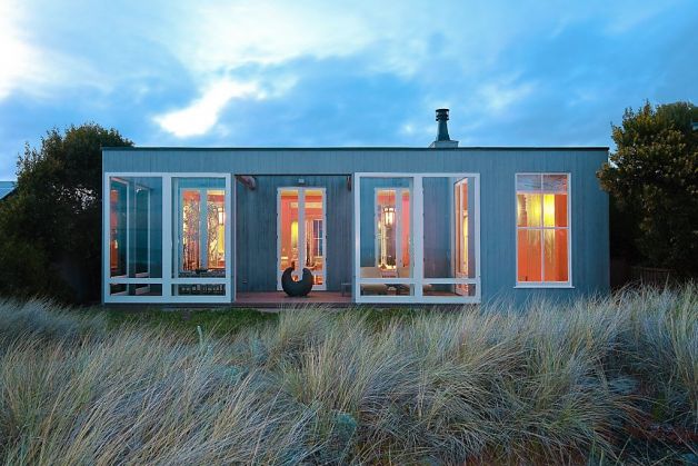
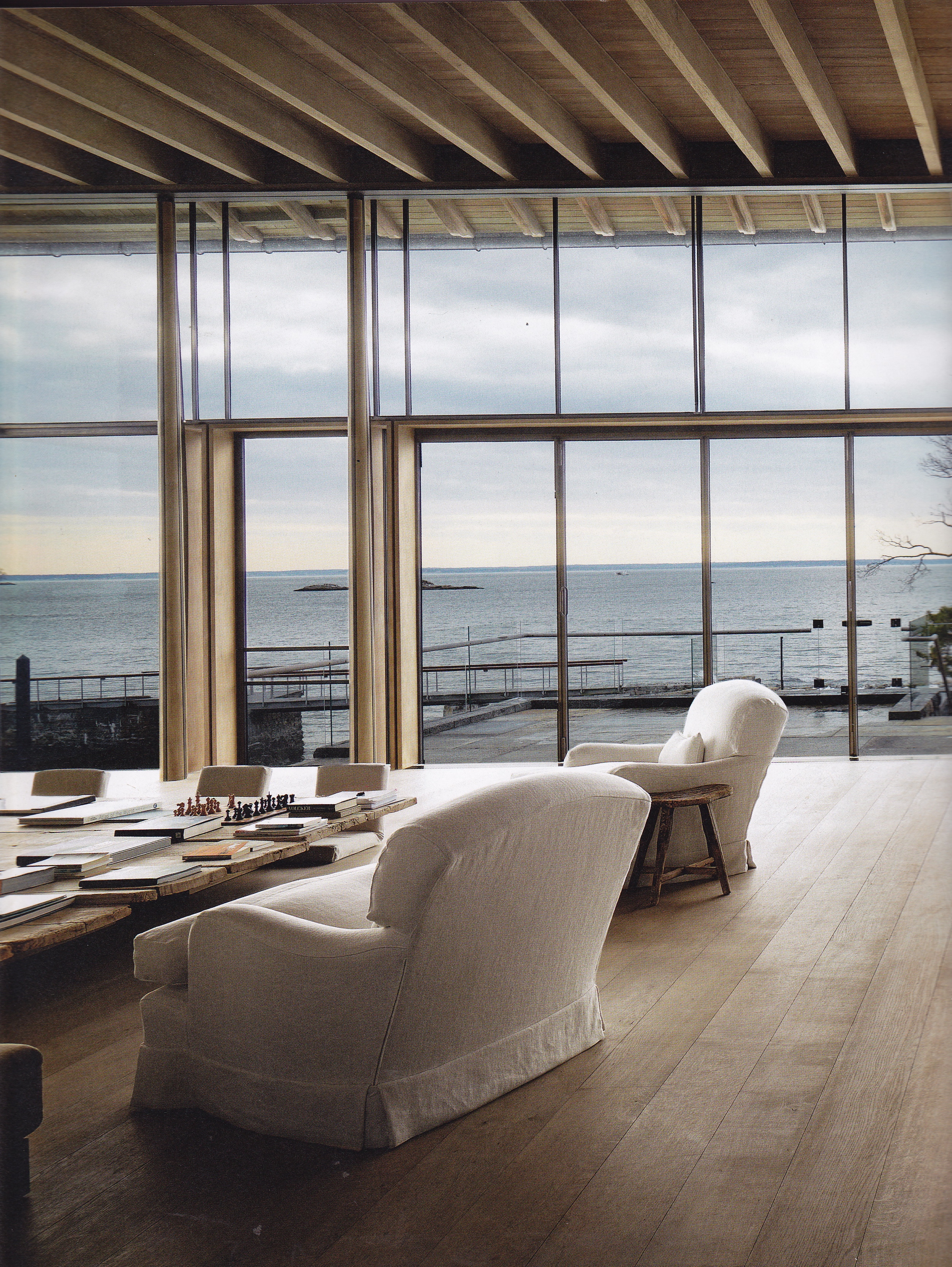
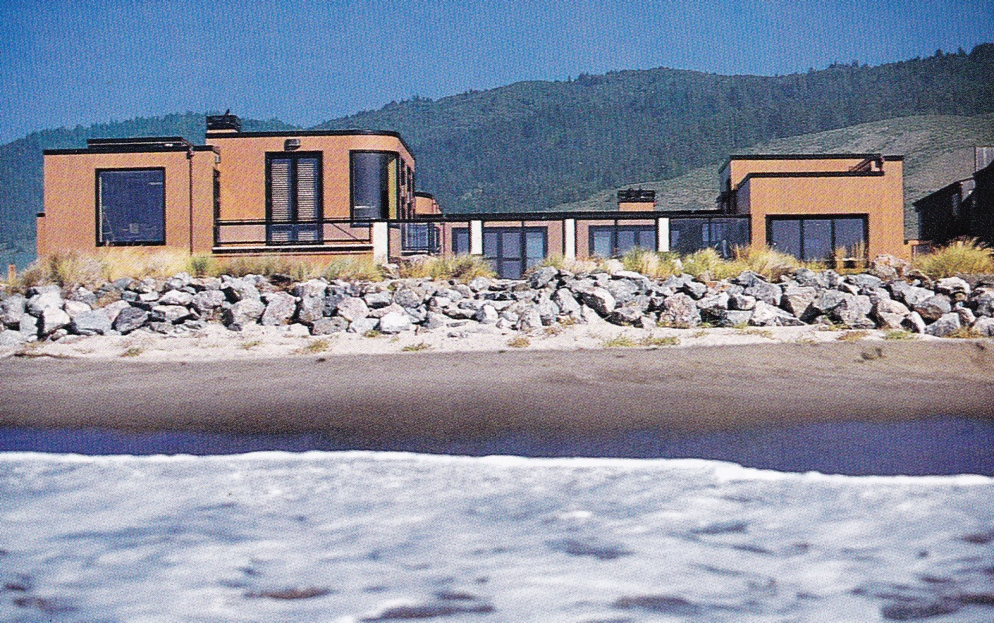
You can always tell when the latest millionaire builds on Stinson Beach in the gated community of Seadrift. As the years advanced, and the community’s beach shacks and ranch style houses aged, dot-commers swept in and scooped them up, replacing them with their own private castles on the sand. One of the earliest I recall is a rambling house built by Walker & Moody Architects with interiors by Sally Sirkin Lewis in the latter 1990’s.

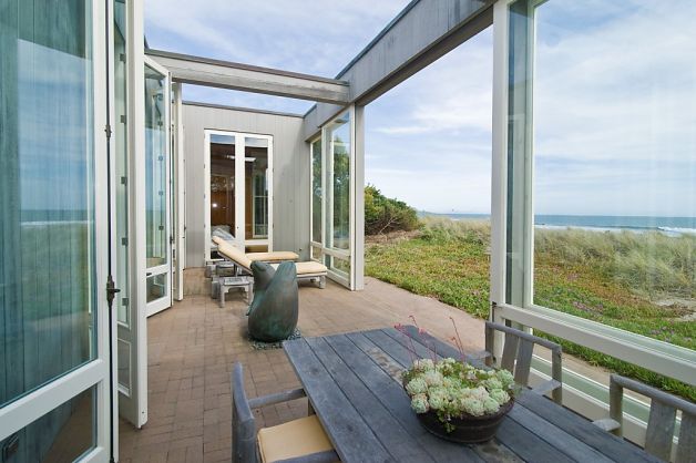
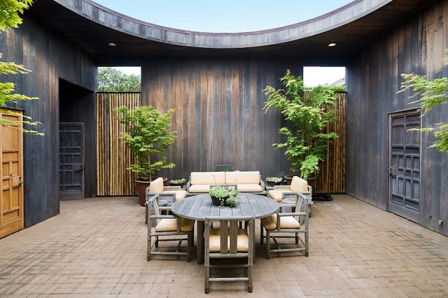
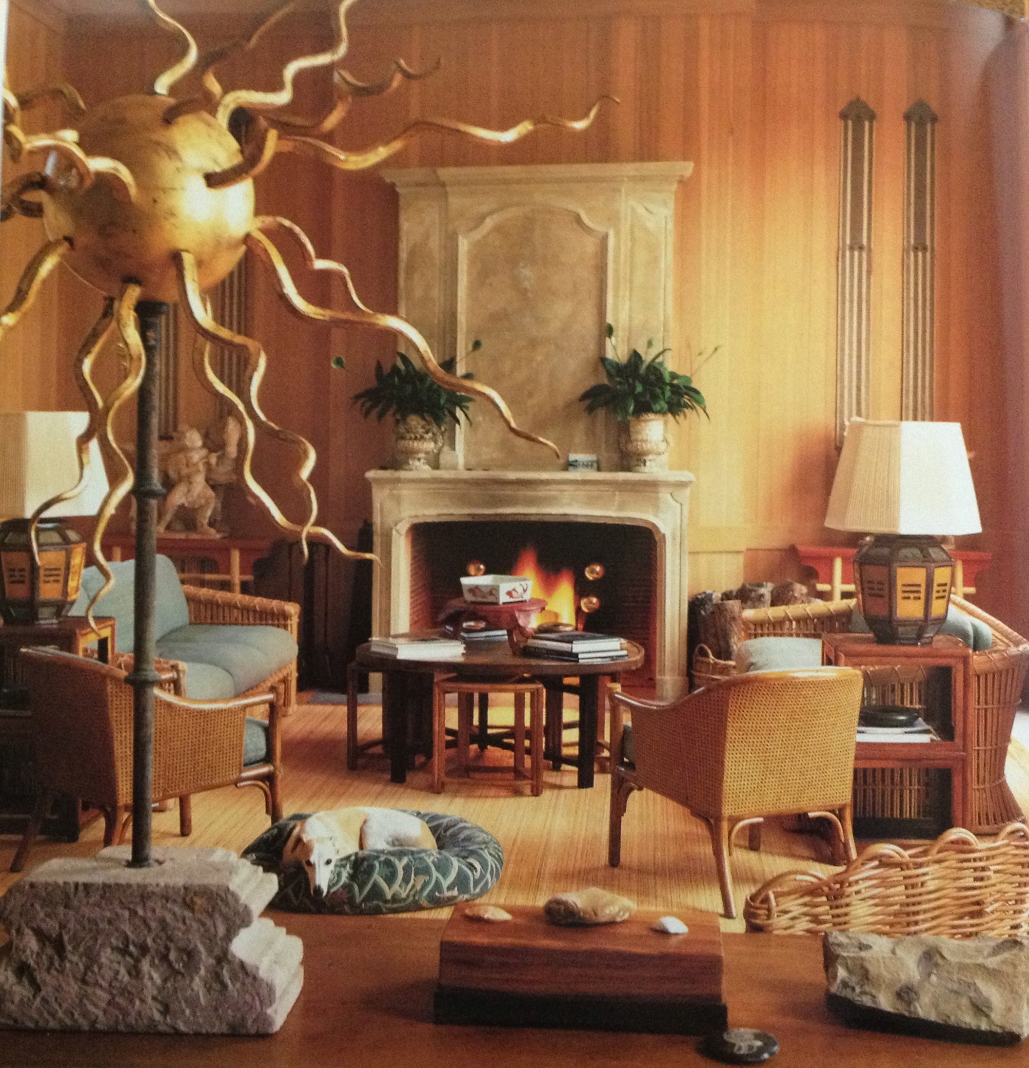
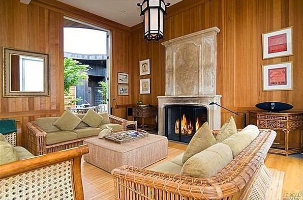
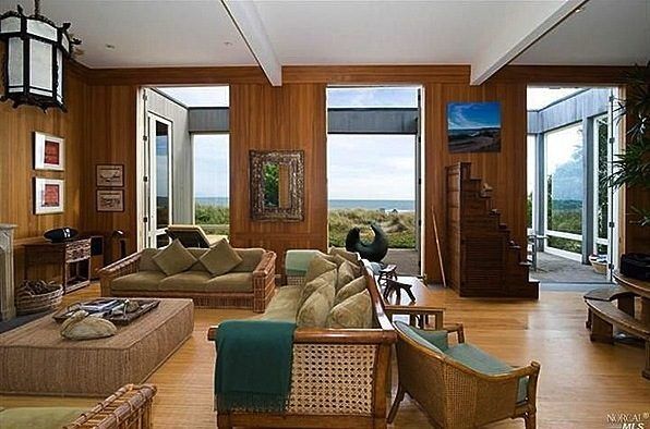
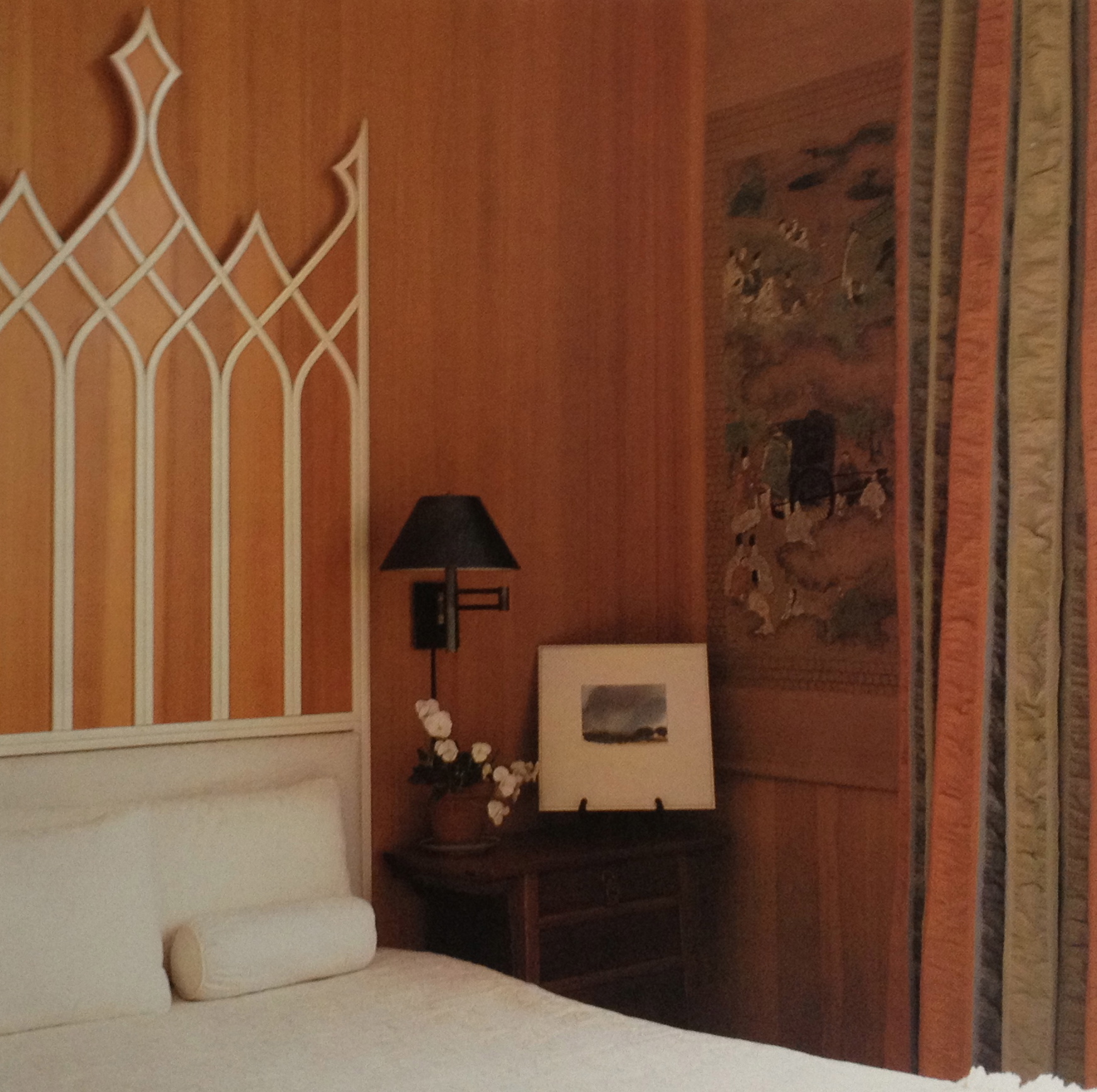
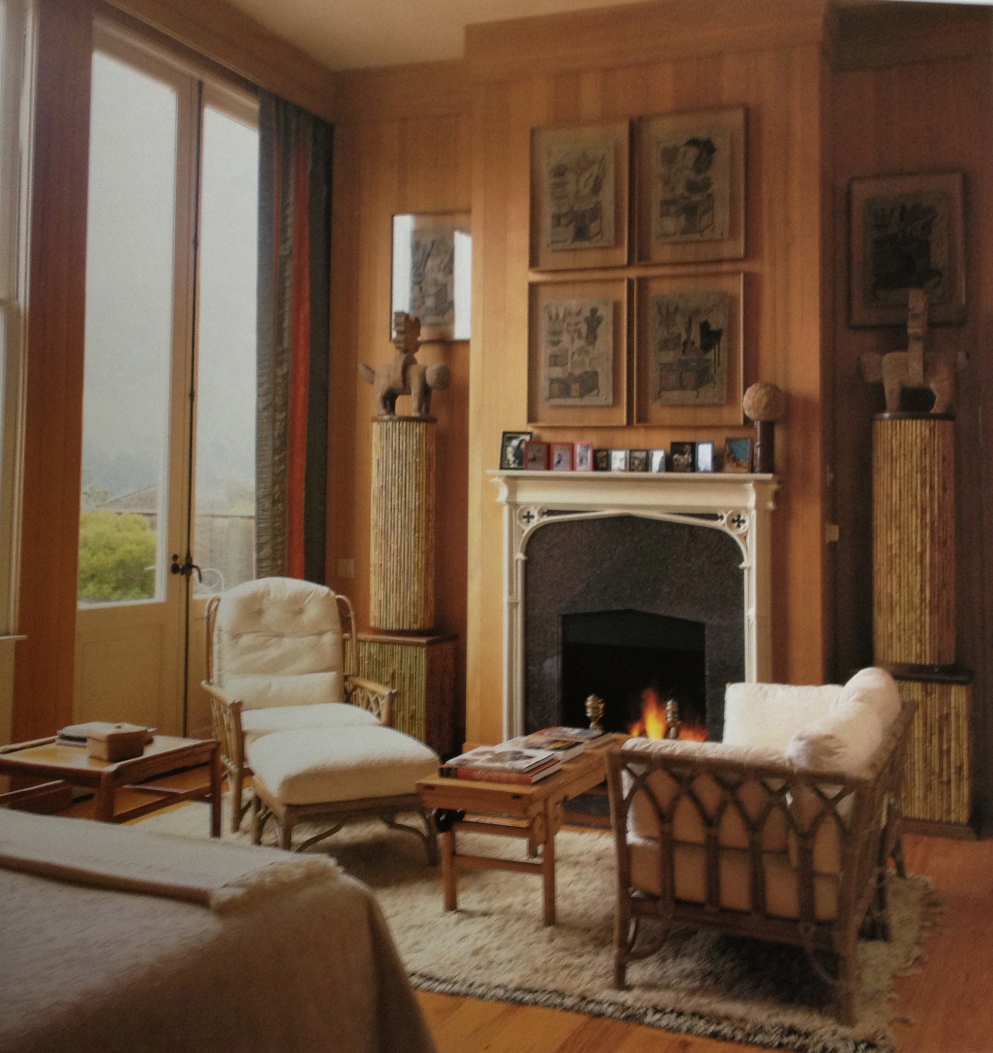
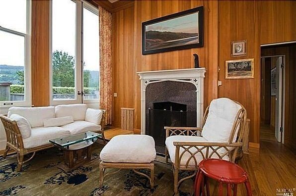
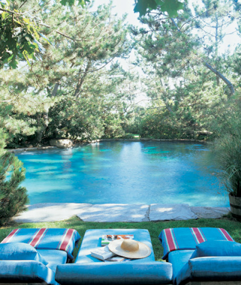
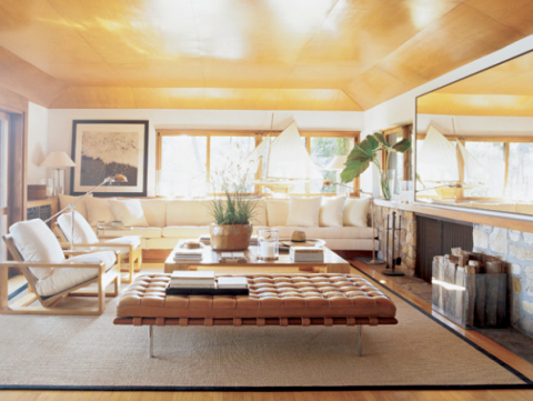
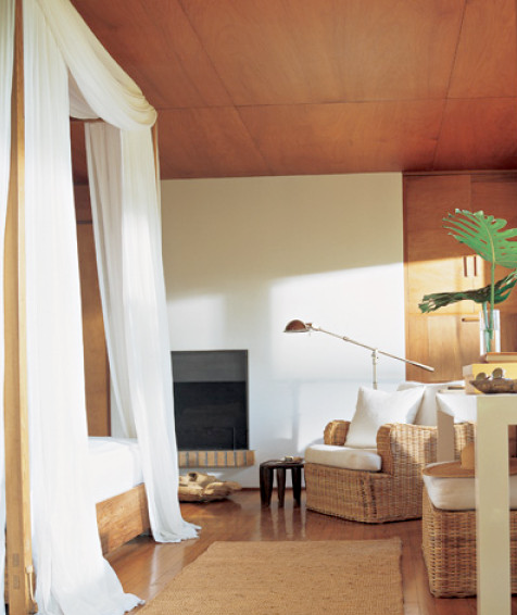
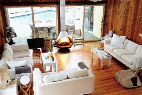
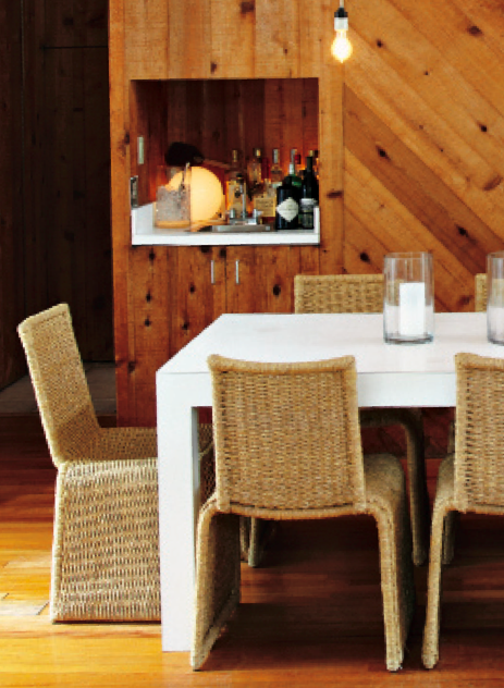
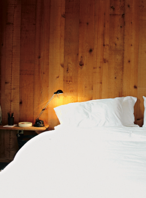
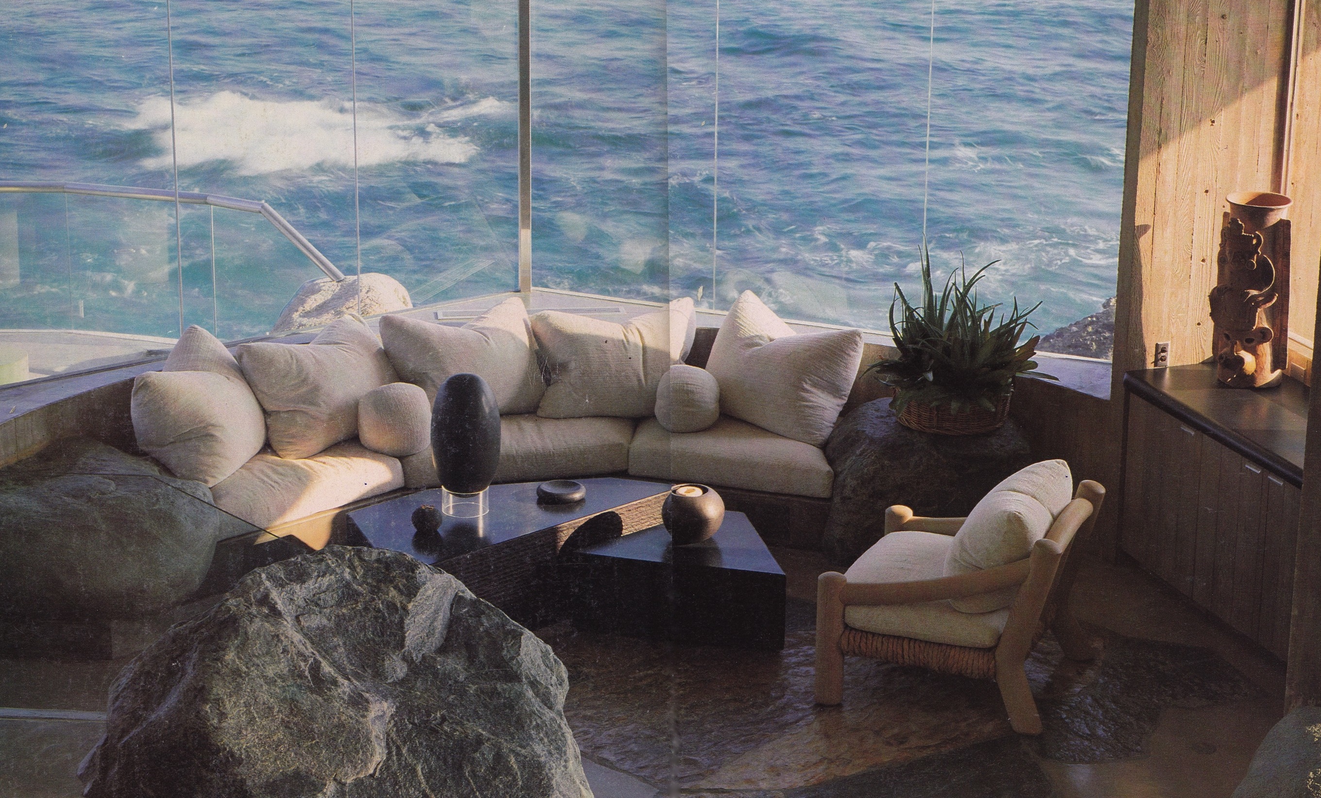
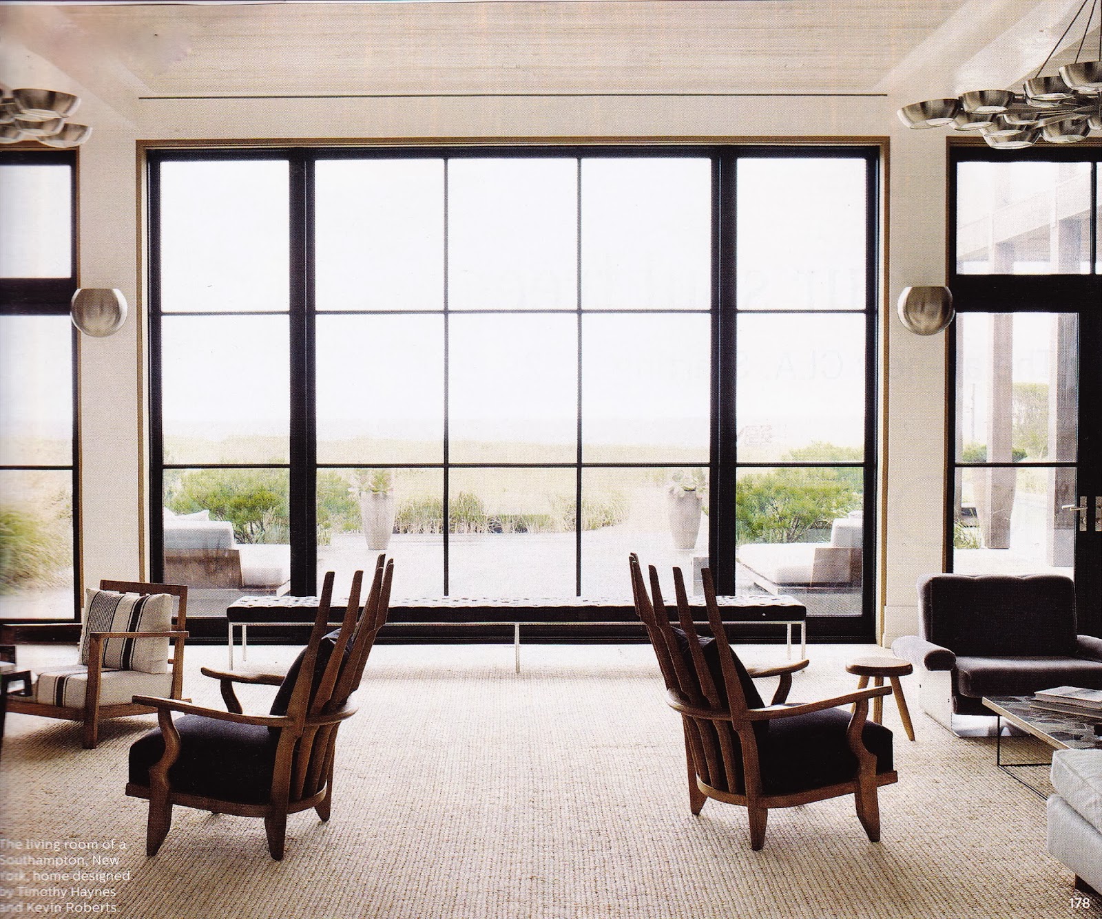
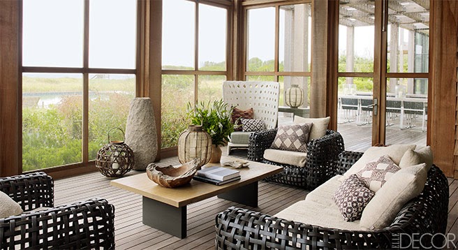
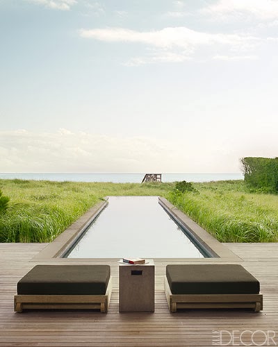
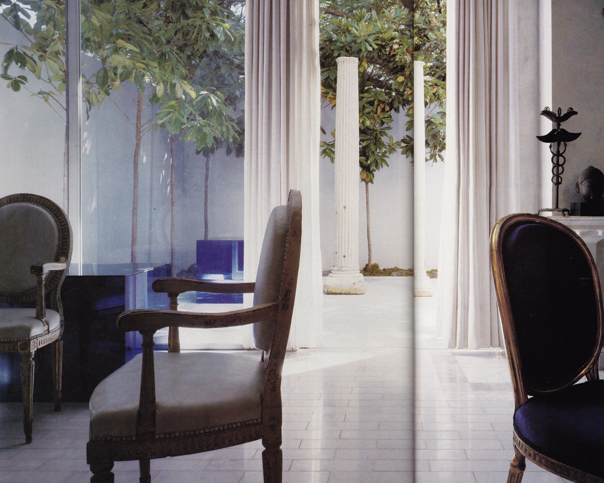
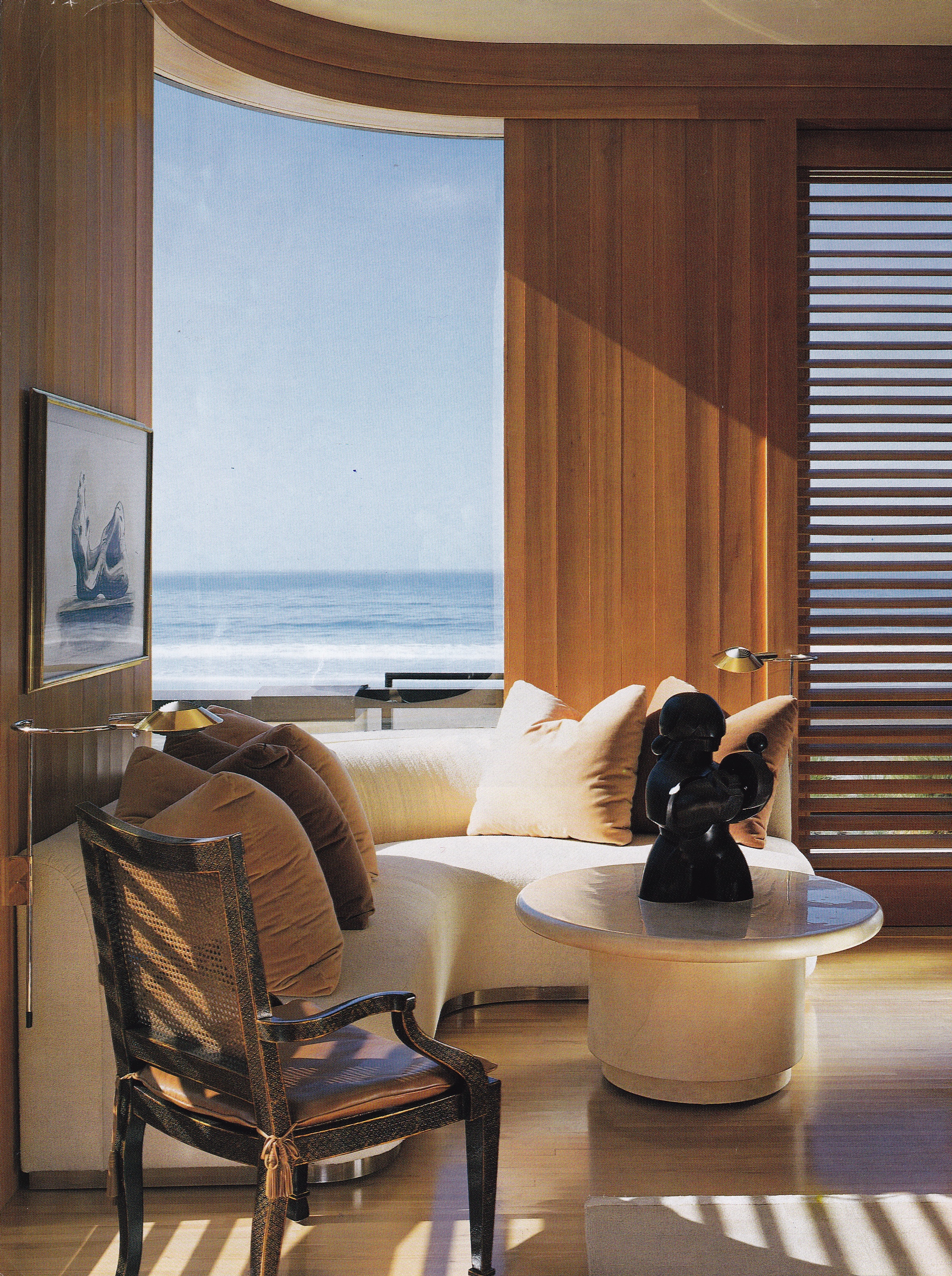
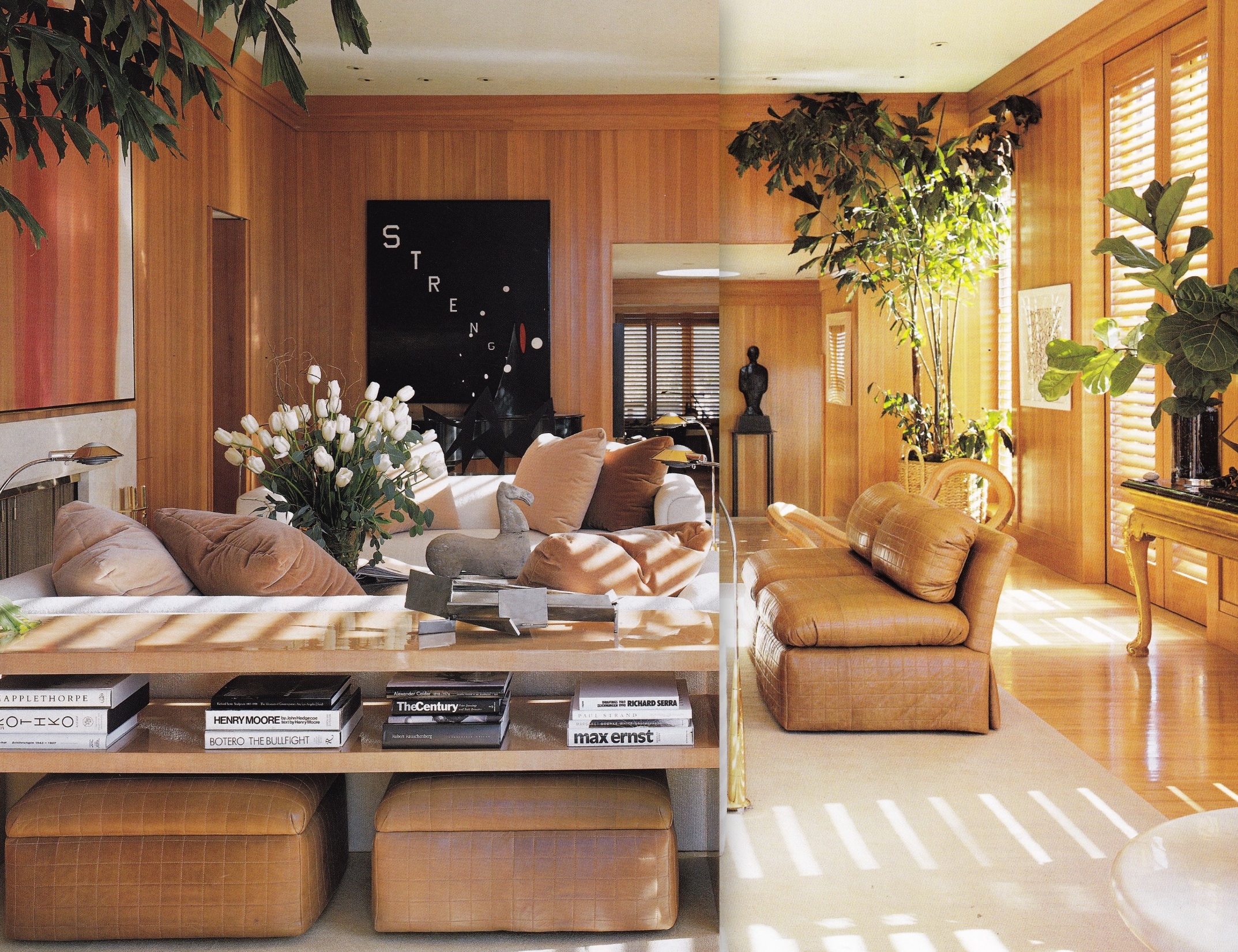
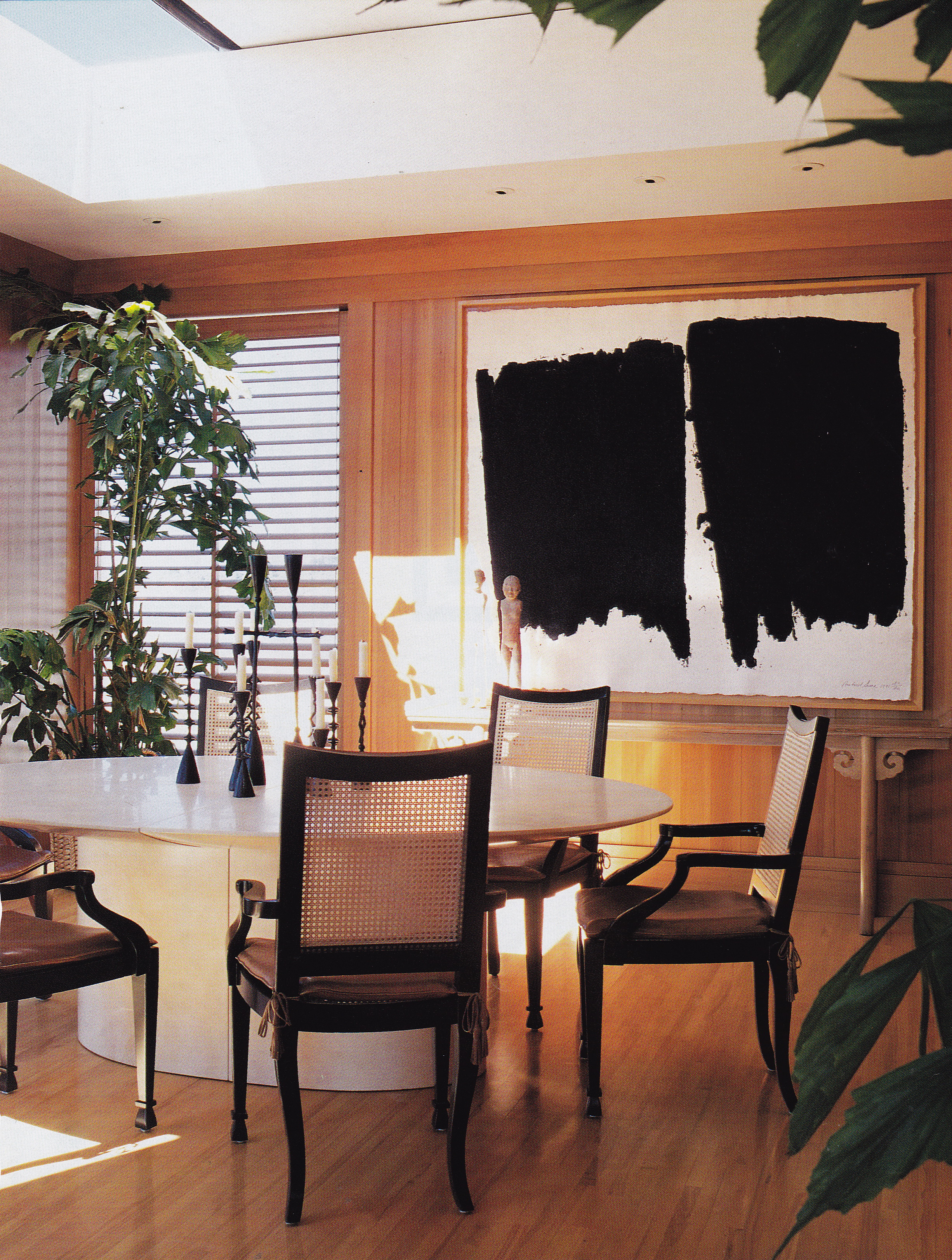
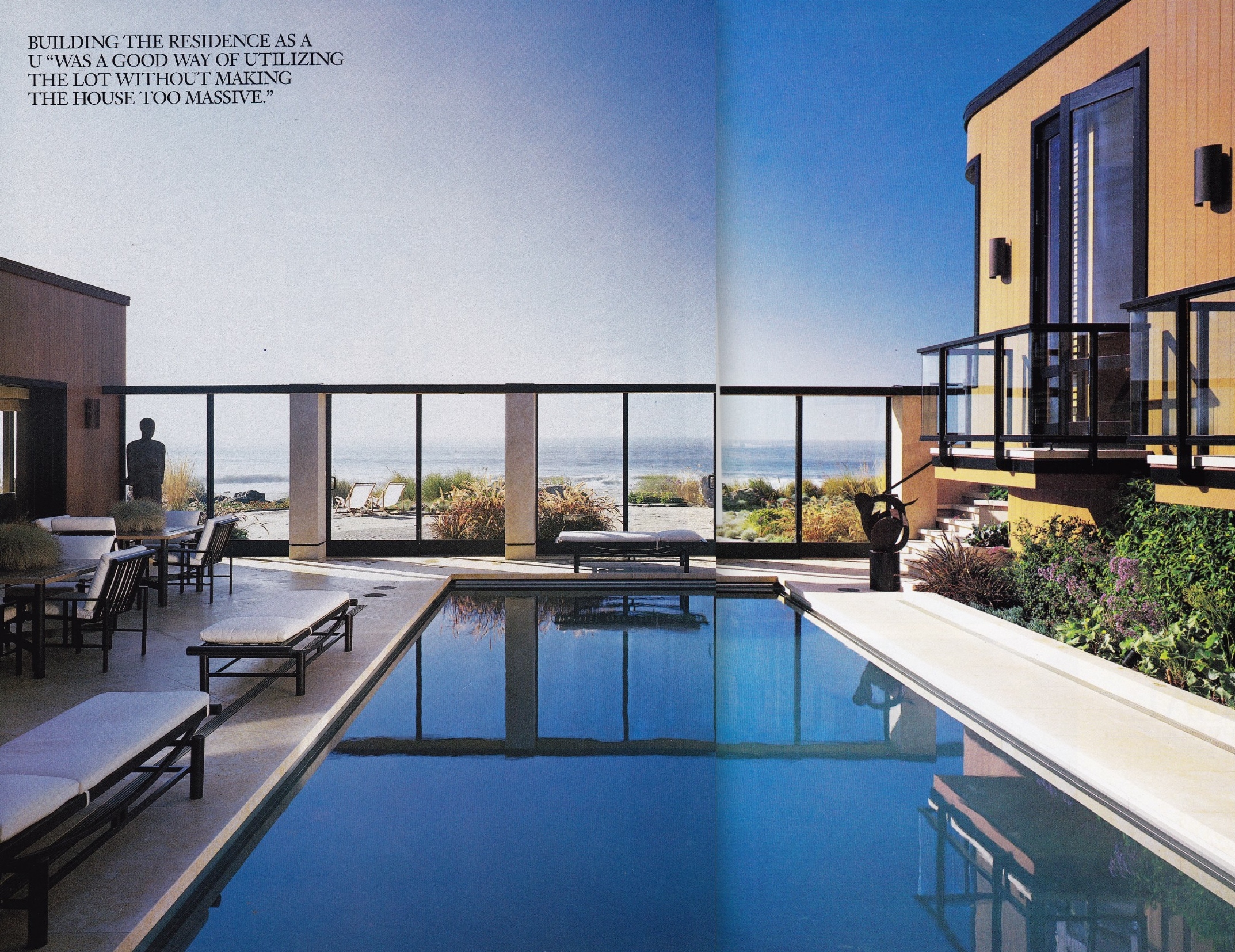
Large by Stinson Beach standards the house extends two lots wide in a u-shape around a central courtyard with one of the community’s few swimming pools, protected by a glass curtain wall. The beachside elevation reveals an expanse of floor-to-ceiling windows framed in black against wood siding stained to match the hemlock paneled walls of the interior. Sections of the home are elevated to take in the views, giving it the appearance of a ship mooring. I recall being fascinated with its evolution as it was being built and curious about what plans for its interiors lie in wait.

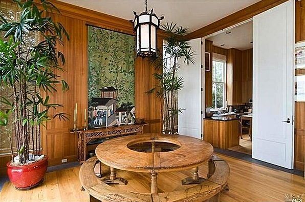
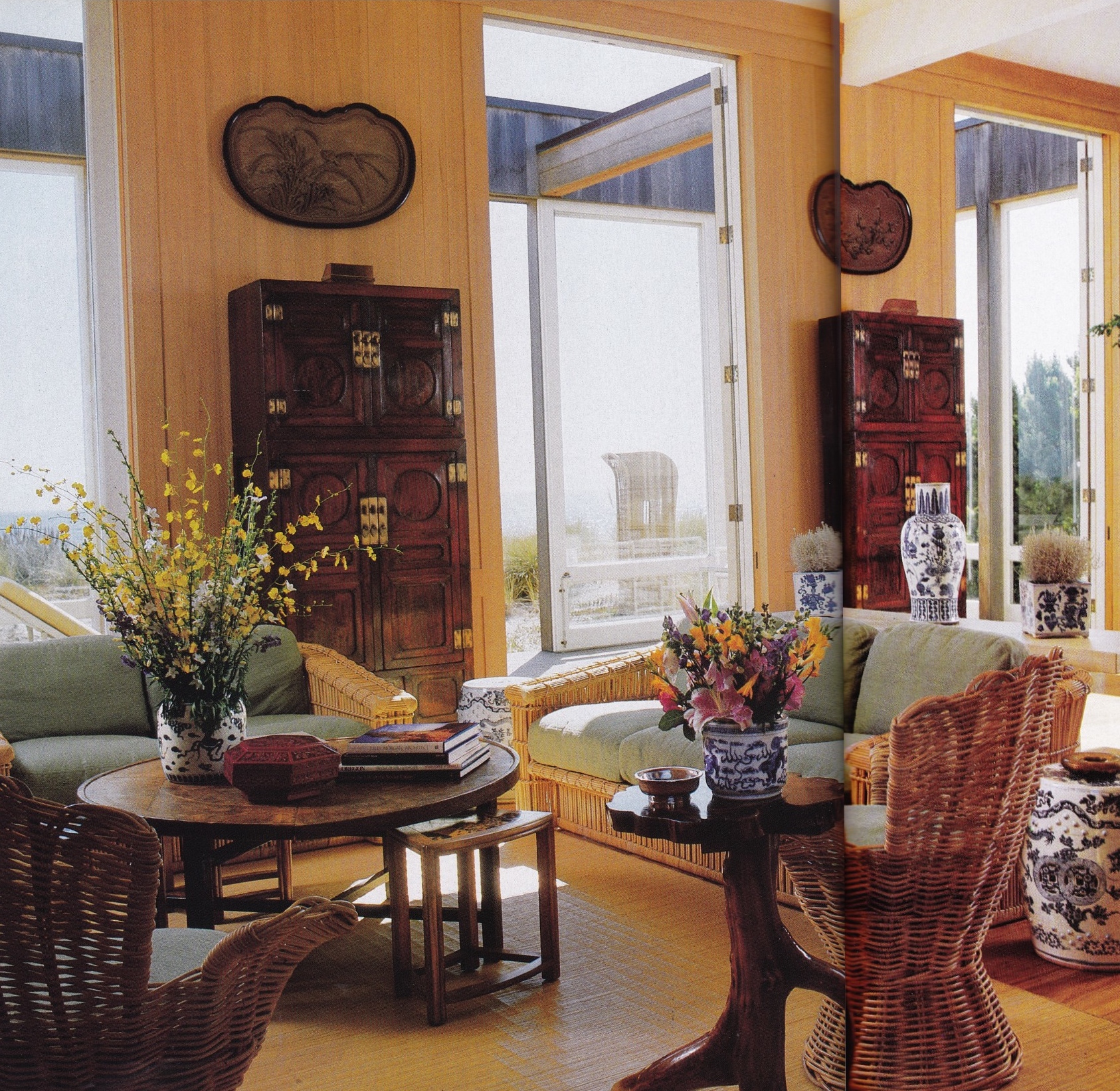
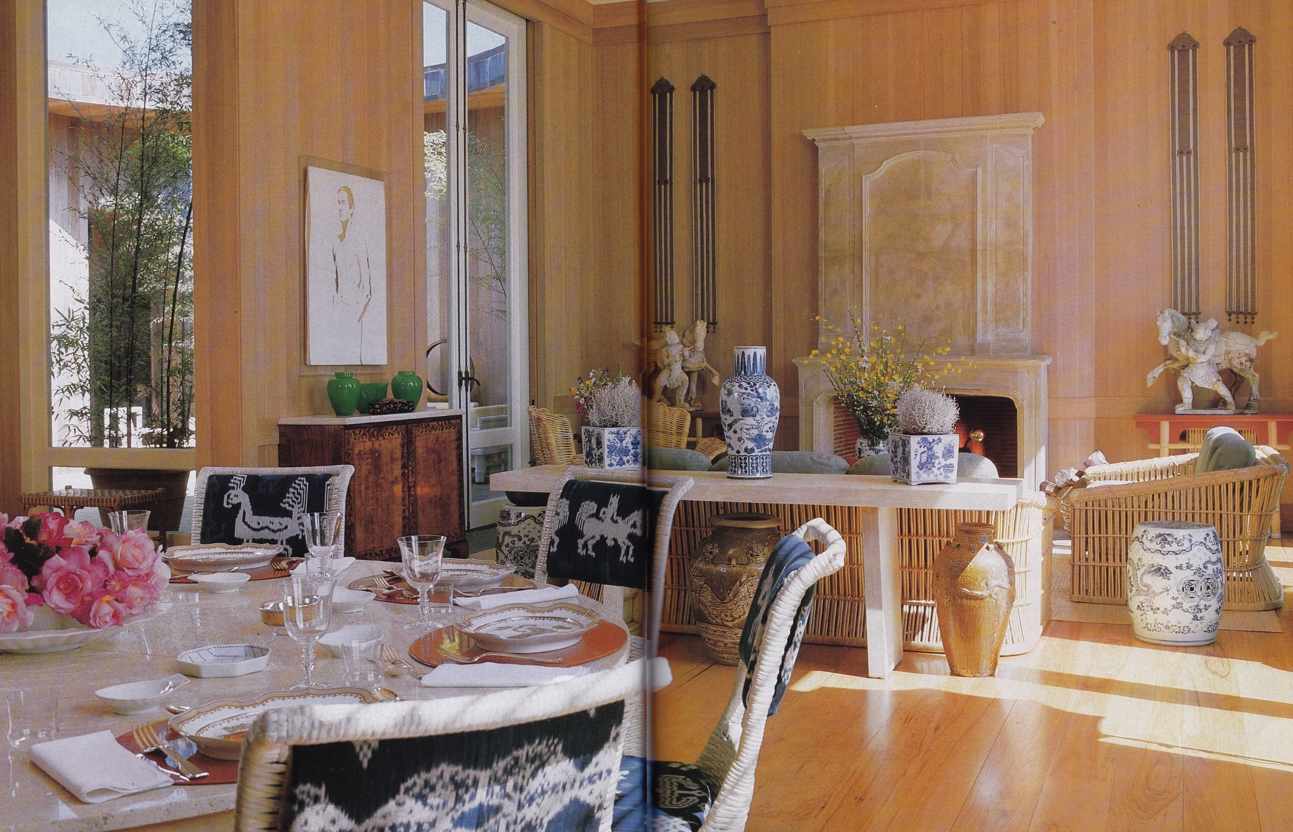
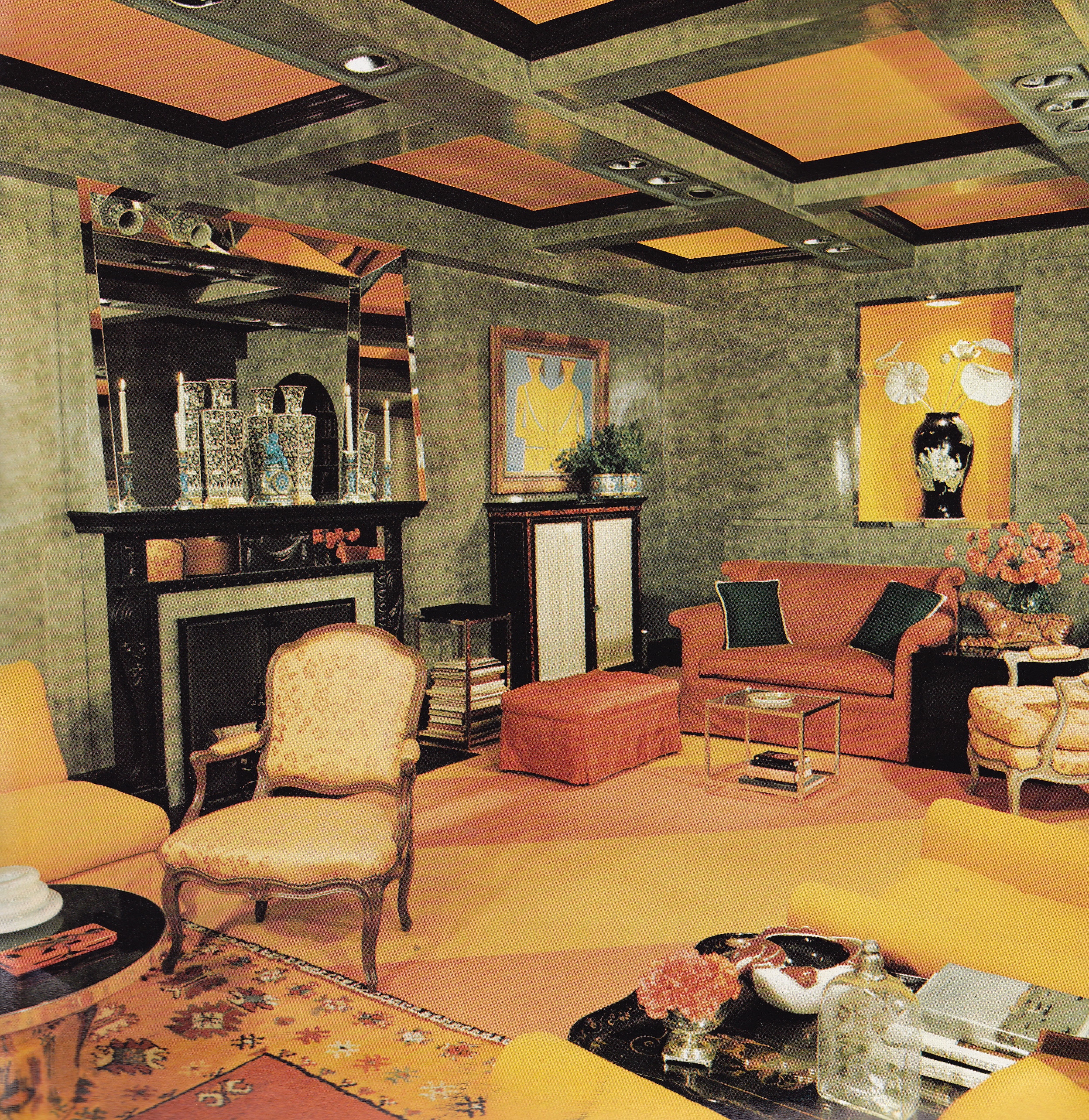
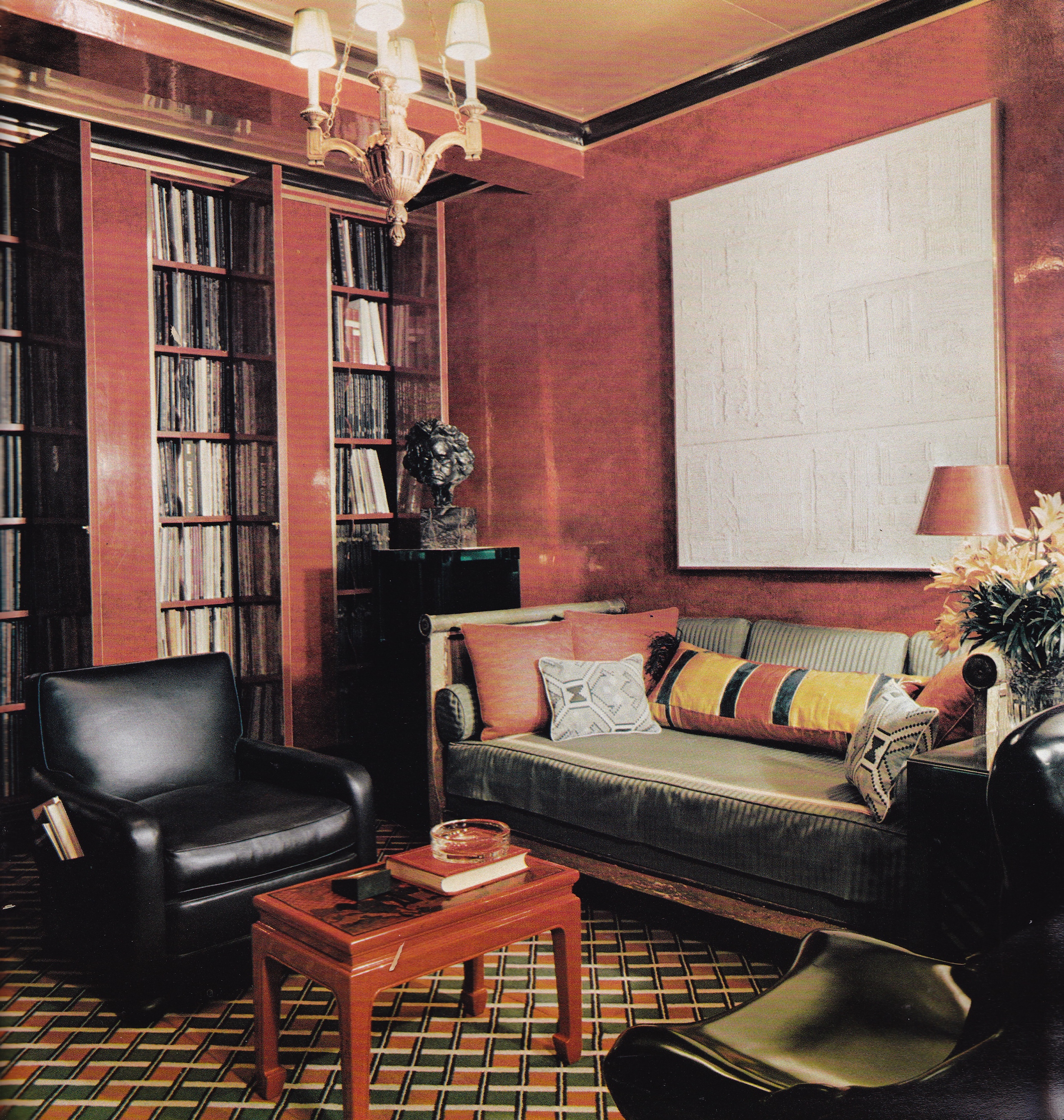
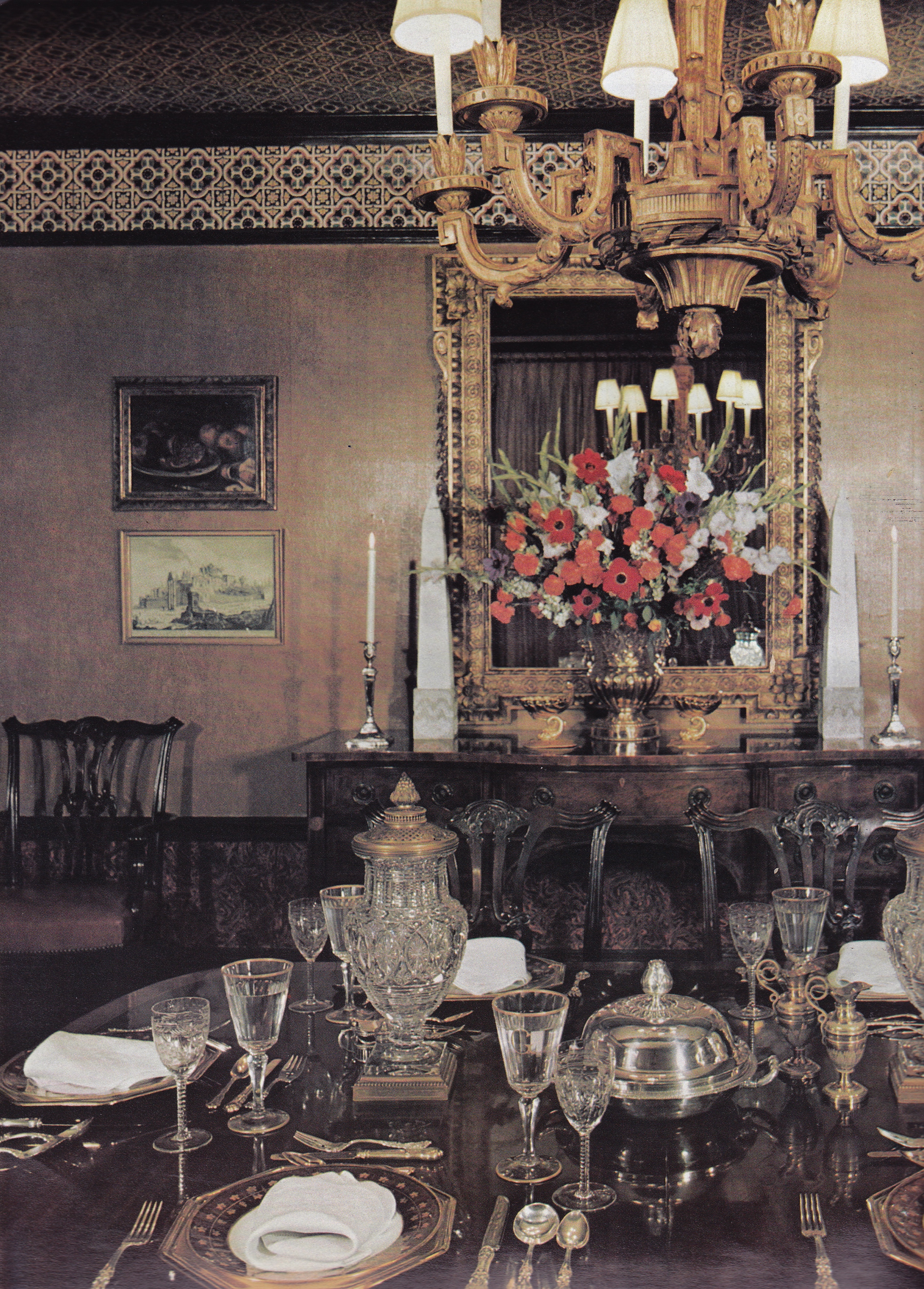
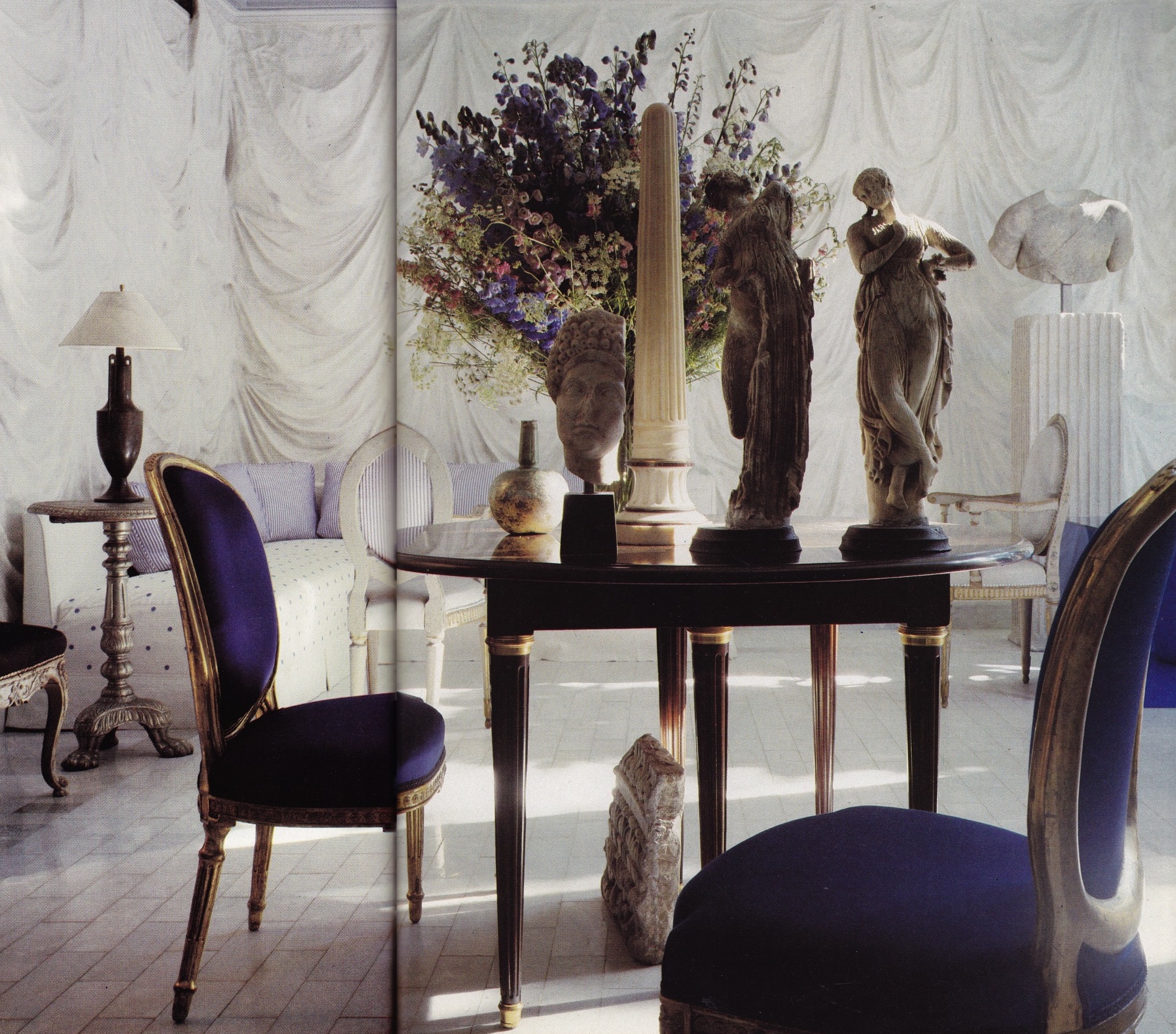
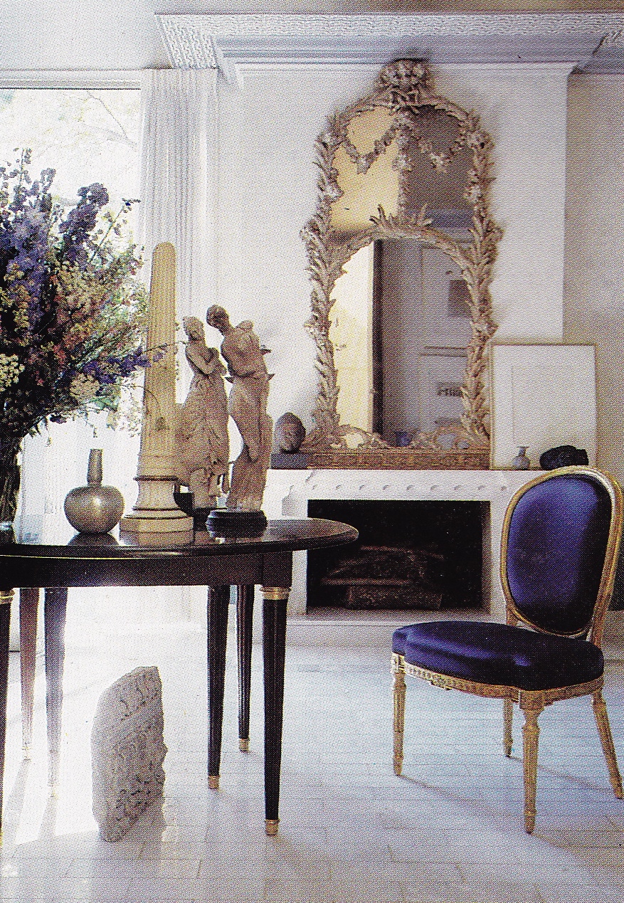
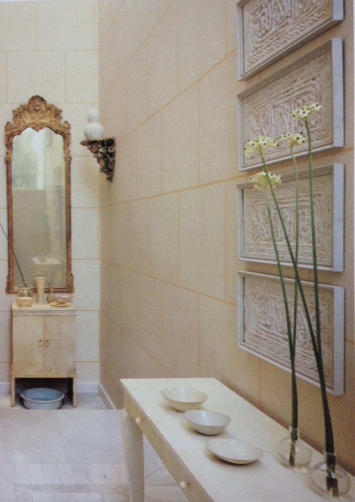
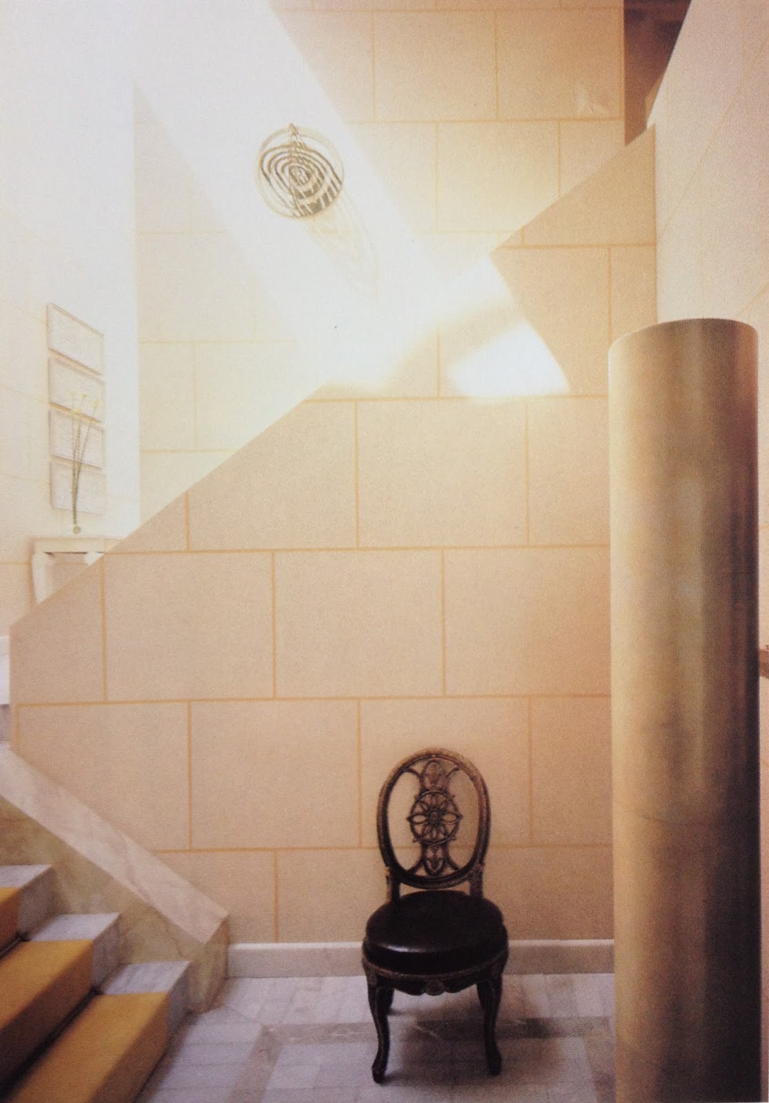
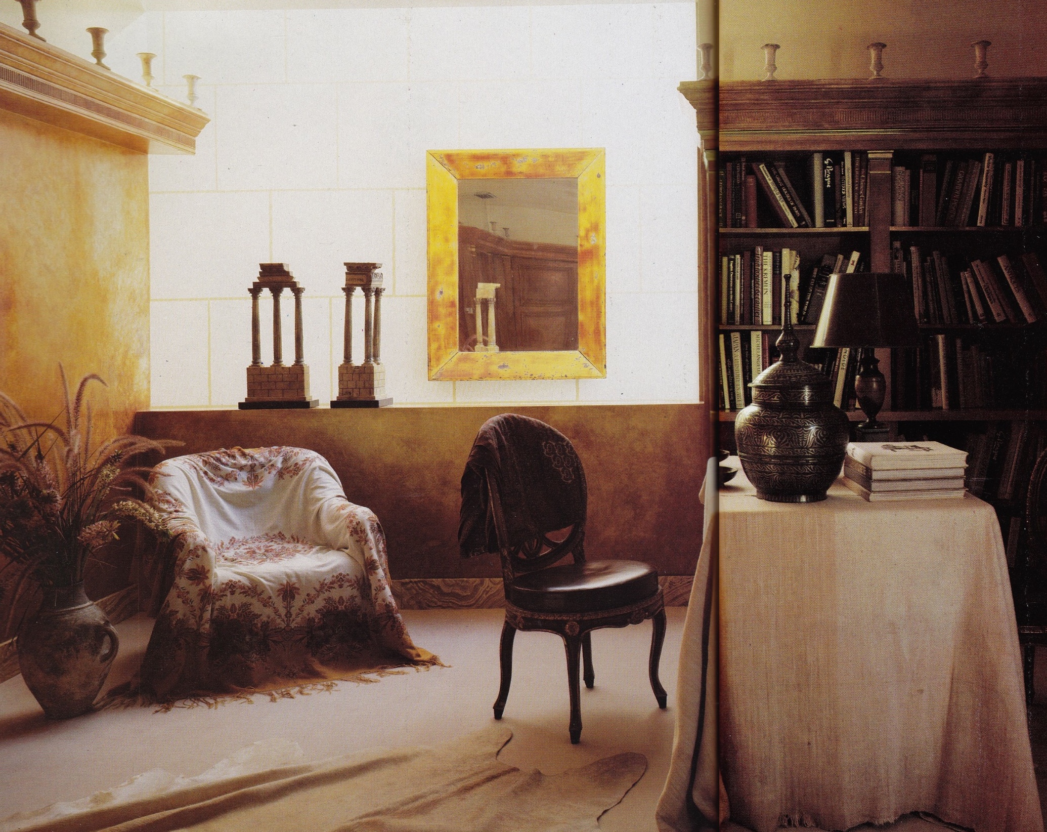
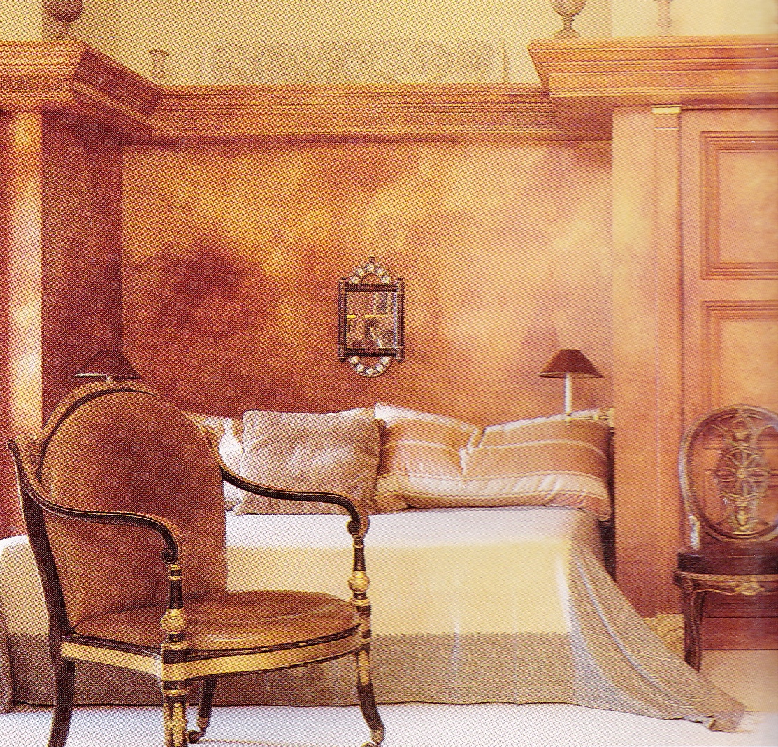
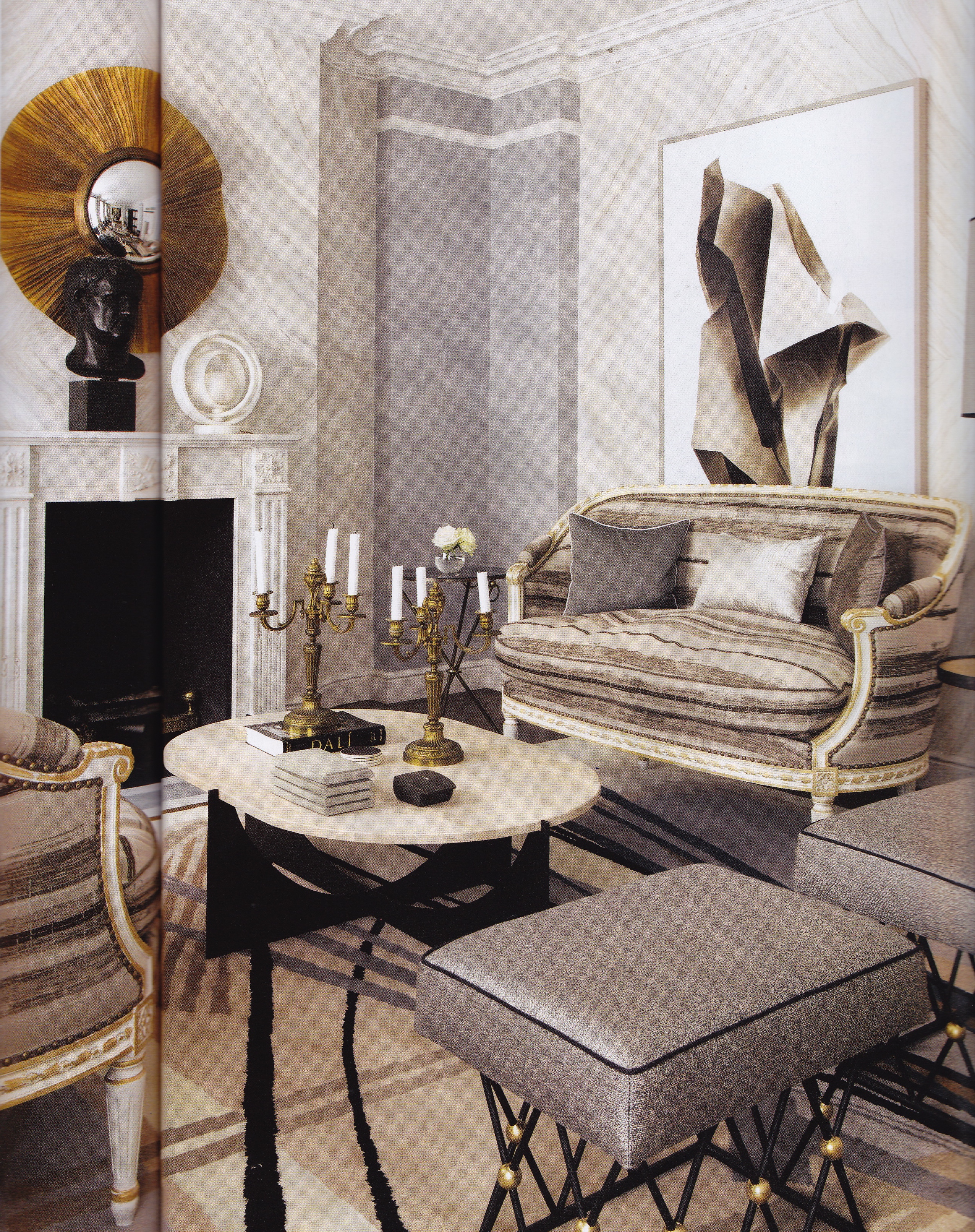
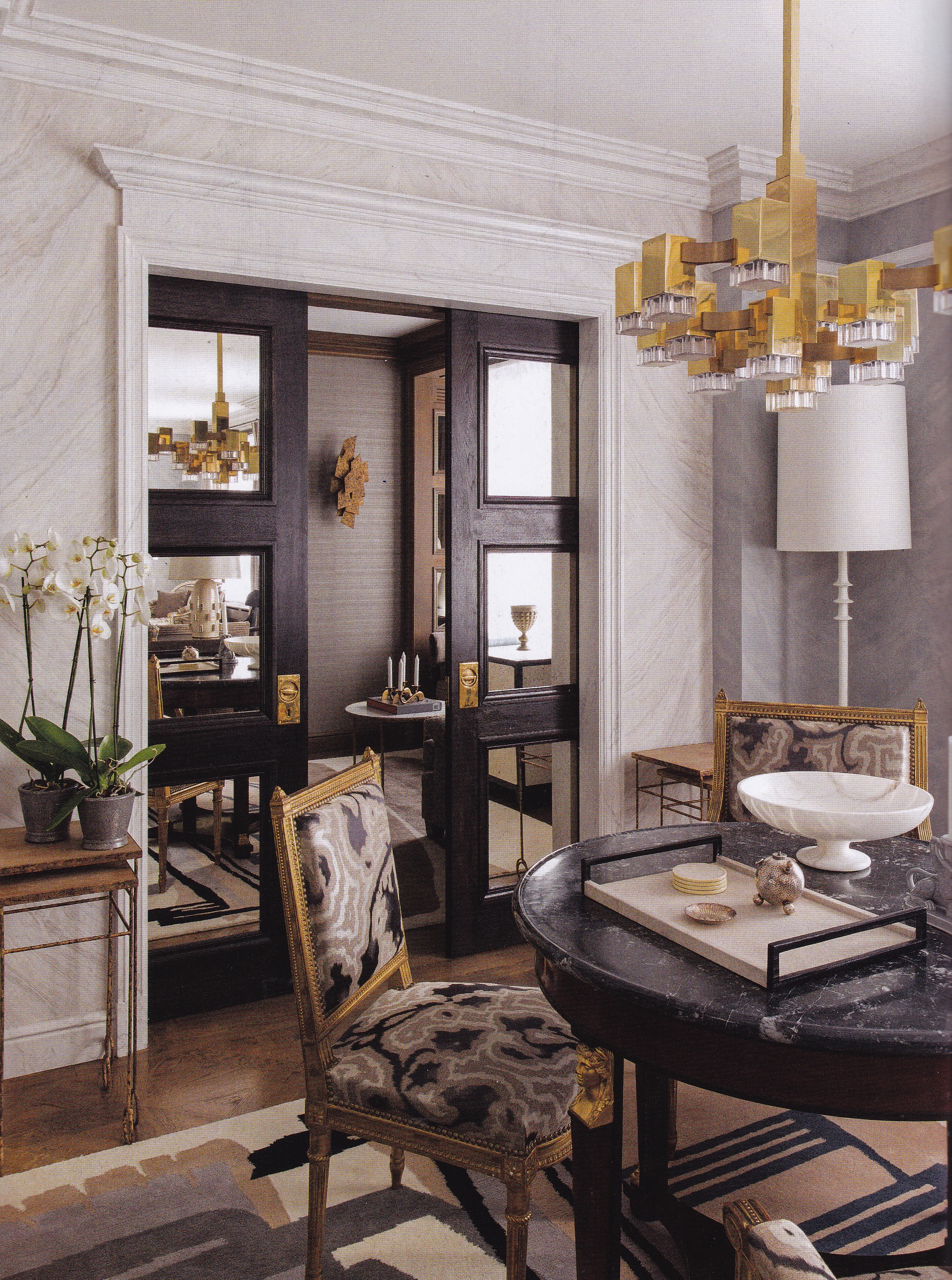
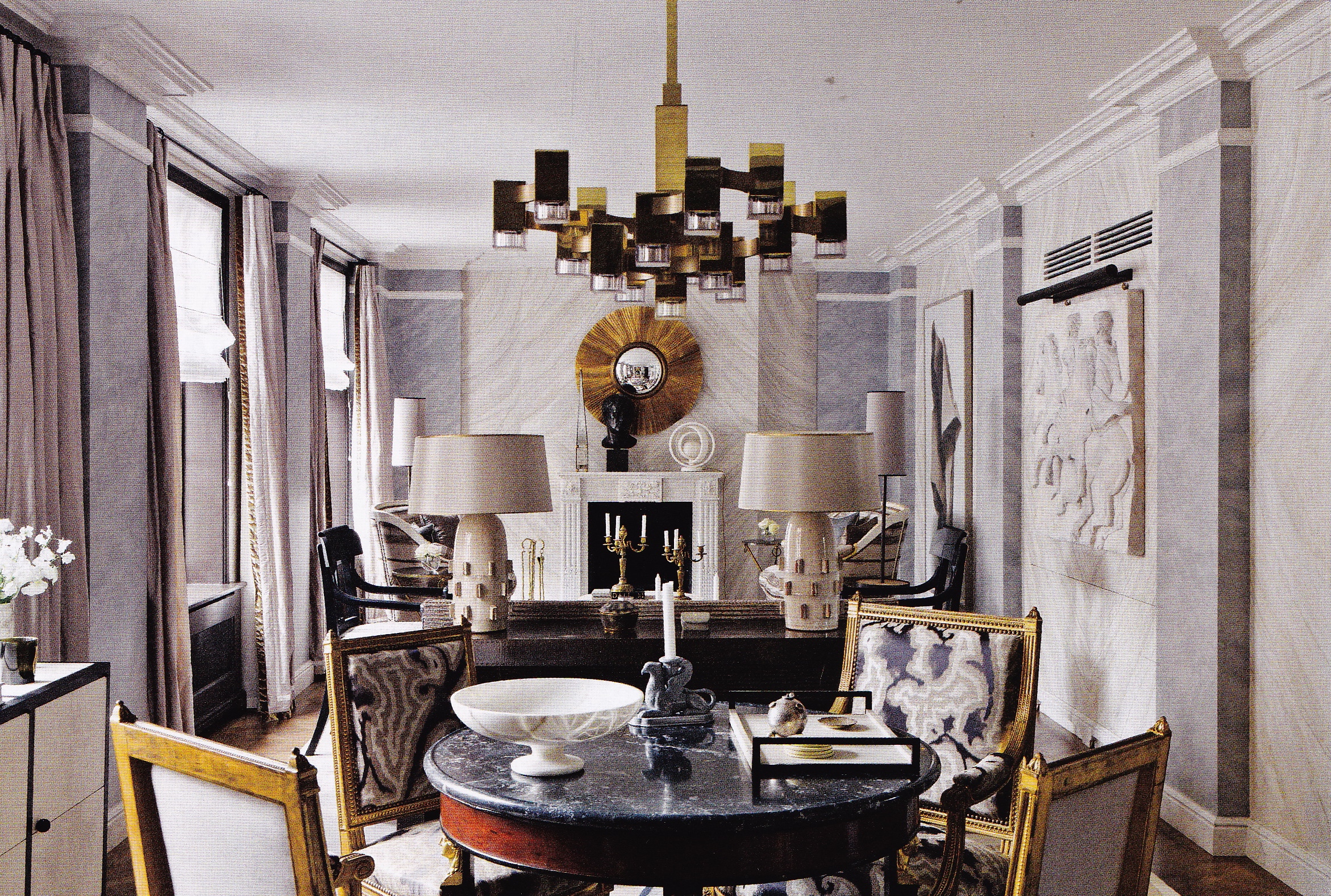
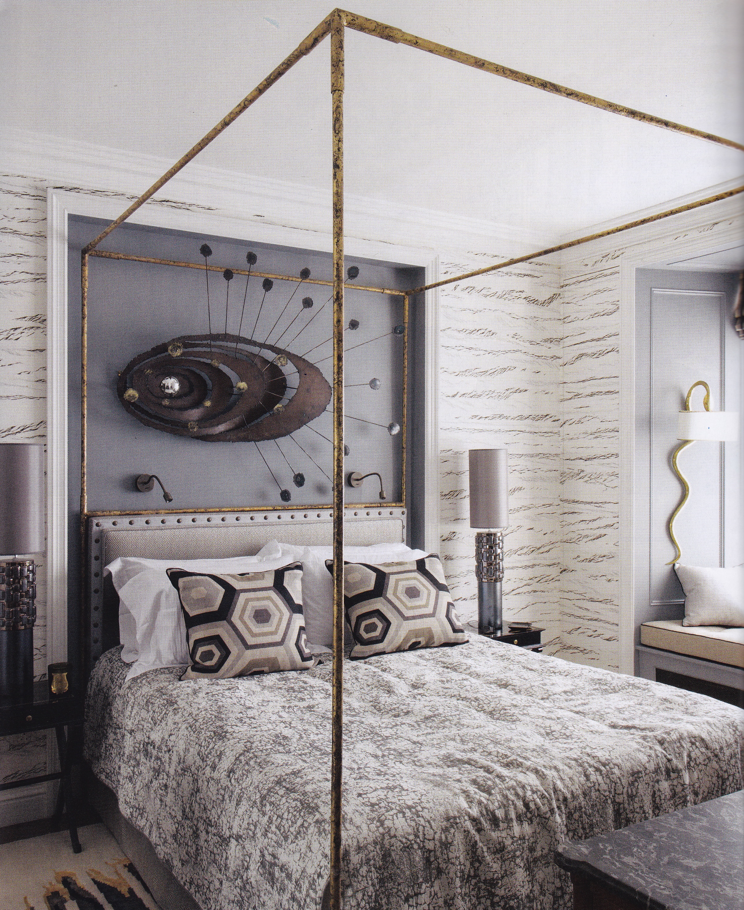
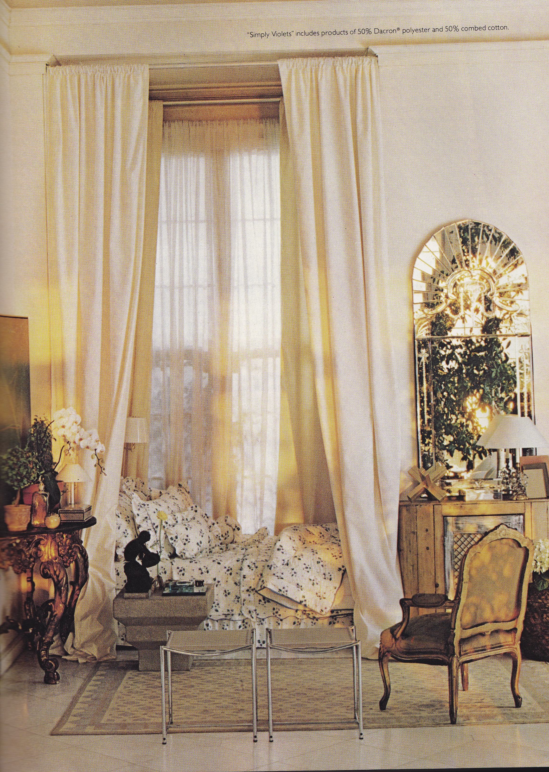
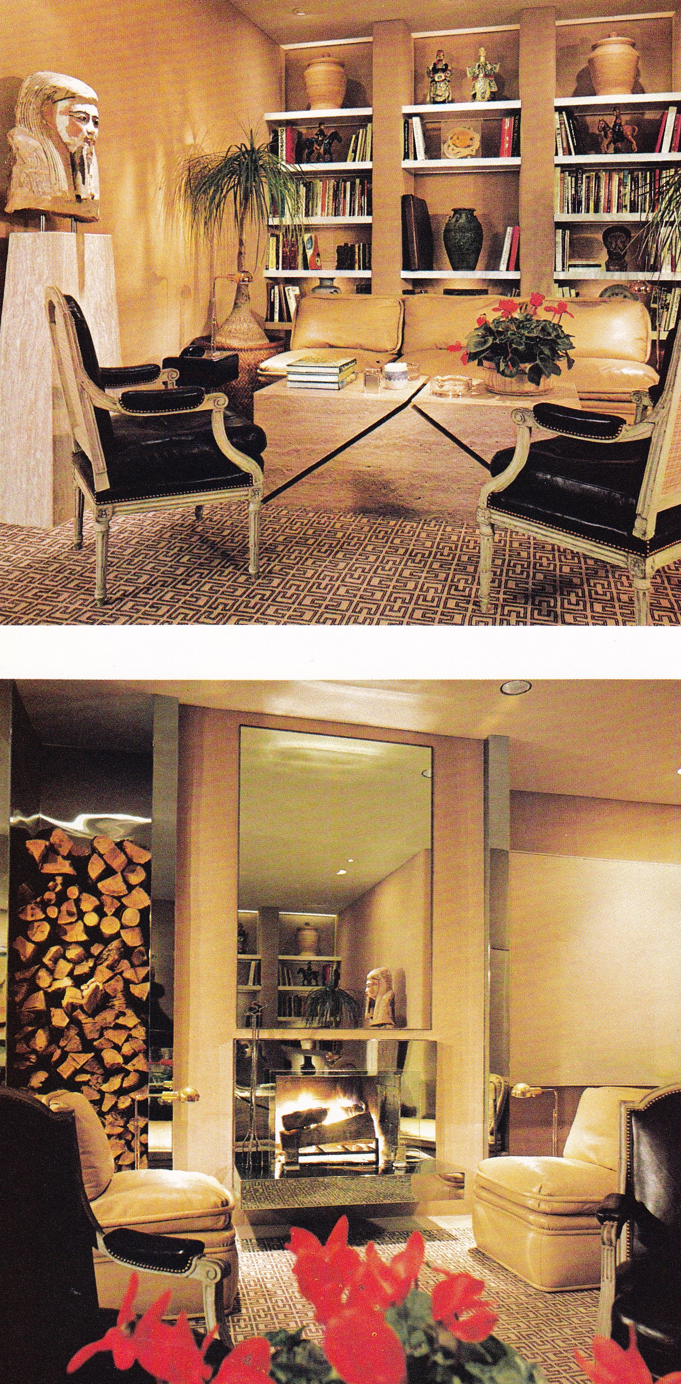
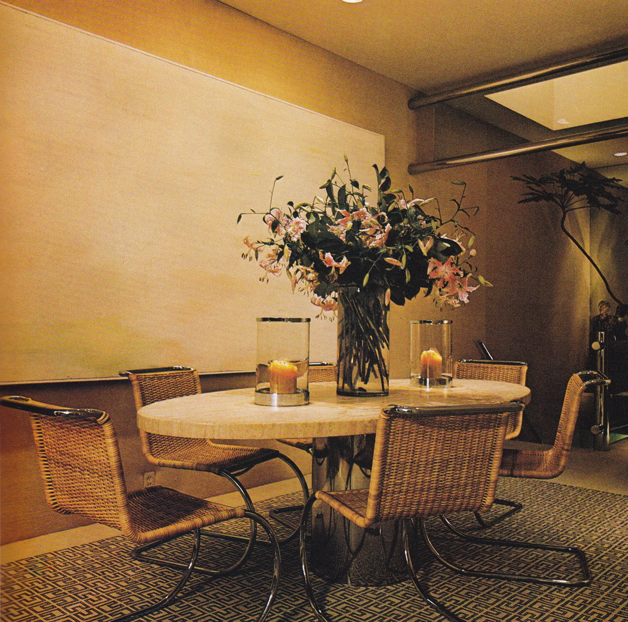
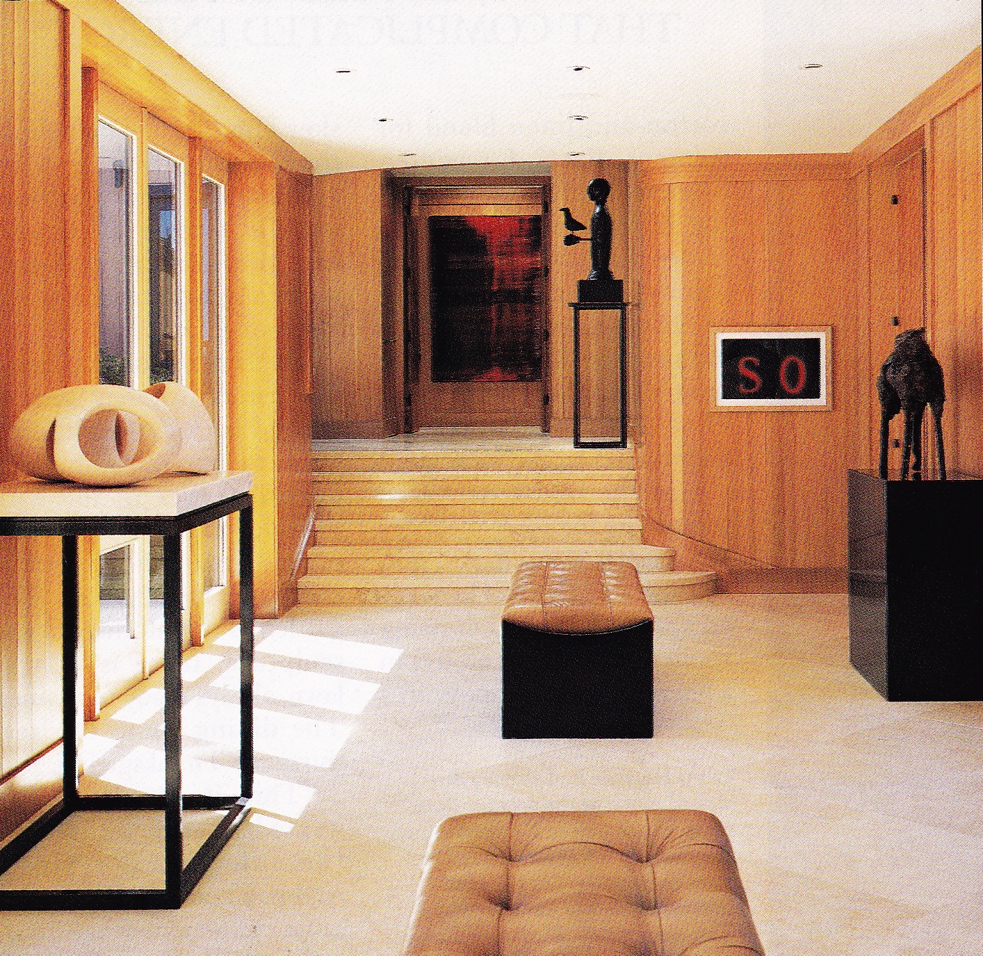
I was living in Los Angeles and working for J. Robert Scott (Lewis’s furniture company) at the time the home was being completed and shortly thereafter published. It was there, in Los Angeles, at a party, that I overheard one of Lewis’s assistant designers comment that Lewis, when first seeing the property, saw no reason to take off her shoes to survey it because she had no intention of walking barefoot on the sand.  Naturally, it came as no surprise when the home was featured in Architectural Digest that its interiors were more an evocation of cosmopolitan glamour than the low-key aesthetic embraced among Stinson Beach’s “old guard”. One look at its interiors and you are immediately transported back to Sally Sirkin Lewis’s world in Los Angeles.

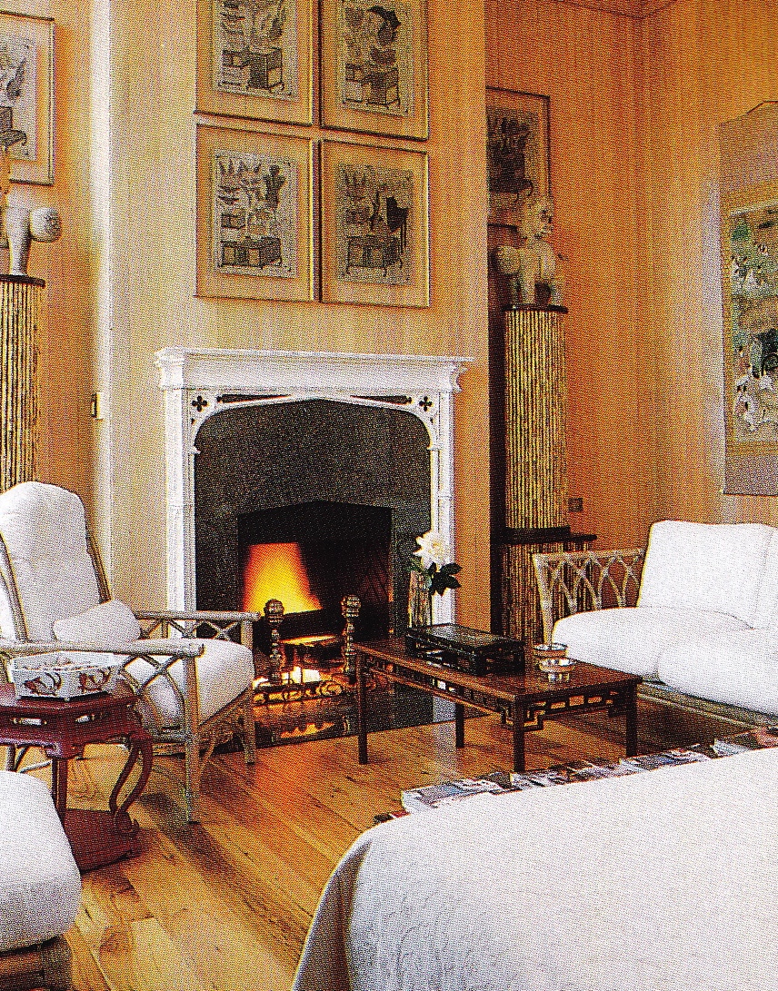
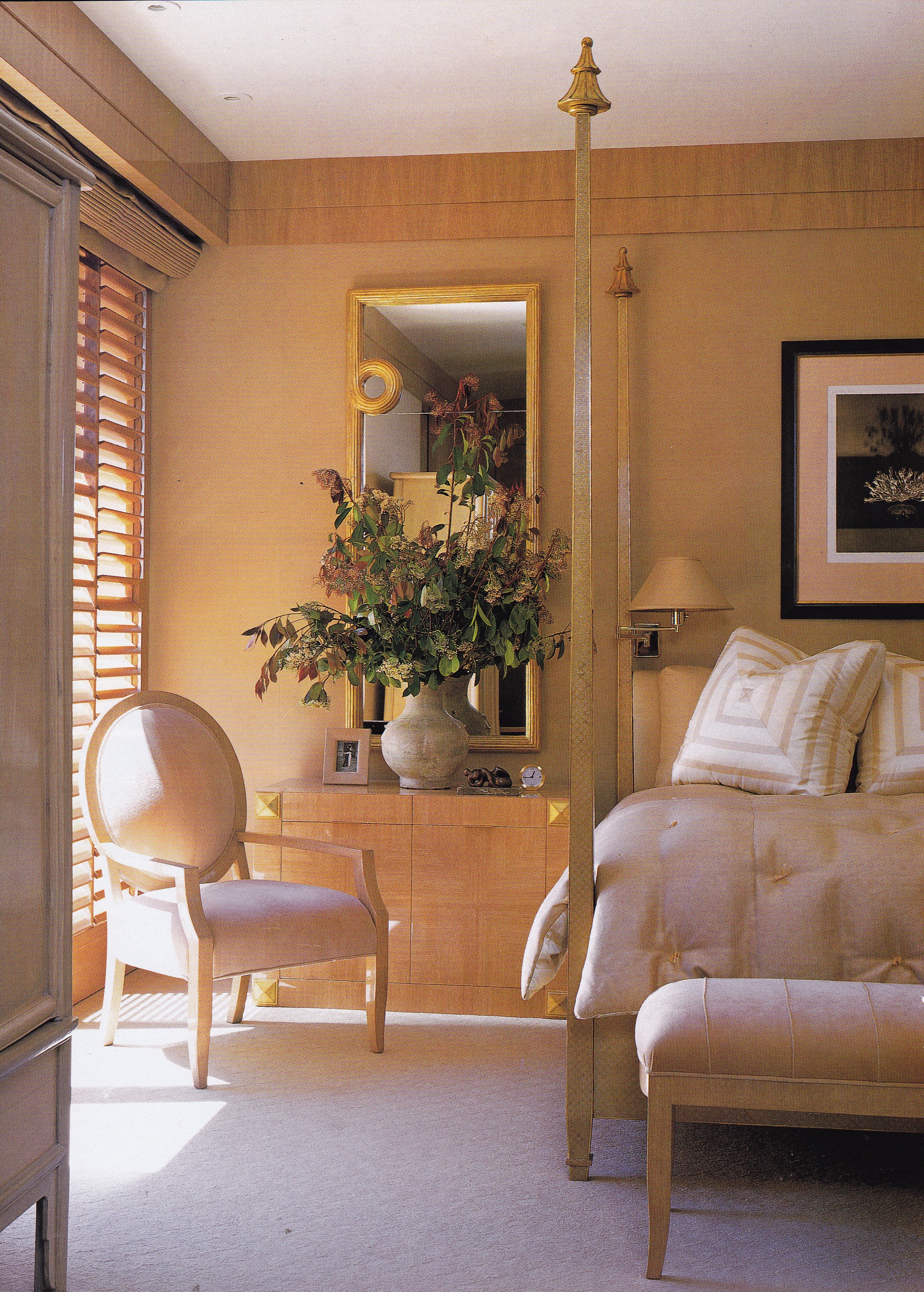
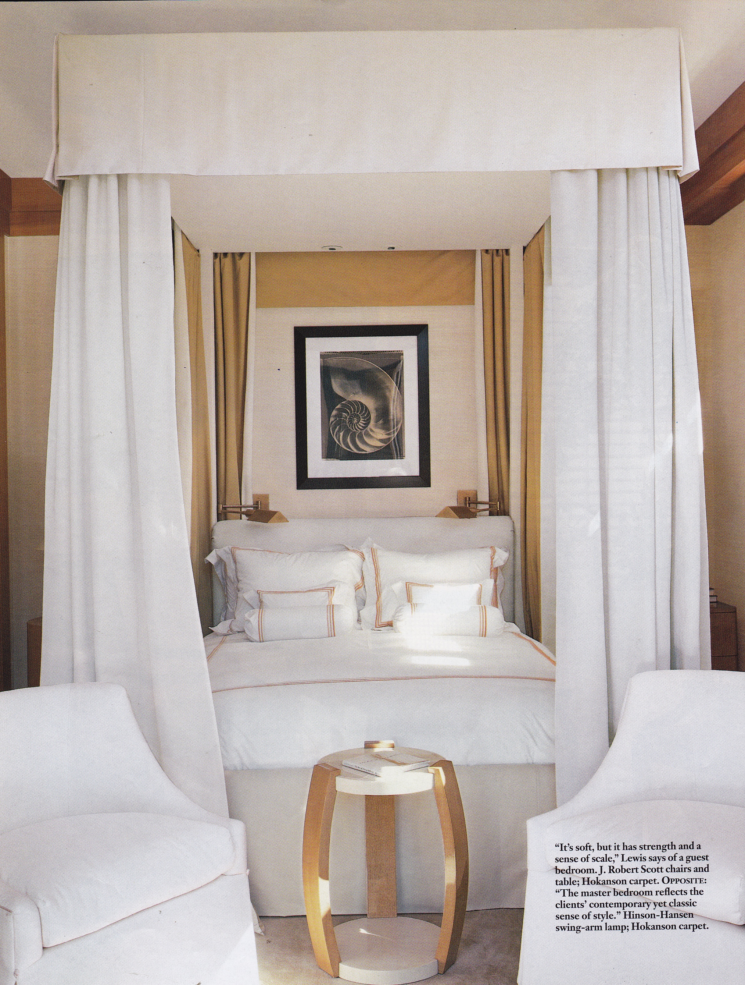
Lewis is known for her glamorous take on modernism, with early references to Jean-Michel Frank, and for her insistence on superior quality. I can attest to the painstaking quality achieved in producing each and every piece that she fastidiously designs and oversees. Her collections will become tomorrow’s highly sought after antiques. To experience the fit and finish of them is like being inside a Rolls Royce: pure luxury and refinement.

The owners of Stinson Beach’s new castle on the sand found their match in Lewis. Desiring a modern envelope in which to showcase their growing collection of art they turned to Lewis to create airy, minimal spaces with luxurious materials in an earthen palette. Step inside for a taste of high style on Stinson Beach.

Sally Sirkin Lewis-Stinson Beach-Walker & Moody Architects-AD-Tim Street-Porter

Sally Sirkin Lewis-Stinson Beach-Walker & Moody Architects-AD-Tim Street-Porter

Sally Sirkin Lewis-Stinson Beach-Walker & Moody Architects-AD-Tim Street-Porter

Sally Sirkin Lewis-Stinson Beach-Walker & Moody Architects-AD-Tim Street-Porter

Sally Sirkin Lewis-Stinson Beach-Walker & Moody Architects-AD-Tim Street-Porter

Sally Sirkin Lewis-Stinson Beach-Walker & Moody Architects-AD-Tim Street-Porter

Sally Sirkin Lewis-Stinson Beach-Walker & Moody Architects-AD-Tim Street-Porter

Photography by Tim Street-Porter for Architectural Digest, July, 2000.

Permalink         Comments (0)        

The McGuire’s in Stinson Beach

Posted August 11, 2014. Filed in Coastal Chic, McGuire, Pan-Asian Style

John and Elinor McGuire-Stinson Beach-CA-Joseph Esherick Architect-AD May 89-John Vaughan

Since before I was born my family has returned time and again to our favorite California beach, our summer home away from home, Stinson Beach. My mother and father discovered it for themselves in the 1950’s on one of their romantic road trips in my father’s red Austin Healey, and it was love at first sight. Since then it has been a favorite family meeting place for summer fun in the sun.

The journey from San Francisco is an adrenaline rush, traveling along Highway One’s vertiginous switchback two-lane mountain road over Mount Tamalpais through Muir Woods and Muir Beach, until reaching the crescent stretch of Stinson Beach forty-five minutes north. With the theater of the mountains plunging below into the Pacific down sheer cliffs I still feel a rush when I round that last bend and Stinson Beach comes into view, with its sandy crescent cove separated by the Pacific to the west and a salt water lagoon with views of Mount Tamalpais to the east. Little has changed in this sleepy village since my parent’s first discovered it. The same market still stands as it did, among a few other white-painted clapboard structures, many of them once homes built at the turn-of-the-20th-century now housing a handful of restaurants, boutiques, a bookstore, and art galleries. But don’t put off filling your tank before you head here: there are no gas stations in Stinson Beach. In fact, you’ll be happy to know corporate America is nowhere in sight. It’s a funky little town with vestiges of the 1960’s hippy era to be found here and there. But, mostly, it’s a natural wonder of beauty and pure relaxation nonpareil.

stinson-beach-014

The stretch of Stinson is divided between the public beach on the south end, and the private beach on the north end. It’s on the north end you will find the gated community of Seadrift, where the Bay Area’s elite buy or rent vacation homes. For years Diane Fienstein has retreated here to her Seadrift home, as had Elinor and John McGuire, of McGuire Furniture, until the sale of their home in 2012 – the feature of today’s post. When I was a teenager there were two houses on this stretch of beach I was most interested in and curious about: the Hertz beach house (of Hertz car rentals), which is sited on the sands of the public beach, and the McGuire’s cedar clad pavilion in Seadrift.

Bolinas Lagoon

Bolinas Lagoon. Photo by Cristopher Worthland.

Seadrift offers a few hundred families a slice of prime real estate heaven, accessed down a narrow mile-long sandspit, with beachside houses facing the Pacific to one side and homes overlooking the Bolinas Lagoon, a bird sanctuary, on the other. The McGuire’s benefited from both perspectives, with a main house on the beach and a guest house across the street on the lagoon. For years I dreamed of being offered an invitation to take a peek inside but, alas, it never came (oh, how I wished I had asked!).

You could say Seadrift is the closest thing to the Hamptons when viewing it from above. Its pristine white sand beach and idyllic panorama are stuff of legends. However, Stinson Beach is not a social mecca. Privacy and solitude is desired within settings that remain low-key and approachable. While tennis and water sports are certainly available, usually all anyone here is interested in is long walks on the beach.

Given the community’s height restrictions most of the homes here are unassuming with low rooflines, with many of its earliest houses resembling the ranch house style or a beach shack. The McGuire’s wanted something more elegant. Enter architect Joseph Esherick. Instead of the usual low-profile horizontal lines he proposed verticality, with thirteen-foot ceilings offering a sense of spatial grandeur, all within the allowed restrictions. Floor-to-ceiling windows open onto views of the sea on one side and the mountains on the other.

McGuire House-Stinson Beach-Marin County-CA

One of the pitfalls of living on the beach are those occasional gusts of wind sending sand into the air and onto decks, patios, terraces and often indoors. To assuage this Esherick devised two terraces – one on the beach side that is glass-enclosed, and the other an interior courtyard with an oculus opening to the sky, giving the impression of a dome, creating elliptical dances of sunlight and shadow on the walls.

McGuire House-Stinson Beach-Marin County-CA

The west facing enclosed terrace opens on to the Pacific.

McGuire Beach House-Stinson Beach-California Beach Houses-Mark Darley

The entrance terrace, above and below, is shielded from the wind but open to the sky.

McGuire House-Stinson Beach-Marin County-CA

For the home’s interiors the McGuire’s turned to their close friend Andrew Delfino for assistance. Not merely a summer resort, they wanted their rooms to provide winter coziness as well as summer airiness. For warmth Delfino suggested the golden tone of glossy pecan for the floors and hemlock for the walls. In keeping with the McGuire’s love of the Far East floors were dressed with mats from Indonesia and many of the doors are faced with panels from old Japanese doors. For furniture the McGuire’s looked no further than their own storage lockers, a treasure trove collected over decades of travel.

McGuire Beach House-Stinson Beach-California Beach Houses-Mark Darley

McGuire House-Stinson Beach-Marin County-CA

Two views of the dining room, taken at different times, features tall doors and soaring ceilings that play up the verticality of the spaces.

John and Elinor McGuire-Stinson Beach-CA-Joseph Esherick Architect-AD May 89-John Vaughan

John and Elinor McGuire-Stinson Beach-CA-Joseph Esherick Architect-AD May 89-John Vaughan

McGuire Beach House-Stinson Beach-California Beach Houses-Mark Darley

McGuire House-Stinson Beach-Marin County-CA

McGuire House-Stinson Beach-Marin County-CA

The living area, photographed at different times, features furniture from the McGuire Furniture company and the McGuire’s collection of Asian antiques and decorative arts. The  two cabinets in the first photo are 19th-century Chinese wedding cabinets. Tan-style sculptures stand on consoles flanking the French limestone fireplace in the second photo. The floors are pecan and the walls are hemlock. The last two photos were taken when the house was listed in 2012.

John and Elinor McGuire-Stinson Beach-CA-Joseph Esherick Architect-AD May 89-John Vaughan

McGuire Beach House-Stinson Beach-California Beach Houses-Mark Darley

McGuire Beach House-Stinson Beach-California Beach Houses-Mark Darley

McGuire House-Stinson Beach-Marin County-CA

The above four photos feature the master bedroom at various ages. In the top three photos Korean ch’aekkori depicting articles in a scholar’s study hang on the walls surrounding an English Gothic Revival mantel. Elinor McGuire designed the “Gothic” rattan chair and love seat.

McGuire House-Stinson Beach-Marin County-CA

Reading list:

California Beach Houses by Pilar Viladas with photography by Mark Darley (buy here); Architectural Digest May, 1989. Photography by John Vaughan; and The San Francisco Gate online.

Permalink         Comments (2)        

Those Lazy-Hazy-Crazy Days of Summer

Ralph Lauren-Montauk-Elle Decor-Pieter Estersohn

For me August defines “those lazy-hazy-crazy days of summer” – a tune originally made popular by Nat King Cole. As summer’s heat intensifies and the air becomes still a languid lull sets in, where it seems all one can do is sit quietly, relax and drink in the nearest quenching facility of water. The houses and locations selected for today’s post reflect this mood with an atmosphere of relaxed insouciance, comfort and a connection with nature. After all, a vacation should be about ease of living and spending time with family and friends in spaces that refresh and rejuvenate. Settle in and enjoy the last days of summer!

Ralph Lauren-Montauk-Elle Decor-Pieter Estersohn

Ralph Lauren-Montauk-Elle Decor-Pieter Estersohn

Ralph Lauren-Montauk-Elle Decor-Pieter Estersohn

The Ralph Laurens’ Montauk retreat photographed by Pieter Estersohn.

Bruce Weber-Golden Beach-Florida

Bruce Weber’s Golden Beach, Florida, home.

Miles Redd-The Pines-Long Island-Paul Costello

Miles Redd-The Pines-Long Island-Paul Costello

Miles Redd-The Pines-Long Island-Paul Costello

Miles Redd’s beach house at The Pines photographed by Paul Costello.

3_living-room-decorating-ideas-ss32-lgn

Alan Wazenberg’s Water Island beach house photographed by Pieter Estersohn.

Axel Vervoordt Living With Light-Long Island-Cutler Anderson Architects

A Long Island residence designed by Cutler Anderson Architects and Axel Vervoordt. From Living With Light.

Horace Gifford House 1965-FIre Island-WoI Aug 2014-Ricardo Labougle

The cedar clad living area of a Fire Island beach house designed in 1965 by Horace Gifford.  Photographed by Ricardo Labougle for The World of Interiors.

Jacques Grange-Portugal-WSJ-Martin Morrell

Jacques Grange’s compound, Casa Nina, in the Alentejo Region of Portugal. Photography by Martin Morrell.

James Huniford-Hamptons

A Hamptons cottage decorated by James Huniford.

dc97aa25f2d02b97df0e8e95bd35e78f

dbe7bac136d4307cfb7cd46404000dfb

A  beachside retreat in Stinson Beach, California, by Butler Armsden Architects.

ED0112_Lisbon_001-625-lgn

ED0112_Lisbon_004-400-lgn

A traditional Portuguese fishing hut, renovated for modern living by Aires Mateus and Assoc. Photography by Gaelle le Boulicaut.

Melvin Dwork-Long Island-AD-1987

Melvin Dwork’s beach house in Long Island featured in Architectural Digest in 1987.

Vicente Wolf-Montauk

Vicente Wolf’s Montauk beach house.

EDC070112Pucci03-625-lgn


EDC070112Pucci05-625-lgn

Ralph Pucci’s Hamton’s retreat designed by Vicente Wolf. Photographed by William Waldron.

John Lautner Beyer Residence 1975 -Michael Taylor-AD May 1985

The Beyer Residence in Malibu designed by architect John Lautner in 1975 and decorated by Michael Taylor for Richard Turner featured in the May, 1985, issue of Architectural Digest.

Haynes-Roberts-Hamptons-Elle Decor-Simon Watson

haynes-EDC-11-13-12-lgn

haynes-EDC-11-13-06-lgn

A beach house in the Hamptons designed by Timothy Haynes and Kevin Roberts. Photography by Simon Upton.


Permalink         Comments (0)        

Favorite Vintage Ads Friday: Perry Ellis for Martex

Posted August 1, 2014. Filed in Favorite Vintage Ads

Perry Ellis for Martex 1983

It seems like I just wrote last week’s Favorite Friday Vintage Ads and here it is Friday, again – how fast this week has flown by! But I’m not complaining, as Friday’s are most welcomed and better still, I’m off to my native home, northern California, to spend a week with my family at our beloved Stinson Beach in Marin county.

Last week I posted an ad produced by Atelier Martex, one of several to come. Today’s feature showcases a signature line for Martex created by the late great fashion designer Perry Ellis. Ellis was know for his classic American point of view, and this room illustrates his pared-down take on American chic. Looking at the room today brings to mind Bill Blass’s country house – spare, classic, and distinctly American.

Have a glorious weekend – I’ll see you at the beach!

CW

Permalink         Comments (0)        

Throwback Thursday: Rubén de Saavedra

Posted July 31, 2014. Filed in Classic Chic, Classic Contemporary, Rubén de Saavedra

Rubén de Saavedra-Manhattan Apartment-AD May/June 75

Rubén de Saavedra, a Spanish interior designer, hit his mark in the 1970’s, often gracing the pages of Architectural Digest. With bravado he transformed traditional rooms into theatrical stages for modern living – a look that today brings to mind the work of Kelly Wearstler and Jean-Louis Deniot. Merging contemporary and classic design with shots of color he was successful at creating the right balance. His rooms are bold and confident, as the strong architectural features and bold color combinations attest. Patrician French antiques mix with contemporary pieces, Asian lacquer furniture, and sleek reflective surfaces – a bit of Parish-Hadley here, a dose of David Hicks there, and a pinch of Op-Pop glam for good measure.

For a client in Manhattan, an opera singer, de Saavedra transformed a traditional apartment on the West Side into an evocation of aural fluidity. The boxed beam ceiling was his solution for unsightly structural beams, painting the insets saffron, which set the scheme for the rest of the room. To counter the warmth factor of the varying shades of saffron and curry he laid lacquered vinyl (a material we wouldn’t consider today) in a cool gray onto the walls and beams. What I have admired in his work was his skill at creating dynamic furniture layouts and a sensitivity to scale and proportion. The Etruscan-red lacquered music room is particularly fetching and feels timeless, with shelving created to house the owner’s collection of records. The facing black leather club chair is probably the only piece I would switch out. The dining room, by contrast, is traditional and formal, and more evocative of a European country estate with its sober tawny color palette, gilded wood Régence chandelier and Italian Renaissance mirror. While the living room certainly feels of its time in terms of its interior architecture, the music and dining rooms prove that good design is lasting.

Rubén de Saavedra-Manhattan Apartment-AD May/June 75


Rubén de Saavedra-Manhattan Apartment-AD May/June 75


Rubén de Saavedra-Manhattan Apartment-AD May/June 75

From the May/June issue of Architectural Digest. Photography by Champion Pictures.

Permalink         Comments (0)        

Hail Stephen!

Stephen Sills-Dallas-HG June 86-Oberto Gilli

Stephen Sills, that is – the classically-inspired interior designer with an American point of view. Sir Sills is the decorator’s decorator, the one that can’t be copied with any success. Have you ever tried to copy a Rothko or a Pollack? I have, with disastrous results. Yes, it’s true, be yourself. It’s your only fate. But, oh, how I wish I could channel the alchemical magic conjured by this one truly extraordinary talent, a sublime gift to the world of interiors.

Too flowery you say? Au contraire! Not for this Stephen Sills groupie. (For anyone who doesn’t know me, I am not the groupie type.) The rooms featured in today’s post were the first rooms designed by Sills to be published. House & Garden featured his Dallas townhouse in 1986 with the headline “Classical Trickery: Designer Stephen Sills Gives a Modern Clarity to Traditional Tromp l”Oeil.” By the time the issue hit circulation Sills’s career had skyrocketed and would find him decamped to New York City. The rest is history in the making.

I am perplexed, actually, that these rooms have not circulated the interior design lover’s blogoshere. Could it be that they are too theatrical for our modern way of living? From what I find on Pinterest, for example, our love of theater has not waned. Aside from the elaborate plaster casts mimicking the drapery of classic Greek sculpture these aren’t rooms dripping with opulence in the vein of le goût Rothschild, a style so out of reach for so many. Admittedly, I have always been a sucker for a marble fragment or two, and for the order, proportion and scale of the Classics, and its inherent sense of refinement and simplicity, the mark of true elegance. And I somewhat wish that we might return, if just a bit, to creating more rooms with stage presence, romance, fantasy and a touch of magic. I have returned to these images time and time again over the years for inspiration and delight. Stephen Sills has been a silent mentor from the start and I will continue to be his loyal disciple, as I told him myself with utmost gratitude and sincerity.

Stephen Sills-Dallas-HG June 86-Oberto Gilli

The Eye Has to Travel by Diana Vreeland comes to mind as I experience these rooms. Sills’s early travels abroad and his years spent in Paris surely influenced his taste for antiquities and the Romantic-Classical Revival styles of the 18th-and-19th-centuries. The loose arrangement of floating Louis XVI chairs by François Hervé covered in cobalt blue satin (from Chatsworth) is reminiscent of the Rothchild’s drawing room at Château Mouton photographed by Horst. But, here, where bona fide antiques mix with a virtuoso of faux , Sills had created an atmosphere more akin to a Federico Fellini film. Plaster-coated draped muslin provides a faux-stone backdrop for Roman antiquities and period Louis XVI furniture floating on cool white marble tile floors, all beneath a shimmering silver tea-papered ceiling. A remarkable 18th-century Irish mirror injects a note of Rococo whimsy atop a quite handsome low and broad mantel of plaster that melds seamlessly with the walls.

Stephen Sills-Dallas-HG June 86-Oberto Gilli

Sills enhanced the sense of illusion that pervades much of the townhouse by extending the interior wall color onto the terrace beyond floor-to-ceiling windows that read like mirrors reflecting back. Even the blue glass cube table in the living area that brings to mind a Donald Judd art work is repeated on the terrace, as if a reflection. A spare elegance and restrained palette allows the important pieces to take center stage, giving these rooms the appearance of an 18th-century Italian villa.

Stephen Sills-Dallas-HG June 86-Oberto Gilli

Faux was the word in the lexicon of designers and decorators of the 1980’s and 1990’s. Here, Sills used it to great effect using Brunschwig & Fils wallpaper cut to imitate stone and pasted onto a “mortar” of another brown wallpaper. He played up the verticality of the entry hall by placing an elongated and narrow 18th-century Irish mirror above a parchment cabinet by Jean-Michel Frank and stacked Islamic tiles over a French Deco console.

Stephen Sills-Dallas-HG June 86-Oberto Gilli

A monastic serenity pervades the entry hall, like stepping back in time to another era in a different place. The celestial mobile floating above the stairs strikes a note of mystery and illusion. The Italian oval-back chair now resides at his Bedford home.

Stephen Sills-Dallas-HG June 86-Oberto Gilli

In the library Sills intended the faux finish for the walls to resemble terra-cotta but he arrived at something that resembled leather and stuck with it. A French Art Deco mirror with a tarnished Korean lacquer frame appears to float beyond the space, suspended on a wall of the entry hall beyond.

Stephen Sills-Dallas-HG June 86-Oberto Gilli

The illusory quality of the burnished faux leather tromp l’oeil walls compliments the bona fide leather upholstered neoclassical Italian chairs creating a rich Old World atmosphere.

From House & Garden, June 1986. Photography by Oberto Gilli.

Thank you, Stephen, for conjuring a world of magic, elegance and timeless chic that will inspire and delight for years to come.

(This post was written in November of 2013. I thought I had published it but recently discovered it was still a draft. My apologies to Stephen and audience!)

Stephen Sills: Decoration+Cristopher Worthland-

Stephen Sills: Decoration

To experience more of Stephen Sills’s beautifully rendered world you can buy Stephen Sills: Decoration HERE.

Permalink         Comments (2)        

The Tempo of Gold

Posted July 28, 2014. Filed in Classical Moderne, Luxe Moderne, The Maximalists

Jean-Louis Deniot-London Apt-AD Italia-March 2014-Stephan Julliard

The work of maximalist French interior designer Jean-Louis Deniot is easy to spot: luxurious, classically-inspired modern rooms for living in the 21st-century, where strong silhouettes and bold statements are juxtaposed within a soothing envelope of gray and gold mineral tones, stone, ivory and parchment.

For a glamorous flat in London Deniot punctuated coolly elegant rooms with the warmth of burnished gold against alternating limestone and gray walls in rooms filled with French furniture in the style of the 18th, 19th, and 20th centuries as well as 21st-century pieces that shall become tomorrow’s highly collectible antiques.  A modern interpretation of neoclassicism pervades the interiors where classical busts mix with modern sculpture, alabaster urns rest on a custom modern burnished gold console, mirrored obelisks stand before Herve van der Straeten’s interpretation of the French soliel mirror, Louis XV candelabra rest on a modern travertine topped table, modern lighting accentuates fine French furniture, and a classical plaster relief shares wall space with modern art. The whole masterfully orchestrated employing luxurious textiles (many of them custom), bespoke rug designs, and walls rendered as stone by expert craftsmen. These are alpha rooms to be certain, one’s own suite at The Carlyle, with just the right does of glamour and escape one seeks from a London teaming with noise and congestion.

Jean-Louis Deniot-London Apt-AD Italia-March 2014-Stephan Julliard

Jean-Louis Deniot-London Apt-AD Italia-March 2014-Stephan Julliard

Jean-Louis Deniot-London Apt-AD Italia-March 2014-Stephan Julliard

Jean-Louis Deniot-London Apt-AD Italia-March 2014-Stephan Julliard

Jean-Louis Deniot-London Apt-AD Italia-March 2014-Stephan Julliard

Jean-Louis Deniot-London Apt-AD Italia-March 2014-Stephan Julliard

Jean-Louis Deniot-London Apt-AD Italia-March 2014-Stephan Julliard

From the May, 2014, issue of Italian AD. Photography by Stephan Julliard.

Permalink         Comments (0)        

Favorite Vintage Ads Friday: Atelier Martex

Posted July 25, 2014. Filed in Favorite Vintage Ads

Atelier Martex - Simpley Violets-1983

Ranking high among my favorite “vintage” ads from the 1980’s are the ad campaigns produced by Atelier Martex. This one features the introduction of a new bedding line named “Simply Violets” released in 1983. If I knew who directed the design of these room settings I would certainly hail their talents. They excelled at creating fashionable, often eclectic and sometimes idiosyncratic vignettes to showcase new bedding lines. But it was the atmosphere they created, not the bedding, per se, that grabbed my attention.

A combination of high and low and traditional and modern were juxtaposed to create a studied nonchalance that invokes an atmosphere of repose. One part Romantic, the other Modern, a balance is struck through the marriage of color and texture. One imagines this is the room of an aesthete, surrounded by their beloved collections and furniture from various provenance and periods. With an artist’s eye, tableaux were created upon the tops of the console and cabinet to express individual caprices. With rooms like these I wonder if Atelier Martex met their sales expectations. I, for one, was more interested in everything else in the rooms they created!

Permalink         Comments (1)        

Throwback Thursday: William Gaylord

William Gaylord-Russian Hill-SF-AD-Russell MacMasters

Today’s Throwback Thursday post features a long-standing favorite designer of mine from the 1970’s, William Gaylord. His style defined the clean, crisp, classic and contemporary aesthetic of California design at the time, a style that would usher in a new American chic with the advent of the California Look, made popular by Michael Taylor.

For his 1870 shingled Victorian on San Francisco’s Russian Hill Gaylord transformed its eccentric and prettily appointed interiors into stream-lined open spaces trimmed-out in gleaming polished chrome with expanses of windows opening onto the theater of San Francisco Bay. A restricted palette of butterscotch, black and white further enhanced his vision for a luxurious hilltop aerie that combined both modern and classic design elements with fine and humble materials.

William Gaylord-Russian Hill-SF-AD-Russell MacMasters

Gaylord transformed two parlors and a porch into one continuous, flowing living area (above three photos). Warm-toned silk upholsters the walls, providing a luxurious foil, while buttery soft leather covers armless sectional units, paired with Louis XVI-style fauteuils. The segmented marble cocktail tables and geometric patterned carpet are Gaylord designs. The fireplace was inset with mirror and chrome, a decidedly 1970’s glam statement – but one which is tempered by the warm and restrained color scheme and simple, though luxurious, materials.

William Gaylord-Russian Hill-SF-AD-Russell MacMasters

In the dining room Gaylor placed a non-structural 500-pound transom to symbolically delineate the entrance from the dining room. Surrounding the marble top-and-chrome-base dining table are Mies van der Rohe chairs set before a minimalist painting by James Dykes.

William Gaylord-Russian Hill-SF-AD-Russell MacMasters

Unabashed luxury defines Gaylord’s bedroom, with walls lined in dark suede and a bed draped with camel’s hair wool. Marble topped gilt wood consoles inject a note of traditional high style in contrast with the modern chrome-and-mirror fire surround.

William Gaylord-Russian Hill-SF-AD-Russell MacMasters

Gaylord’s hilltop perch afforded views over San Francisco Bay toward the Golden Gate Bridge and Marin County beyond.

From Architectural Digest, May/June 1977. Photography by Russell MacMasters.

Permalink         Comments (0)        

Nouveau Classique

Florence Grinda-Paris Apt-Russian AD

When Florence Grinda, Director of Development of European Affairs at Sotheby’s, went looking for a  new Paris pied-a-terre she called upon her longtime friend Pierre Passebon, the famous antiquaire and art collector, who has collaborated on several of his own residences with interior designer Jacques Grange. Passebon found the apartment close to the Esplanade des Invilides in the 7th arrondissement, telling Grinda “It’s the smallest and ugliest apartment, so it is naturally cheap, but not to worry, because together we will turn into a confection”. And that they did. Nearly daily the duo discussed the redesign, analyzing sketches and visiting galleries and flea markets, picking up furniture and decorative items as they went along. Grinda’s vision was to recreate the 18th-century in terms of scale, color and atmosphere, combined with the spirit of a collector. The results are coolly elegant and highly personal rooms washed in shades of blue, aqua, celadon, turquoise and sepia. Eclectic collections and objets de curiosité fill the apartment and lend the spaces a sense of creative mystery. One part grand dame, the other grande bohème, Grinda and Passebon have created a confection that will surely arouse the senses of the fashionable set for decades to come.
Florence Grinda-Paris Apt-Pierre Passebon-Russian AD

The mantel was created from tiles Florence collected in Madeira. The stained glass screen was made by Géraldine Ensminger.

Florence Grinda-Paris Apt-Russian AD

In the entrance hall Entrance Hall is an exuberant bronze mirror topped with palm fronds. The celestial globe is 18th-century.

Florence Grinda-Paris Apt-Pierre Passebon-Russian AD

A portrait of Florence by Andy Warhol hangs between the apartment’s original bookcases.

Florence Grinda-Paris Apt-Pierre Passebon-Russian AD

A bronze tree based on a drawing by Géraldine Ensminger serves as a stand for the bird collection of glass and porcelain.

Florence Grinda-Paris Apt-Pierre Passebon-Russian AD

The kitchen was converted from a bedroom. When her collection of ceramic plates outgrew wall space Florence had them hung on the ceiling.

Florence Grinda-Paris Apt-Pierre Passebon-Russian AD

Dining one evening at the house of the sculptor Claude Lalanne Florence discovered a child’s bed adorned with water lillies. She wanted her own, to her taste, for her new apartment. This particular bed is the the only version that Lalanne has created. During the remodeling of the apartment parquet de menuiserie from the 1760’s was discovered beneath old wall-to-wall carpet.

Florence Grinda-Paris Apt-Pierre Passebon-Russian AD

The guest bath, formerly a bedroom, is filled with treasures collected from nearby flea markets.


From the October, 2008, issue of Russian AD. Photography by Pedro D’Orey.


Permalink         Comments (2)        

A Man and His Castle: Château du Champ de Bataille

Posted July 21, 2014. Filed in Chateaux, French Country Houses, Jacques Garcia
A porphyry bowl stands in the entrance hall.

A porphyry bowl stands in the entrance hall.

Fresh off the presses is Spanish interior designer Jacques Garcia’s second monograph, Jacques Garcia: Twenty Years of Passion, featuring his beloved Château du Champ de Bataille, a 17th-century estate in Normandy. Garcia purchased the property twenty years ago, then in derelict state, and has worked tirelessly since restoring and furnishing every glorious inch to sublime delight. Four-hundred sumptuous pages will take you on a grand tour of its ninety-four acres spotted with formal gardens, water features, lakes and architectural follies, and in to its magnificent interiors furnished with rare antiques and porcelains, sculpture, art and personal collections. If not for this labor of love Jacques’ château could quite possibly be but a remembrance of things past.

A celebratory spirit enlivens one of several fountains and lakes on Garcia's ninety-four acre property.

A celebratory spirit enlivens one of several fountains and lakes on Garcia’s ninety-four acre property.

Garcia spent ten years working on the glorious Apollo Salon, restoring the ca. 1650 ceiling and filling the space with Louis XV period furniture and antiques.

Garcia spent ten years working on the glorious Apollo Salon, restoring the ca. 1650 ceiling and filling the space with Louis XV period furniture and antiques.

Garcia created a cabinet of curiosities in the manner of grand European country houses.

Garcia created a cabinet of curiosities in the manner of grand European country houses.

Garcia recreated the château's original neoclassical style, adding elements such as this antique Roman bust.

Garcia recreated the château’s original neoclassical style, adding elements such as this antique Roman bust.

The pretty and elegantly appointed private dining room features pink-and-gilt console tables by George Jacob and a "Roses and Myrtle" Sèvres dinner service commissioned by Louis XV for Mme. du Barry.

The pretty and elegantly appointed private dining room features pink-and-gilt console tables by George Jacob and a “Roses and Myrtle” Sèvres dinner service commissioned by Louis XV for Mme. du Barry.

Garcia designed a vaulted ceiling and furnished the lower level of the two-tier Consulate-style library with large reading tables stamped Jacob Desmalter.

Garcia designed a vaulted ceiling and furnished the lower level of the two-tier Consulate-style library with large reading tables stamped Jacob Desmalter.

The armory houses Garcia's collection of antique arms and armor. Decorated in a 19th-century style it is used as a gathering place in the  winter.

The armory houses Garcia’s collection of antique arms and armor. Decorated in a 19th-century style it is used as a gathering place in the winter.

Garcia collaborated with landscape designer Patrick Pottier on the restoration and design of the grounds.

Garcia collaborated with landscape designer Patrick Pottier on the restoration and design of the grounds.

To see more of this remarkable château you can buy Jacques Garcia: Twenty Years of Passion here. Photography by Eric Sander.

Permalink         Comments (1)        

Favorite Vintage Ads Friday: J. Robert Scott

J. Robert Scott Ad 1977

I have retained a rather large lot of “vintage” issues of Architectural Digest that dates back to the 1970’s but it appears that there were not many ads taken out by J. Robert Scott until the later 1980’s, a company who usually exclusively advertised in the Los Angeles based magazine. I use the word “vintage” loosely, as it tends to be thrown around so often these days in reference to anything at least twenty years old, regardless of the fact that the word vintage, in reference to merchandise, is defined as the age of anything fifty years to 99 years in age. I apologize for perpetuating this trend with my inaccurate weekly post heading!

The black-and-white ad featured in today’s Favorite Vintage Ads Friday post, from 1977, epitomized the California Chic look of its era – the “new look” – and what would later become known as “the California look” made popular by Michael Taylor. Sally Sirkin Lewis, the owner and an interior designer, combined Art Deco and Asian motifs in luxe materials creating her own take on modern luxury. The black-and-white photo further plays up this reference, with the stair-stepped design of the glossy black vases, the rounded corners of the white display columns that reference Chinese lacquered tables, the over-scale stepped round “mirror”, and the over-stuffed, wide-channel-quilted pale leather armless sofa setting on a brushed steel base. Classic, bold and crafted of the finest materials, these “vintage” items will become highly sought after by future collectors.

Permalink         Comments (0)